9 Studio Apartment Color Mistakes (And What to Do Instead)
Color is the cheapest thing you can change in a studio — and the most punishing when you get it wrong. One bad decision and your already-small space starts feeling like a confusing, chaotic box. Here’s the thing: most studio color mistakes aren’t about bad taste. They’re about not knowing the rules of small spaces. Let me walk you through the nine I see most often.
Mistake #1: Too Many Accent Colors Fighting for Attention
Studios can absolutely handle color and personality — but there’s a difference between a curated palette and a color free-for-all. When you’ve got a blue pendant, a pink mirror, striped pillows, a patterned rug, and a yellow side table all in the same room, nothing lands. Everything competes. Pick two accent colors max, then let them repeat intentionally across the space. Cohesion is what makes a colorful room feel designed instead of chaotic.
Pro tip: Use the 60-30-10 rule. 60% neutral base, 30% secondary color, 10% accent pop. That’s it.
Mistake #2: Ignoring Warm Neutrals and Going Straight to White
Bright white sounds like the smart choice for a small space — more light, more air, right? Not always. Flat white walls with no warm undertones can make a studio feel like a waiting room. Look at what warm neutrals do: creamy whites, linen, greige (grey-beige), soft oatmeal. Pair them with earthy terracotta, moss green, or walnut wood tones and suddenly your space has depth and warmth without feeling heavy. This is the look that makes people walk in and say “oh, this feels so good.”
Mistake #3: Going All-White to “Make It Feel Bigger”
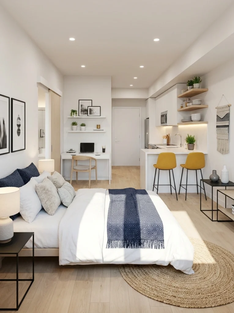
Here’s the thing — all-white doesn’t actually make a studio feel larger. It makes it feel stark. Without contrast, your eye has nothing to anchor to, and the space reads as flat. Notice how the yellow bar stools in this room do all the heavy lifting? That single hit of mustard gives the whole space a focal point. You need at least one moment of contrast — a dark piece of furniture, a bold textile, a colored chair — or the room just disappears into itself.
Renter-friendly alternative: Can’t paint? A richly colored sofa or area rug does the same job as a painted accent wall.
Mistake #4: Playing It Too Safe When Your Personality Is Begging to Show Up
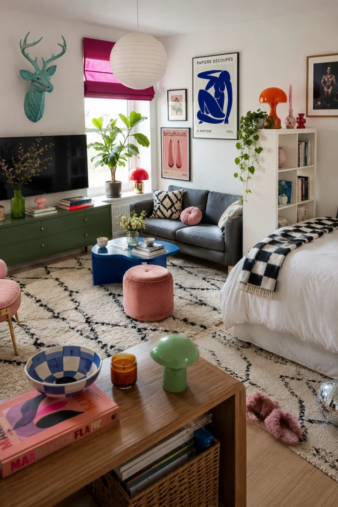
Some people overcrowd. Others go so neutral they’ve essentially disappeared from their own home. If a room feels like it could belong to anyone, that’s a problem. Studios are intimate spaces — they should feel unmistakably you. Commit to a style and lean in. Eclectic art, mushroom lamps, a Beni Ourain rug, trailing pothos — it all works when there’s a clear point of view behind the choices. Fear of commitment is what makes a space feel generic.
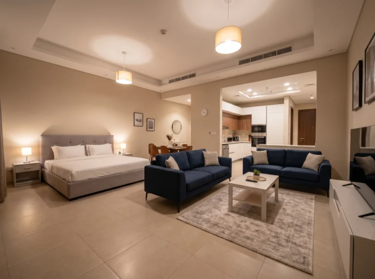
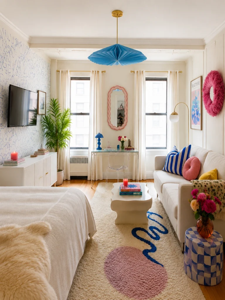
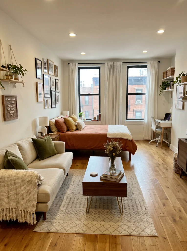
Mistake #5: Thinking Black and White Is “Safe” Without an Anchor Color
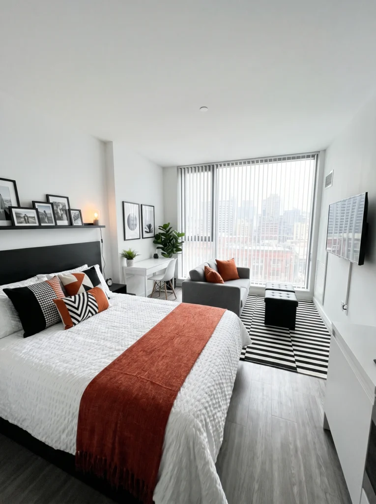
Black and white is bold, graphic, and genuinely chic — but in a studio, it needs one warm anchor or it reads cold and impersonal. Notice the rust bed runner and rust accent pillows here? That single warm color is doing enormous work. It stops the space from feeling clinical. If you love a monochrome palette, don’t abandon it — just add one earthy tone. Terracotta, amber, warm tan. One color. That’s all it needs.
Mistake #6: Avoiding Color Because You Think “It’ll Be Too Much”
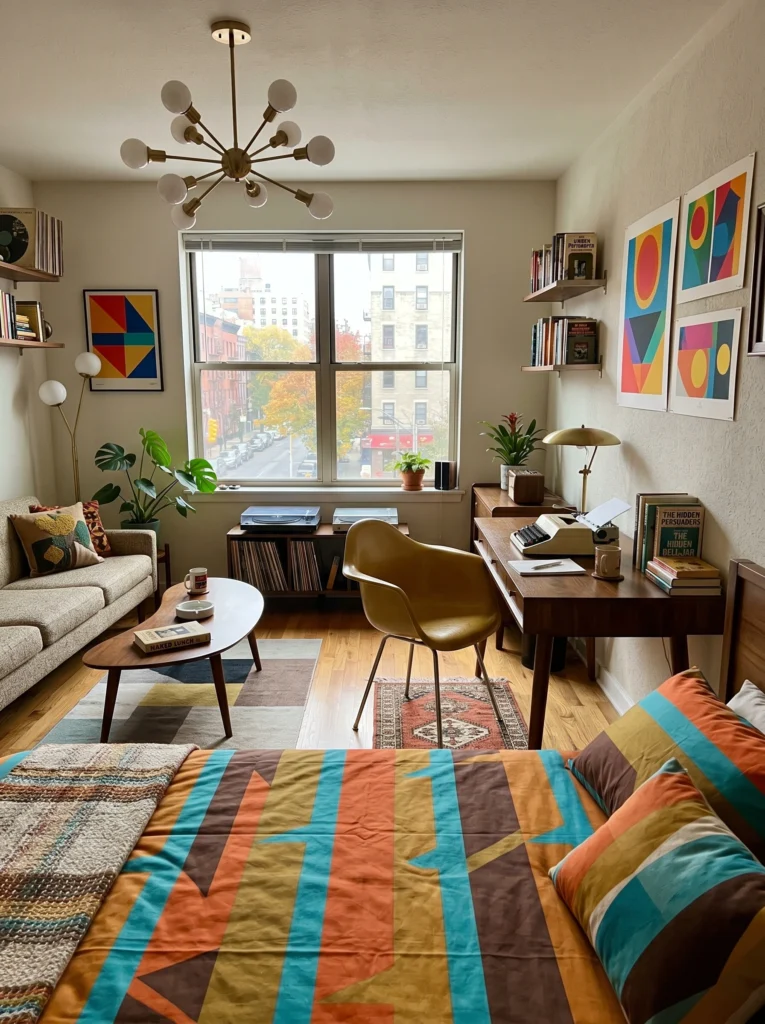
Color-shy decorators often end up in a beige purgatory — not quite neutral, not quite warm, just kind of… nothing. Mid-century style is a great example of how bold color works in a small space when it’s intentional. Geometric art in primary colors, a warm amber desk lamp, a colorful quilt — these choices feel cohesive because they share the same retro energy. When your colors have a common vibe, more is genuinely more. The Sputnik chandelier ties it all together.
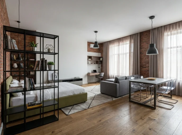
Mistake #7: Overdoing a Feature Wall Until It Overwhelms the Room
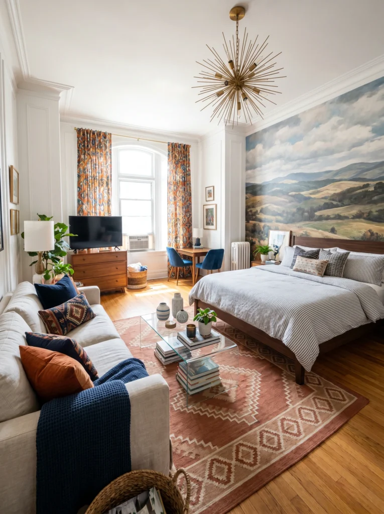
A feature wall is a brilliant idea in a studio — it anchors the sleeping zone and adds visual interest without requiring paint everywhere. The mistake is choosing something so dominant it shrinks everything around it. This mural works because it’s soft, painterly, and the colors (dusty blue, sage, warm tan) echo through the rest of the room — the navy pillows, the rust rug, the walnut dresser. The wall leads. Everything else follows. That’s the formula.
Pro tip: If you’re going bold on a wall, pull one color from it into at least three other elements in the room. That’s how you make a statement without creating chaos.
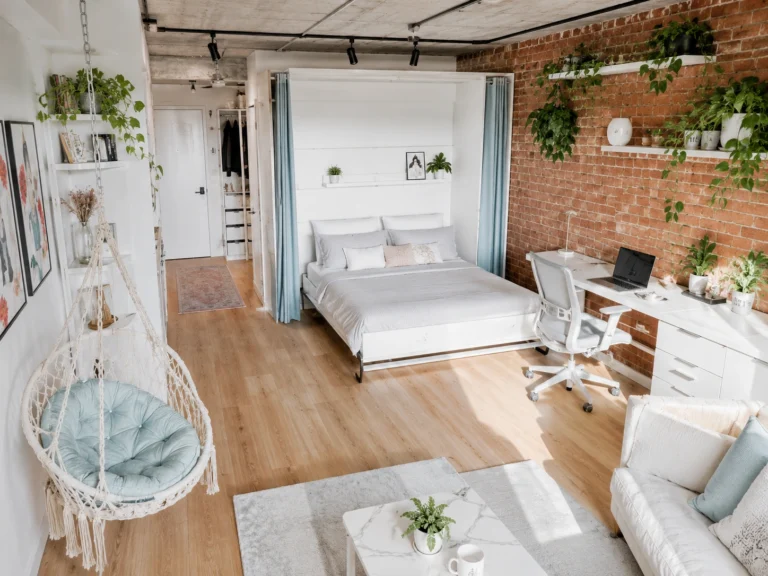
Mistake #8: Forgetting That Green Is a Neutral
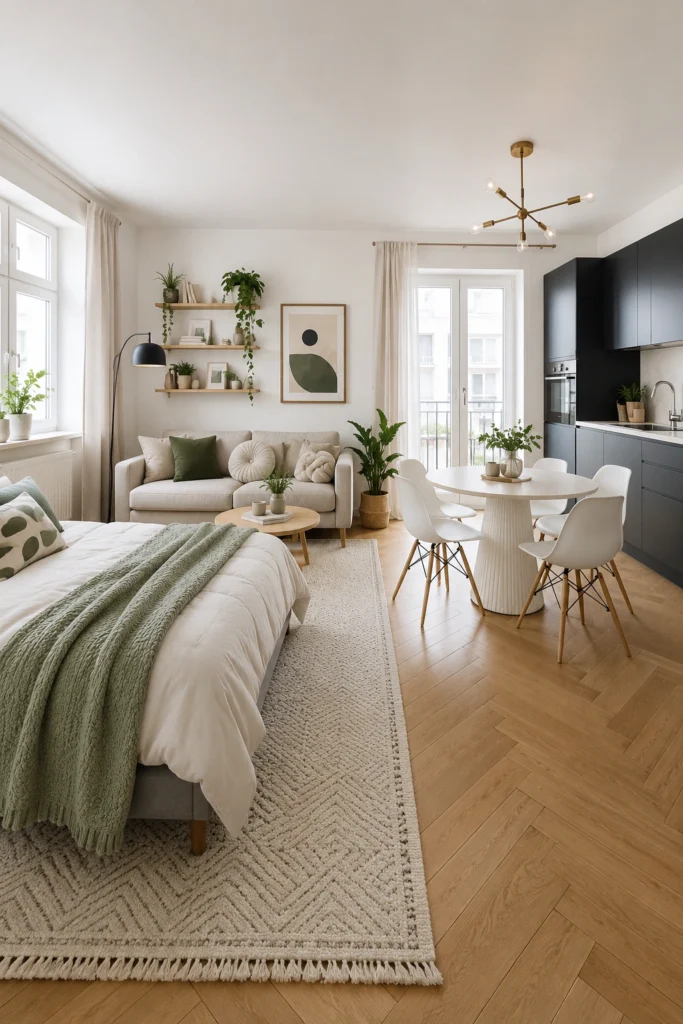
People treat green like it’s a risky choice. It isn’t — especially soft, muted greens like sage, eucalyptus, or moss. In a studio, green reads almost like a neutral. It pairs beautifully with white, warm wood, black, and cream. It brings the outside in without screaming for attention. A sage throw, a green cushion, a trailing plant on a shelf — these additions make a room feel alive and fresh without any drama. It’s the color equivalent of a deep breath.
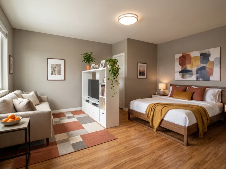
Mistake #9: Adding Color Everywhere Instead of Committing to One Anchor Piece
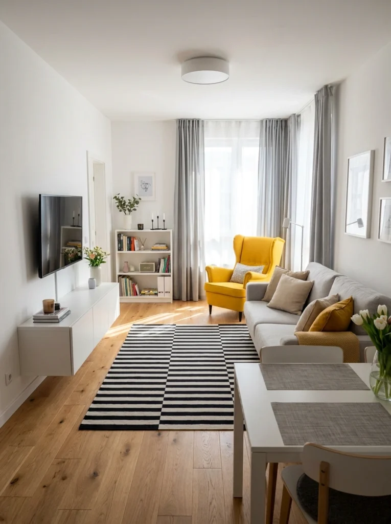
This is the flip side of Mistake #1 — instead of spreading color thin across twenty objects, put it all into one statement piece and let everything else breathe. A mustard yellow armchair in an otherwise white and grey room? That’s design confidence. You don’t need more color — you need better placement of it. One anchor piece that’s genuinely bold gives the whole room a focal point and a personality. Everything else can stay quiet.
Final Thoughts
Studio apartments are small, but that doesn’t mean they need to be timid. Most of the color mistakes I see come from either doing too much at once or being so afraid of committing that nothing interesting happens. Both lead to the same result: a space that feels off without you quite knowing why.
Pick a palette you love and actually use it. Let one color lead. Repeat it in three places. Add contrast where the room needs an anchor. That’s honestly most of the formula.
Your studio doesn’t need to look bigger — it needs to look like yours.
Happy decorating, Sofia