Studio Apartment Wall Art Mistakes to Avoid (And What to Do Instead)
You finally hung something on the walls — and your studio still feels off. Sound familiar? Wall art in a studio apartment is trickier than it looks. One wrong move and your space feels smaller, busier, or just… confused. Here’s exactly what to stop doing, and what actually works.
Mistake #1: Treating Your Studio Like a Showroom
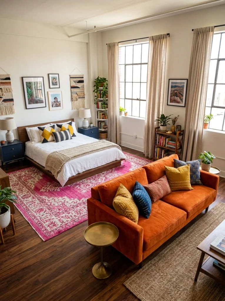
Here’s the thing — a studio apartment isn’t a hotel lobby. When people try to make their space look “impressive,” they reach for oversized, impersonal art that fills walls but tells zero story. Look at how this space works: a mismatched gallery wall with photos, woven wall hangings, and framed prints, all layered together in a way that feels lived in.
That orange velvet sofa doesn’t care about impressing anyone. It just works. Your art should feel the same way — like you actually chose it, not like it came with the lease.
Mistake #2: Going Minimal With Art in a White Box
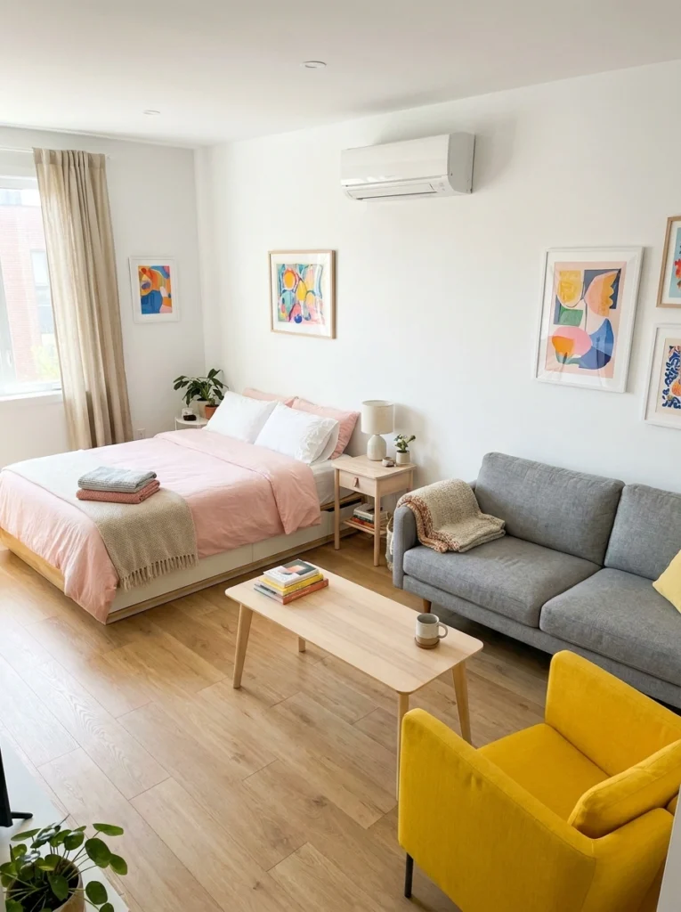
White walls are a blank canvas — not a design plan. The most common mistake in clean, bright studios is under-decorating the walls out of fear. This space nails it: a mix of colorful abstract prints in warm wood frames scattered at different heights creates rhythm without chaos. The art doesn’t all match perfectly, and that’s the point.
A yellow accent chair and pink bedding do their job, but it’s the wall art that gives the room its personality. Don’t be scared of color on the walls. A timid single frame on a big white wall just looks forgotten.
Mistake #3: Hanging Everything at the Same Height
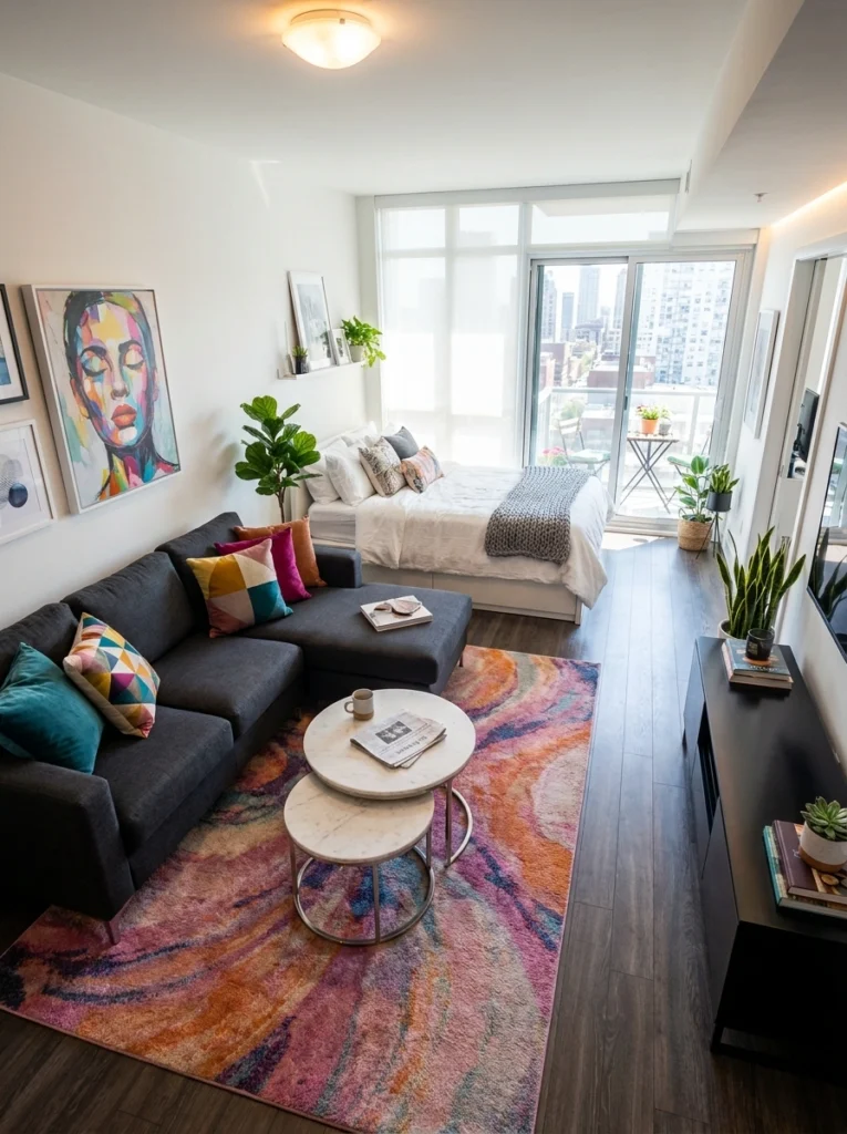
This is the part most people skip — and that’s exactly why their room feels flat. Hanging every piece of art at perfect eye level creates a visual line that stops the eye dead. Instead, mix it up: one large piece, a couple of smaller ones slightly above or below.
This studio does it well — a tall abstract piece anchors the wall, while smaller frames cluster at different heights beside it. The jute rug and tufted sofa keep things grounded, so the gallery wall can breathe and move. Stagger. Always stagger.
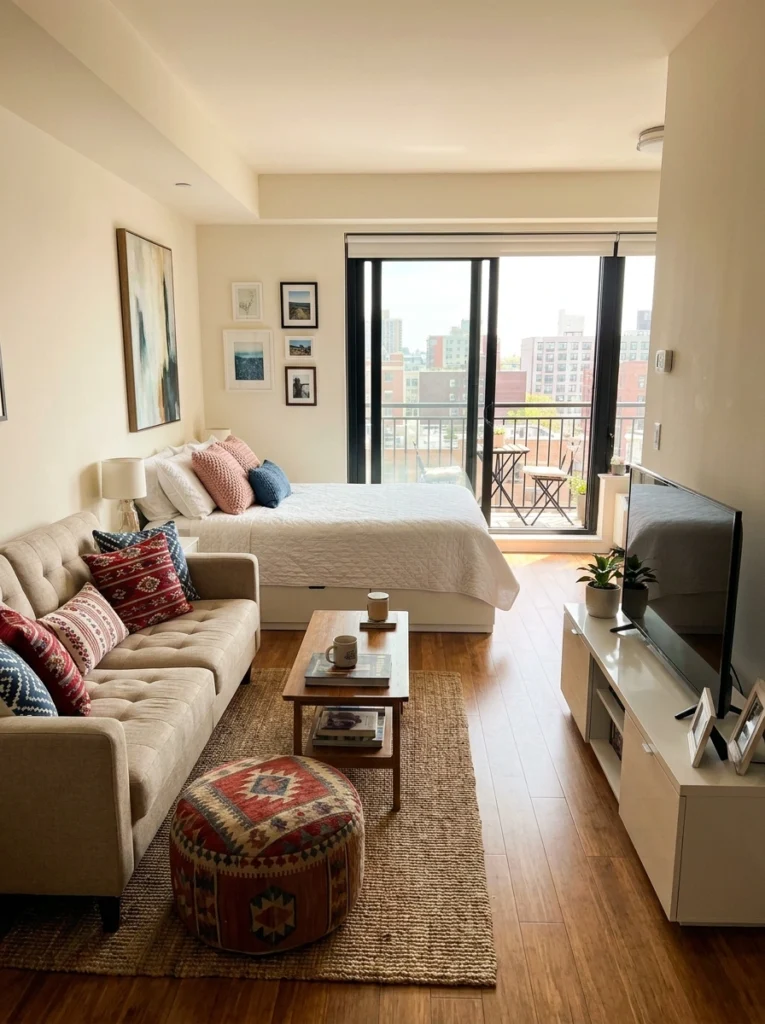
Mistake #4: Choosing Art That Fights Your Rug
Pro tip: If your rug is the loudest thing in the room, your art needs to either complement it or step back entirely. This studio has a wildly colorful swirling rug — and the large portrait artwork on the wall holds its own without competing. Both are bold, but they’re bold in different ways. Where people go wrong is hanging maximalist art and using a maximalist rug simultaneously with zero breathing room between them.
The dark sectional acts as the visual buffer here. Pick your statement piece and build everything else around it.
Mistake #5: Using Too Many Small Frames
Small frames clustered together without intention look like they escaped from a storage box. The difference between a curated gallery wall and a jumbled one is scale and spacing. This studio gets it right — a mix of sizes, all in matching gold frames, arranged with deliberate gaps between them. The blush-and-cream palette ties everything together so the eye reads the wall as one cohesive moment, not twenty separate decisions.
if you’re using frames smaller than 5×7, you need at least seven of them — or skip it and go bigger.
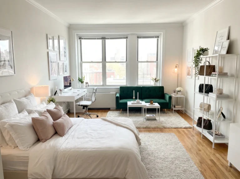
Mistake #6: Ignoring the Wall Behind the Bed
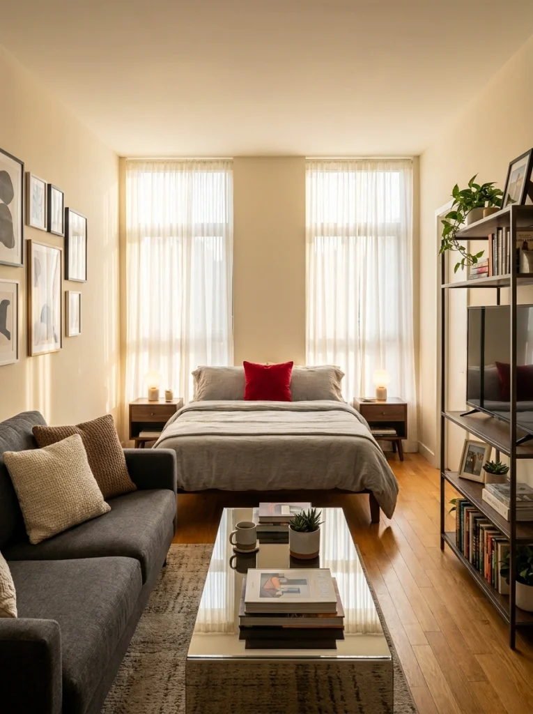
The wall behind your bed is prime real estate. In a studio, it’s often the first wall you see when you walk in — and leaving it bare is a wasted opportunity. This space uses a curated set of black-and-white abstract prints in varied frame sizes to create a calm, sophisticated focal point.
The warm candlelight on the nightstands and the pop of a red pillow do the heavy lifting on warmth, so the art can stay cool and graphic. Don’t be afraid to hang a proper gallery on your headboard wall. It anchors the whole room.
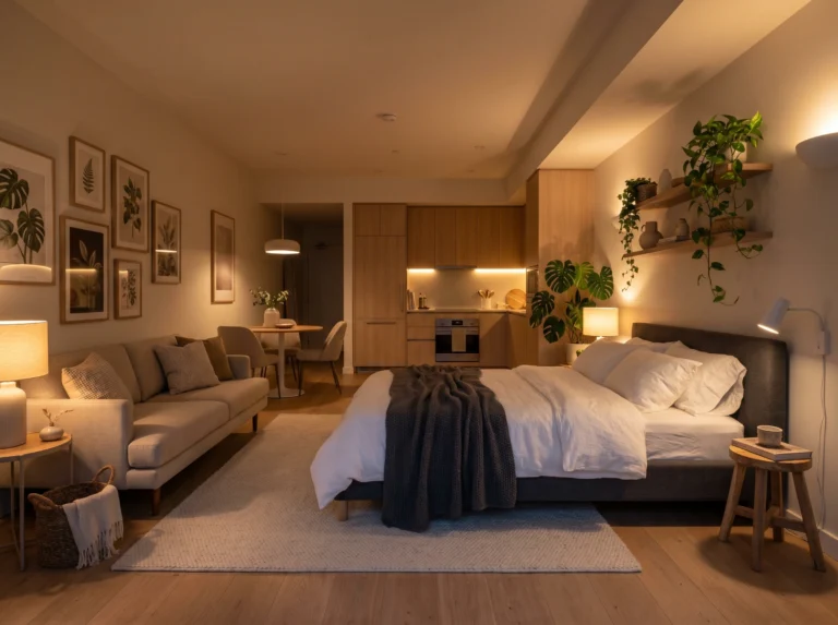
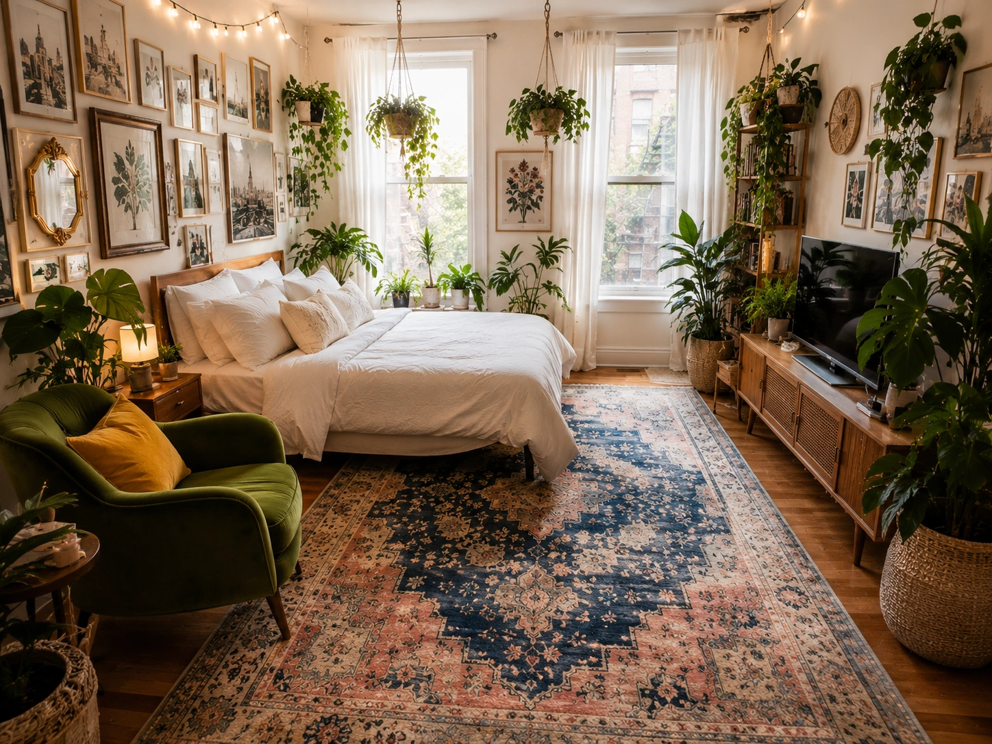
Mistake #7: Skipping Plants as Part of Your Wall Story
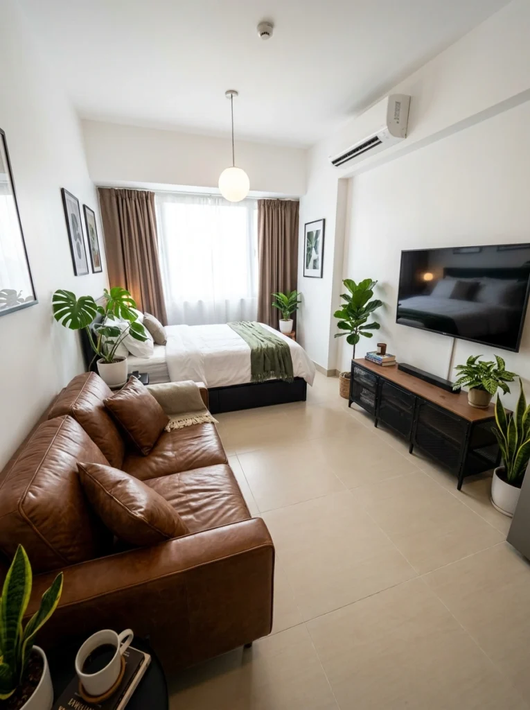
Wall art doesn’t have to mean only framed prints. Plants are part of the visual story too — and pairing botanical prints with actual greenery is one of those moves that feels obvious once you see it done well. This studio lines the space with monstera and fiddle leaf fig plants, then echoes that with botanical-themed framed art on the walls. The brown leather sofa grounds the whole look in warmth. It feels layered and intentional without trying too hard.
Pro tip from someone who learned the hard way: even one large plant near your art wall changes the entire mood of the space.
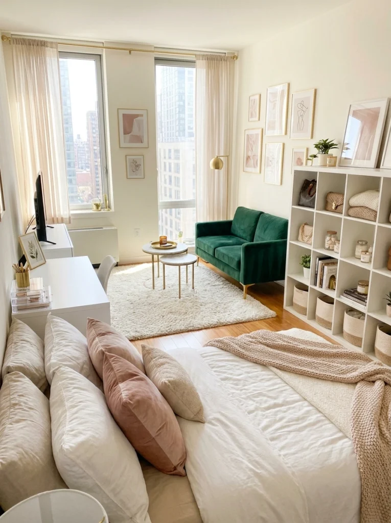
Mistake #8: Forgetting That Shelves Are Wall Decor
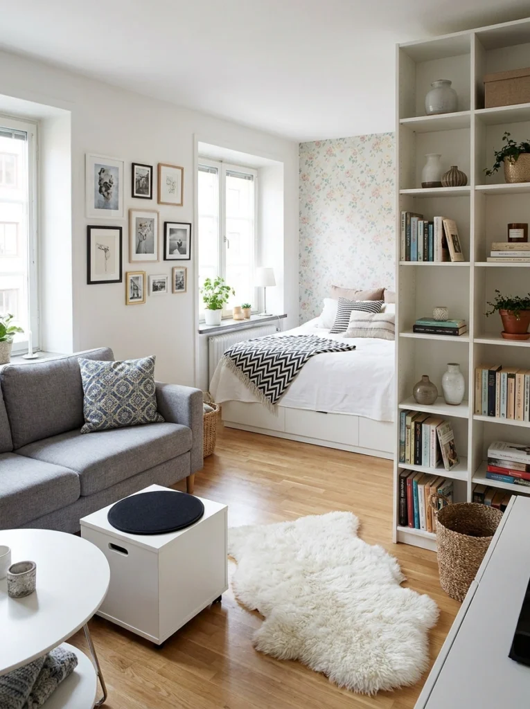
A floor-to-ceiling open shelf isn’t just storage — it’s a vertical design element. This Scandinavian-style studio uses a tall white bookcase as both a room divider and a display wall, filled with books, ceramics, and small plants. Meanwhile, the gallery wall on the left mixes black-and-white photos with warm wood frames in an organic, collected way.
The floral wallpaper peeking through in the bedroom nook adds a sweet surprise. The lesson? Think about your walls in three dimensions. Shelves, ledges, and hanging art can all work together.
Mistake #9: Letting the Art Compete With the View
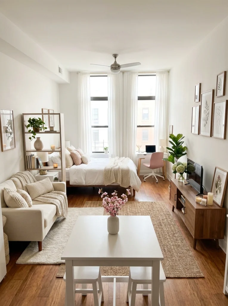
If you have good natural light or a decent view, let it breathe. This studio keeps its art soft and tonal — botanical prints in warm wood frames on the right wall — so they complement the flood of natural light without blocking or competing with it. The white curtains amplify everything. A small desk nook, a jute rug, and a cream sofa give the room calm structure. Art on a wall near a big window should frame the light, not fight it. Pale, nature-inspired prints are always a safe and beautiful choice here.
Final Thoughts
Wall art in a studio apartment is honestly one of the highest-impact things you can get right — or wrong. Too much, too small, too low, too matchy: any of these can make a room feel like it’s working against you. But once you start thinking about art as part of the room’s whole story — not an afterthought — everything clicks.
Pick one wall. Just one. Start there, and let the rest follow.
Your walls should tell your story — not a stranger’s idea of what looks good.
— Sofia
Image credits: All images used with permission for editorial purposes.