Studio Apartment Layout Mistakes to Avoid
You moved in, arranged things in what seemed like a logical order, and somehow the whole place still feels cramped, chaotic, or just… off. Sound familiar? Studio apartments are tricky — one wrong furniture decision and the entire space pays for it. Here’s the thing: most layout mistakes are completely fixable without spending a fortune. Let’s talk through the biggest ones.
Mistake #1: Ignoring Zones Entirely
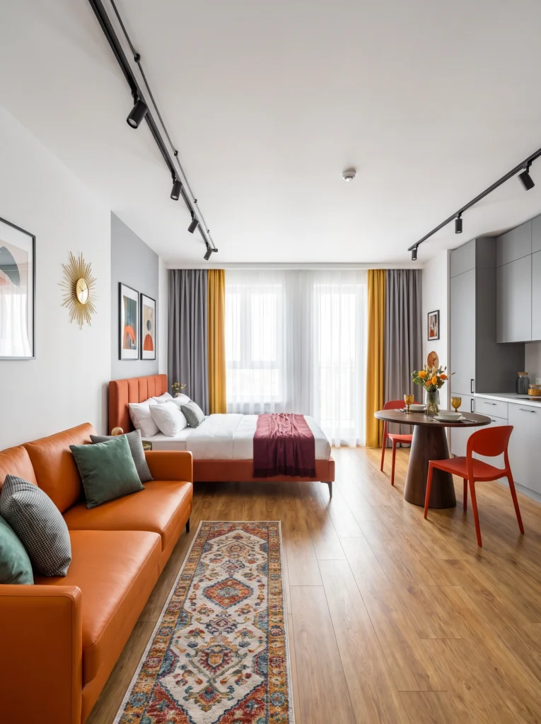
When everything bleeds into everything else, your studio feels like one big messy room — not a home. The fix is intentional zoning, even without walls. A runner rug along the bed defines the sleep area. A small round dining table in the corner creates a dedicated eating spot. Track lighting overhead lets you direct light to each zone independently. Zone it, and suddenly the same square footage feels organized.
Pro tip: Use rugs as your zone markers — one under the sofa, one under the bed. Different textures, same color family.
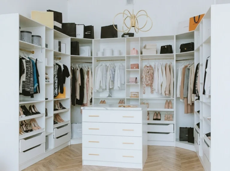
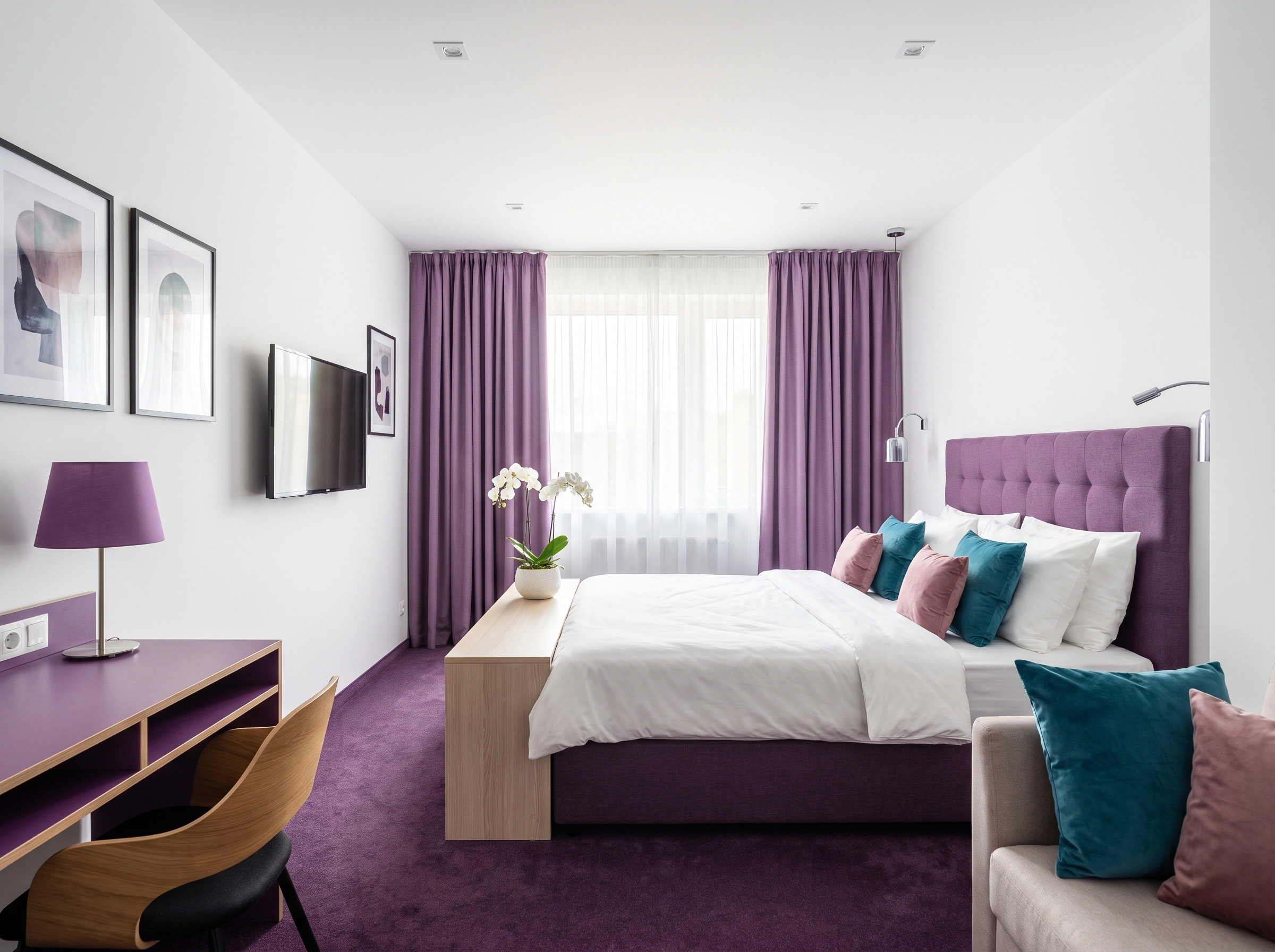
Mistake #2: Choosing the Wrong Statement Light
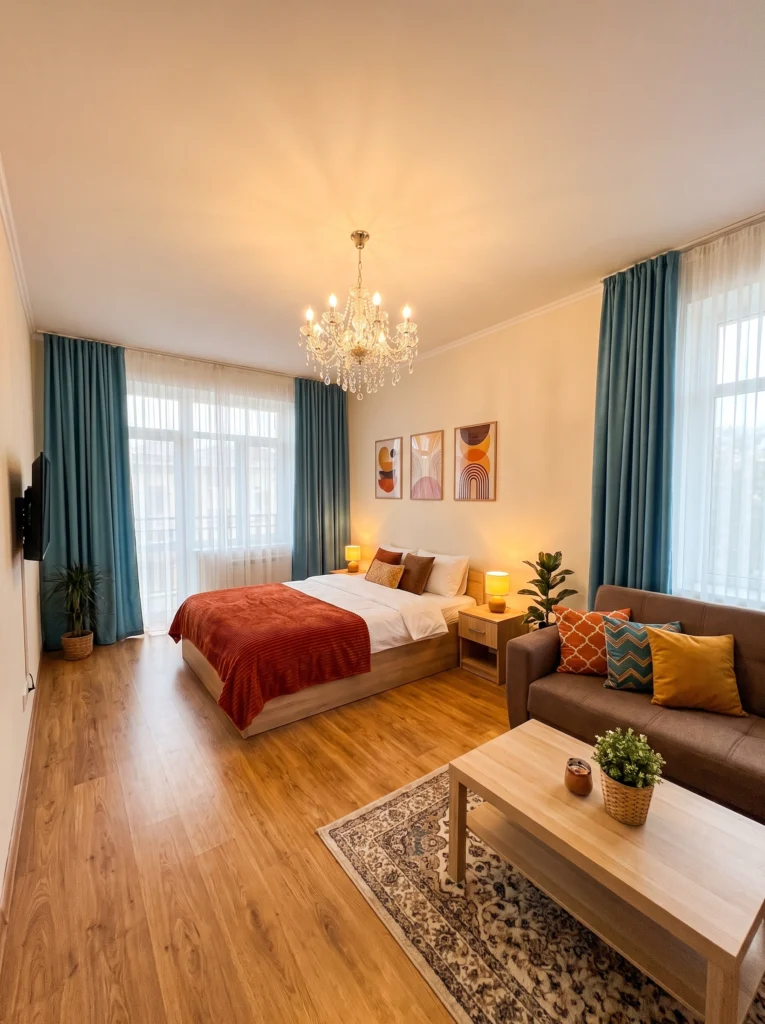
A chandelier in a studio sounds glamorous. And honestly? It can work — but only if it’s scaled right and your ceilings are tall enough to carry it. The mistake most people make is hanging something too small, too low, or too formal for a casual open-plan space. Pick a fixture that feels intentional, not accidental. Warm-toned bulbs are non-negotiable. Cold white light in a studio kills the mood instantly.
Sofia’s honest take: If your chandelier looks like it belongs in a hotel ballroom, it’s too much. Aim for cozy drama, not grand entrance energy.
Mistake #3: Over-Darkening a Small Space
Dark furniture isn’t the enemy — but in a small, low-light studio, stacking a dark sofa next to a dark bed frame next to dark dining chairs is a fast track to feeling boxed in. Notice how white walls and pale floors do the heavy lifting here: they keep the space breathing even when the furniture skews moody. The rule: go dark on one or two pieces, let everything else stay light.
Renter-friendly alternative: Can’t paint? Hang a large white or cream mirror opposite your main window. It bounces light and visually doubles the room.
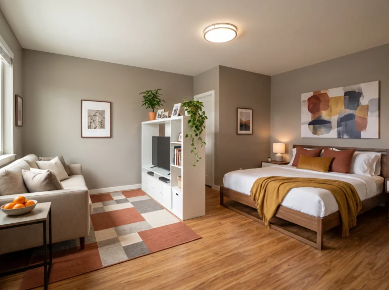
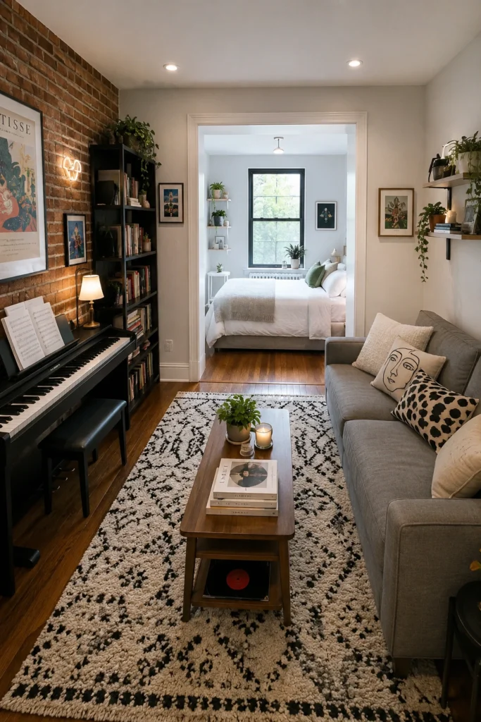
Mistake #4: Skipping the Foot-of-Bed Anchor
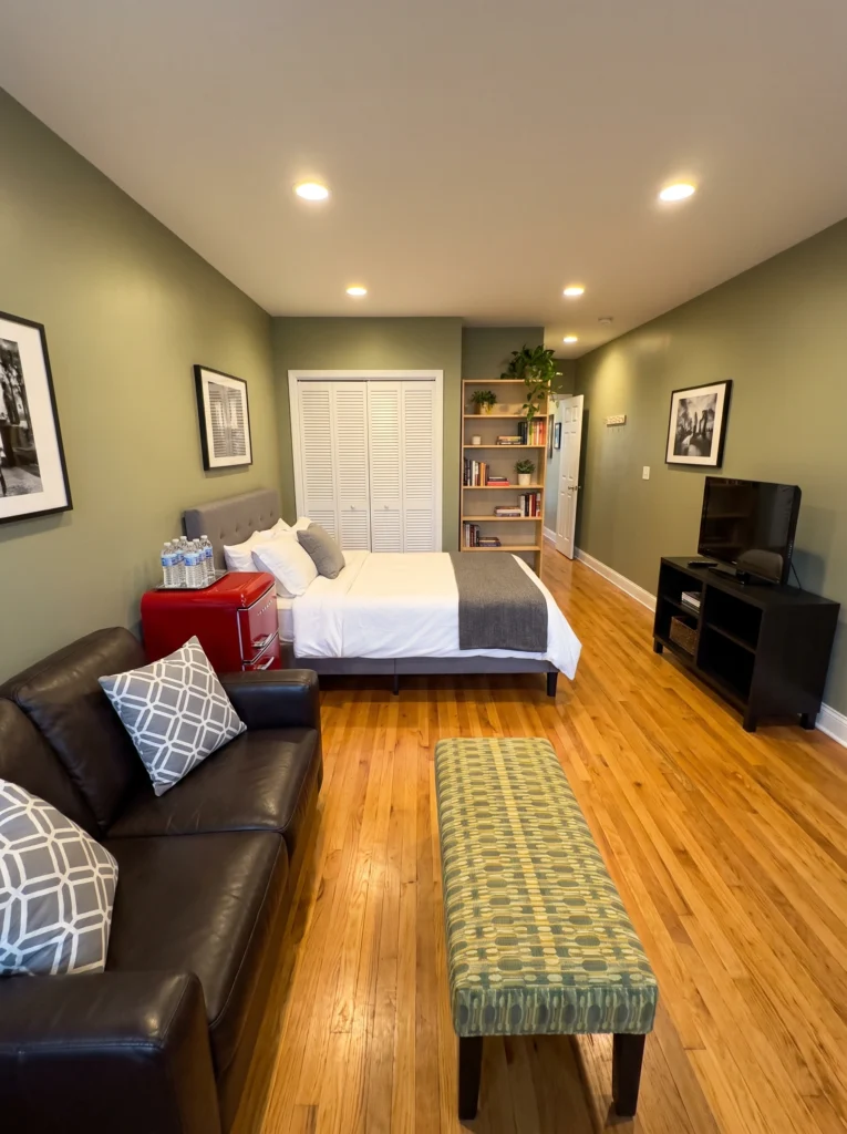
The foot of your bed is dead space in most studios — and that’s a wasted opportunity. A bench, storage ottoman, or folded blanket chest does two things: it visually separates the sleeping zone from the living area, and adds storage you desperately need. This studio nails it with an upholstered bench that creates a natural boundary between sofa and bed without a single wall.
My tip: A storage bench from IKEA (the BÄNKSKÄR or similar) runs under $100 and gives you hidden storage plus that visual anchor.
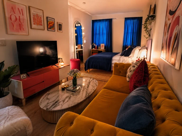
Mistake #5: Letting Furniture Float Without a Rug
Furniture floating on bare floor with no rug is the number one reason studios feel unfinished. A rug grounds your sofa and coffee table into a real “living room” — even when the bed is six feet away. Go bigger than you think you need. Most people buy rugs too small, which makes the space feel more cramped. At minimum, the front legs of your sofa should sit on the rug.
Budget vs. splurge: Save on the rug itself (IKEA’s VINDUM is large and affordable). Splurge on a good rug pad — it stops slipping and makes cheap rugs feel luxurious.
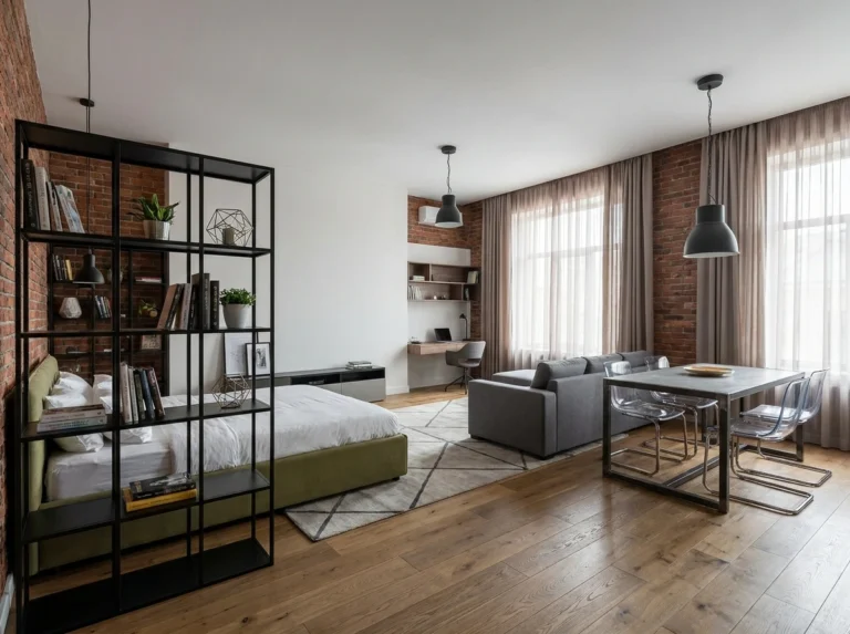
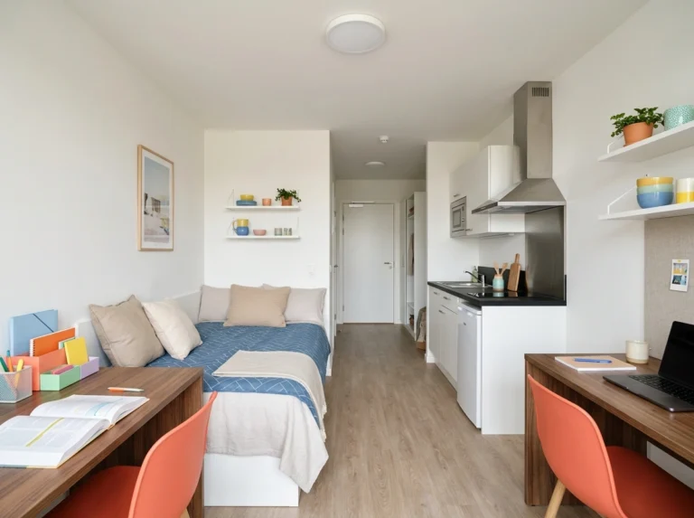
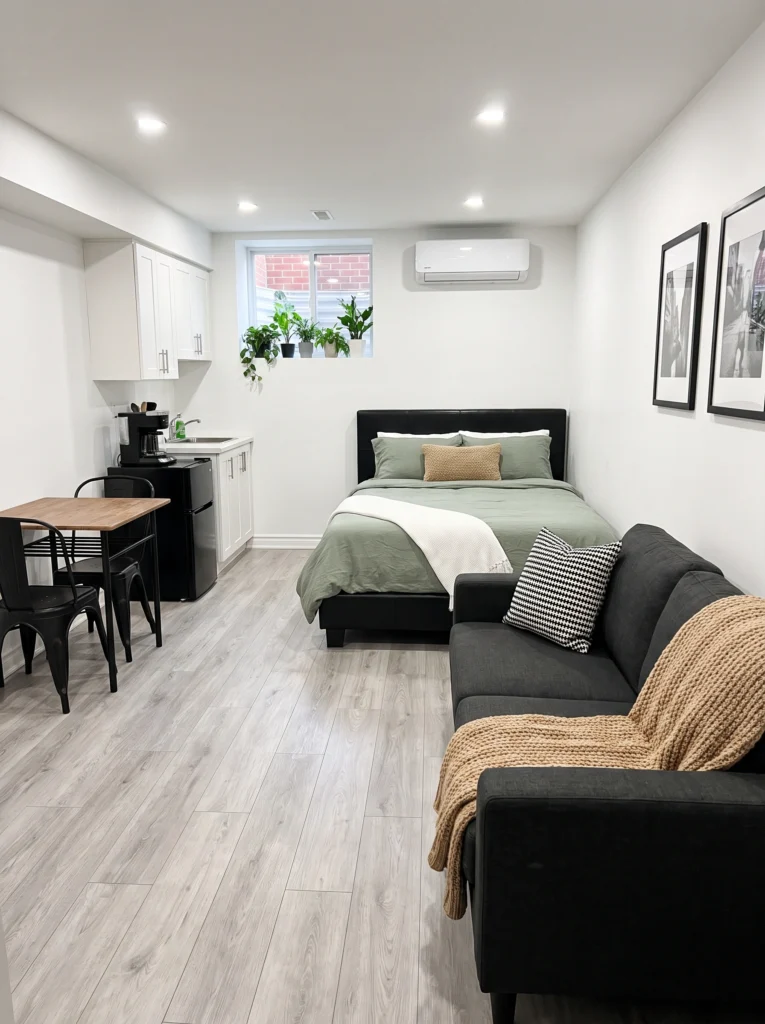
Mistake #6: Not Defining a Living Zone Separately From the Sleeping Zone
This is the mistake I see most often. People push the bed against one wall and the sofa against the other and call it done. But without a clear visual break, your bedroom is your living room, and neither feels like either. Even in a narrow space like this one, the living area is its own world — a rug, a coffee table, a bookshelf that fills the wall. The bedroom through the doorway feels like a separate room entirely. Define your zones and stick to them.
Pro tip: A bookshelf, a low console, or even a change in rug can act as a “wall” between zones — no construction required.
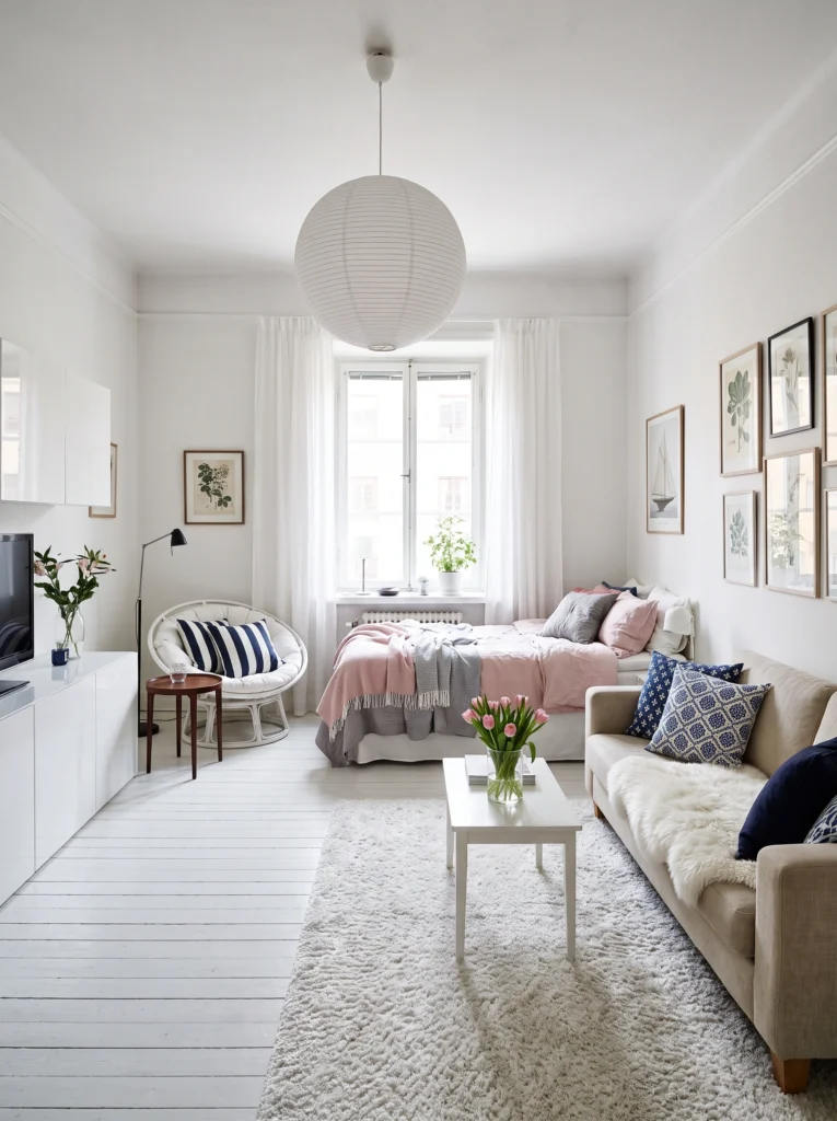
Mistake #7: Ignoring the Sofa-to-Bed Relationship
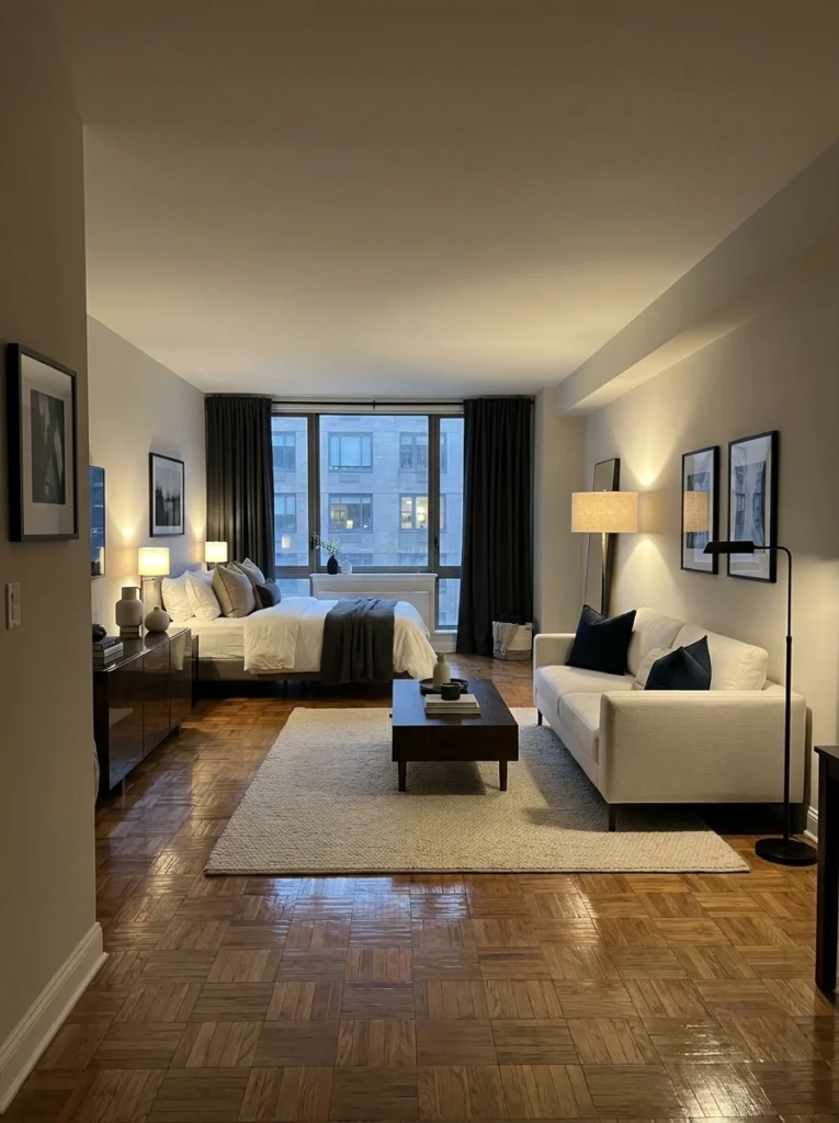
In a studio, your sofa and your bed are in a relationship whether you like it or not. How they face each other — or don’t — matters more than almost any other layout decision. Here, the sofa sits at a slight angle, creating its own living zone with a rug, coffee table, and floor lamp. The bed is behind it but feels completely separate. If your sofa is just floating with its back to your bed and no intention, that’s what’s making the room feel unresolved.
Mistake #8: Leaving the Walls Too Bare — Or Hanging Art Too High
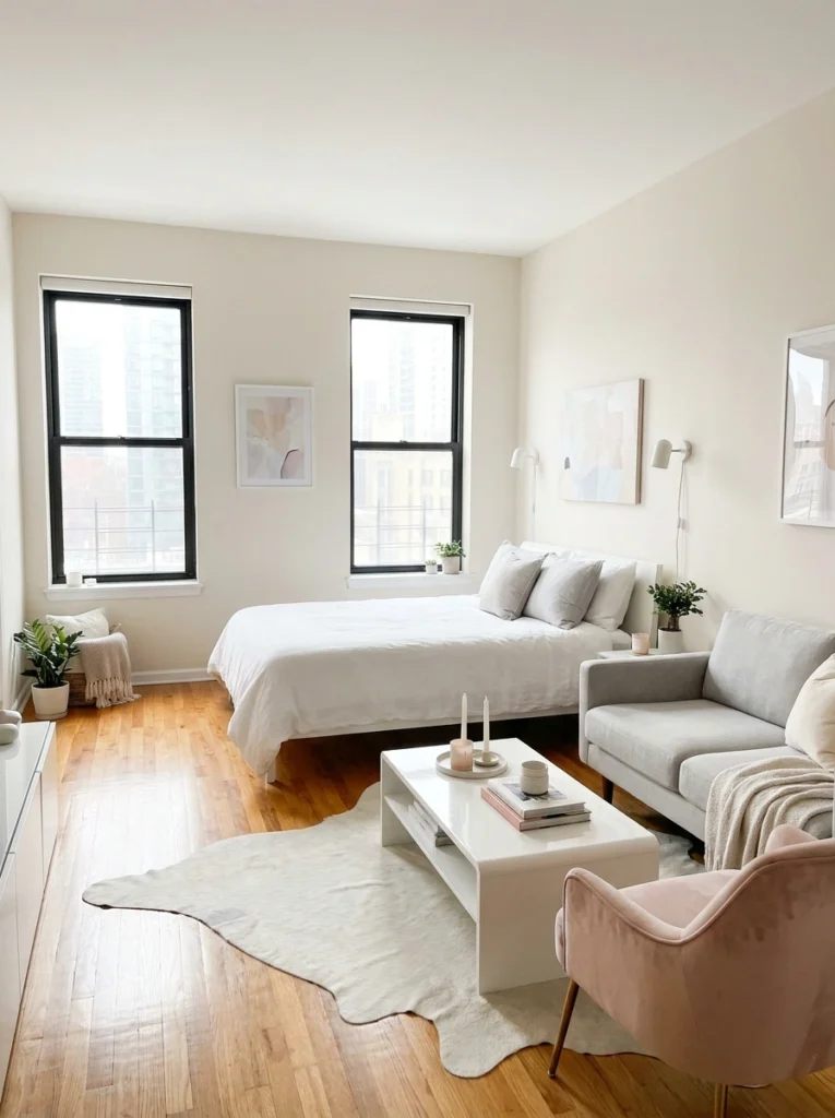
Blank walls in a studio feel like unfinished sentences. But there’s a second mistake people make when they do hang art: they hang it too high. Art should sit at eye level, not floating near the ceiling where no one looks. In this bright studio, the abstract pieces are hung just right — large enough to hold the wall, low enough to feel connected to the furniture below. Even one well-placed piece on the right wall makes the whole room feel considered.
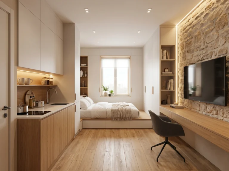
Mistake #9: Forgetting Vertical Space — The Most Wasted Real Estate in Any Studio
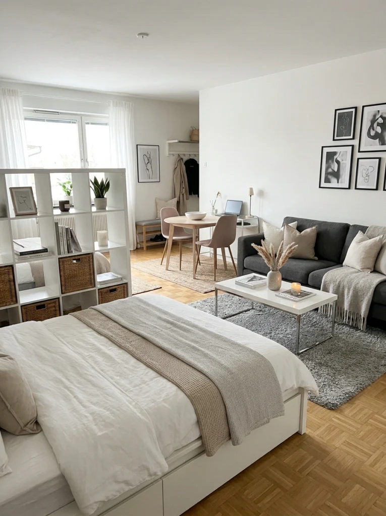
Floor space is precious. Vertical space is free — and almost nobody uses it. This studio does it beautifully: a floor-to-near-ceiling IKEA Kallax unit acts as both storage and a room divider between the sleeping and living zones. A gallery wall fills the space above the sofa. Hooks and shelves near the entry handle coats and bags. When you stop thinking about your apartment as a horizontal problem and start treating the walls as usable space, everything opens up.
Final Thoughts
Studio living isn’t a compromise — it’s a puzzle, and once you crack it, it’s genuinely satisfying. Most of these mistakes come down to the same root issue: treating the space like a regular apartment with the furniture just pushed closer together. It’s not. It needs its own logic.
Pick one mistake from this list that feels the most familiar. Just one. Rearrange, reposition, or add one element that addresses it. You’ll feel the shift almost immediately.
A well-arranged studio doesn’t feel small — it feels intentional. And intentional always feels good.
Happy decorating, Sofia