What Colors Make a Studio Apartment Look Bigger: 11 Designer-Approved Palettes
You know that tight, closed-in feeling when every wall seems like it’s creeping toward you? In a studio apartment, color is the fastest way to push those walls back — no renovation, no sledgehammer, just the right palette. The trick isn’t always “paint everything white.” It’s about choosing colors that play with light, depth, and contrast in smart ways. Here are 11 palettes that actually make small spaces feel bigger.
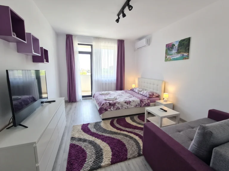
1. Soft Blue Accent Wall with Lavender
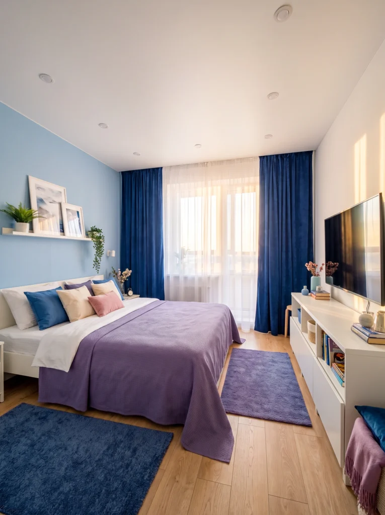
A light blue accent wall does something almost sneaky — it recedes visually, which makes the room feel deeper than it is. Pair it with lavender bedding and navy curtains for a cool-toned palette that reads calm and spacious. Keep the remaining walls white and your furniture light so the blue becomes a backdrop, not a boundary. This palette works especially well in rooms with good natural light.
Pro tip: Stick to one blue-toned accent wall max. Painting all four walls blue in a studio will shrink the space instead of opening it up.
2. All-White with Powder Blue Accents
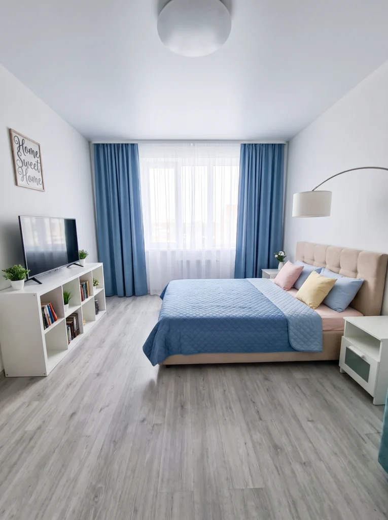
Here’s the classic approach done right. An all-white room is the fastest way to bounce light around a small space, but it needs a color anchor or it’ll feel like a waiting room. Powder blue bedding, soft curtains, and a couple of pastel pillows give the eye something to land on without adding visual weight. The light grey floor keeps things airy from top to bottom.
Sofia’s honest take: All-white studios can feel cold fast. A warm-toned lamp or a linen throw in oatmeal fixes that in seconds.
3. White Base with Emerald and Blush Pops
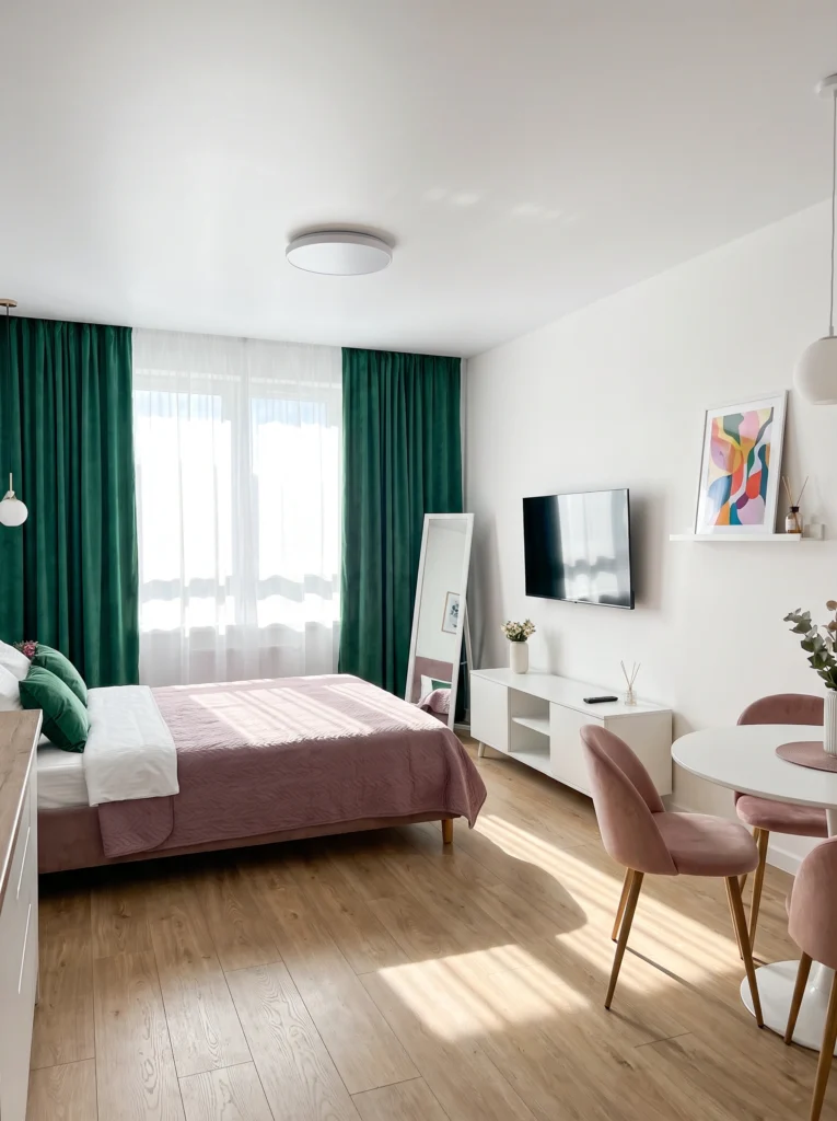
White walls are doing the heavy lifting here, reflecting every bit of natural light streaming through those emerald curtains. The boldness works because the saturated colors appear only in soft furnishings — curtains, bedding, chairs — not on the walls themselves. That’s the secret: keep your permanent surfaces neutral and let your accent pieces carry the personality. The room feels open and vibrant at the same time.
Renter-friendly alternative: Can’t commit to emerald curtains? Start with blush velvet dining chairs — they add color without overwhelming the room.
4. Warm Blush and Soft Grey
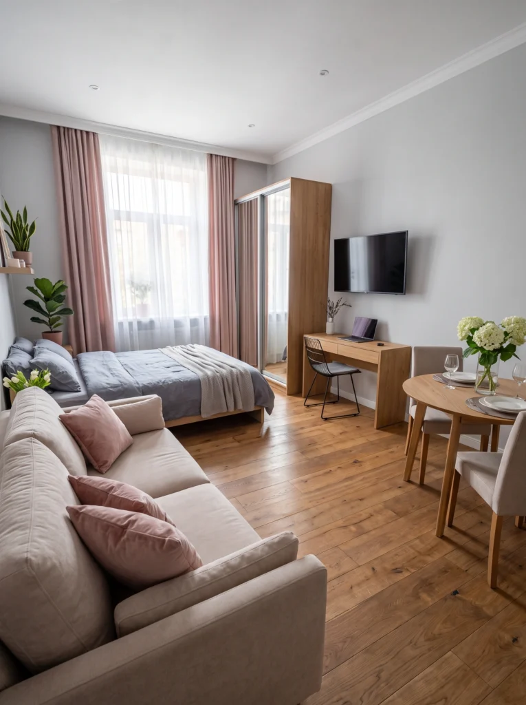
This palette proves that warm neutrals can open up a space just as effectively as cool ones. Blush curtains soften the window wall, while grey bedding keeps the sleeping zone from competing with the living area. The warm oak floors and wood furniture tie it all together without darkening anything. It’s a tonal approach — everything whispers in the same soft voice, and the room breathes because nothing fights for attention.
My tip: In a warm-toned studio, match your curtain color to your throw pillows. It creates flow and makes the space read as one cohesive room instead of choppy zones.
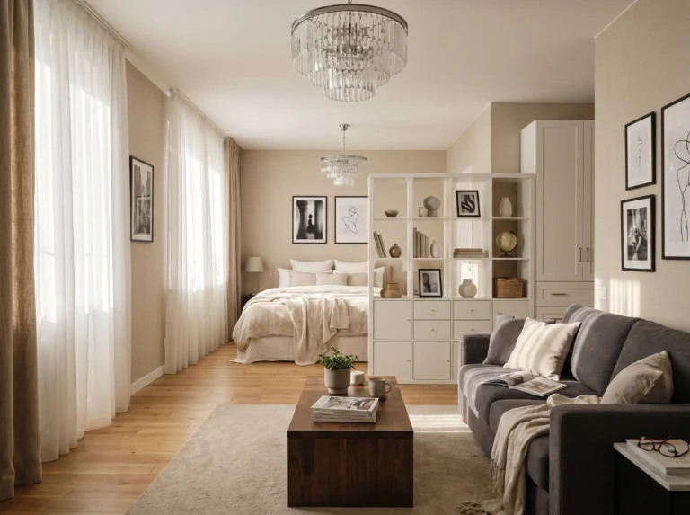
5. Warm Cream with Dusty Rose
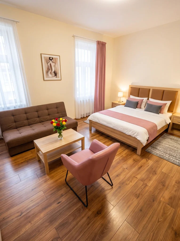
Cream walls are underrated for small spaces. They have all the openness of white but with a warmth that makes the room feel instantly livable. Adding dusty rose through a curtain panel, an accent chair, and bedding details brings softness without shrinking the space. The brown futon and wood tones ground the palette so it doesn’t drift into “too sweet” territory. This one feels grown-up and spacious at the same time.
Budget vs. splurge: Save on the futon — a basic tufted model works fine. Splurge on one good accent chair in a color you love. It anchors the whole room.
6. Bold Green and Orange
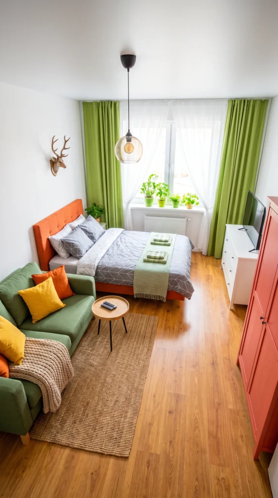
This is for anyone who thinks “making a room look bigger” means beige everything. It doesn’t. Bold, saturated colors work if you balance them with white walls and natural textures. The green and orange pop against the white ceiling and walls, and the jute rug adds warmth without closing things in. The trick is confidence — commit to the palette instead of scattering random colors everywhere.
I’ve tested this: Bold curtains in a small room sound risky, but when they match your sofa, the eye reads them as one continuous element. That continuity actually makes the room feel longer.
7. Warm Monochrome: Tan and Caramel
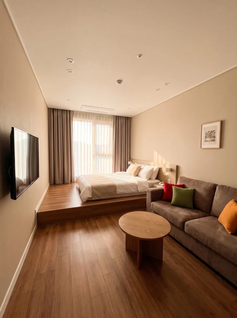
Going monochrome in warm tones creates a cocoon effect that’s both cozy and surprisingly spacious. When the walls, curtains, floor, and furniture all live in the same tan-to-caramel range, borders between surfaces blur and the room feels continuous. The raised platform bed adds dimension without needing a room divider. A few pops of red, green, and orange in the pillows keep it from feeling flat.
Sofia’s honest take: Monochrome doesn’t mean boring. It means everything agrees, and that visual harmony is what tricks the eye into seeing more space.
8. Crisp White with Navy and Natural Wood
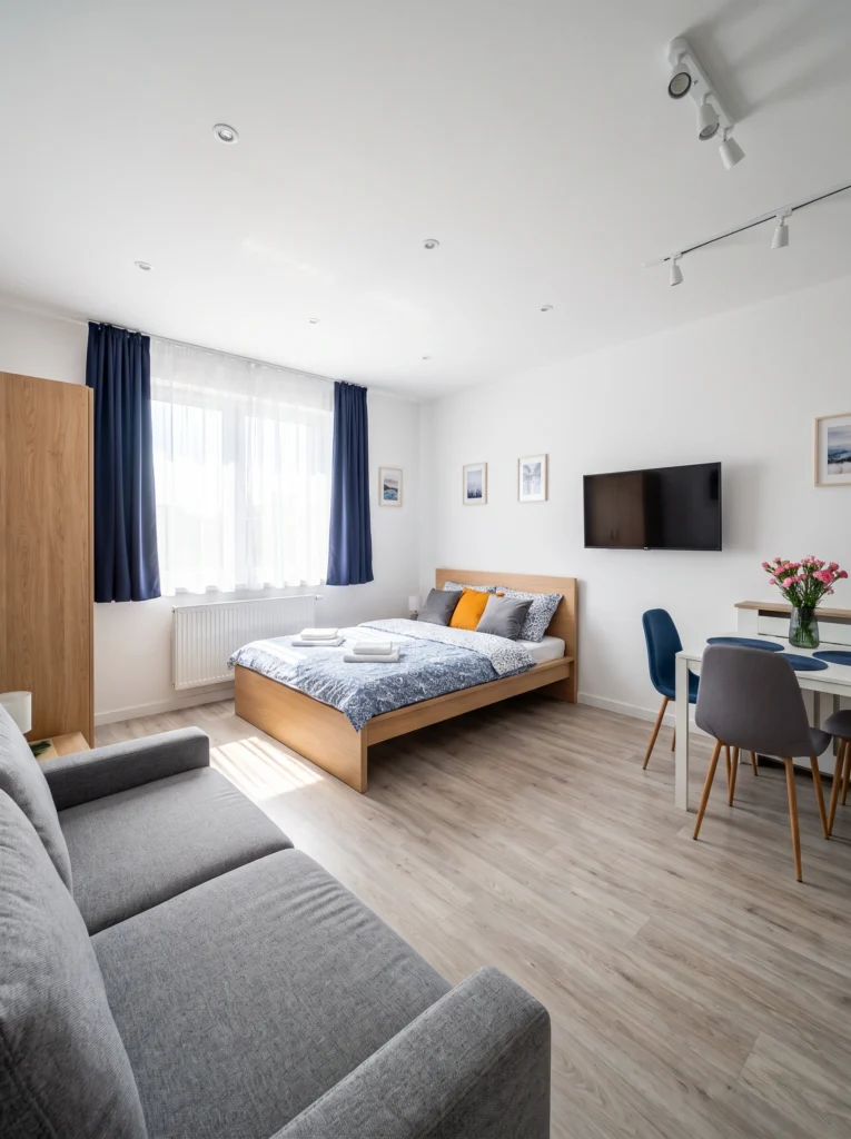
This is the Scandinavian-inspired approach that works in practically every studio. White walls and light flooring maximize brightness, while navy curtains add depth at the window without pulling the walls inward. Natural oak furniture — the bed frame, wardrobe, dining table — brings warmth that white alone can’t deliver. The result is a room that feels clean, organized, and twice its actual size.
My favorite: Track lighting in a studio is a smart move. It lets you direct light exactly where you need it instead of relying on one sad overhead fixture.
9. Dusty Blue with Rich Brown
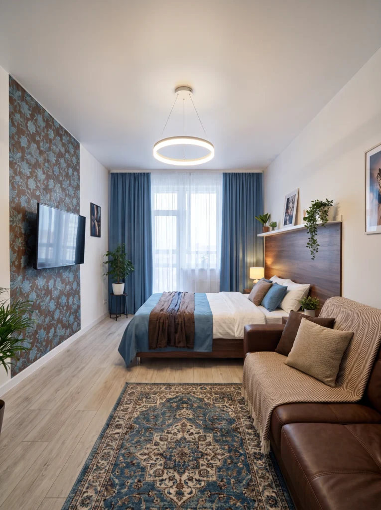
This palette has more going on, but it works because the colors are tonal — dusty blue and warm brown belong to the same visual family. The wallpaper accent wall adds pattern without overwhelming because it’s confined to one surface. Layered textiles in matching tones on the bed, sofa, and floor create depth that makes the room feel intentional and rich rather than cramped. The ring pendant light draws the eye up, adding vertical space.
Pro tip: A patterned accent wall works in small spaces only if the other walls stay plain. One bold surface plus three quiet ones equals breathing room.
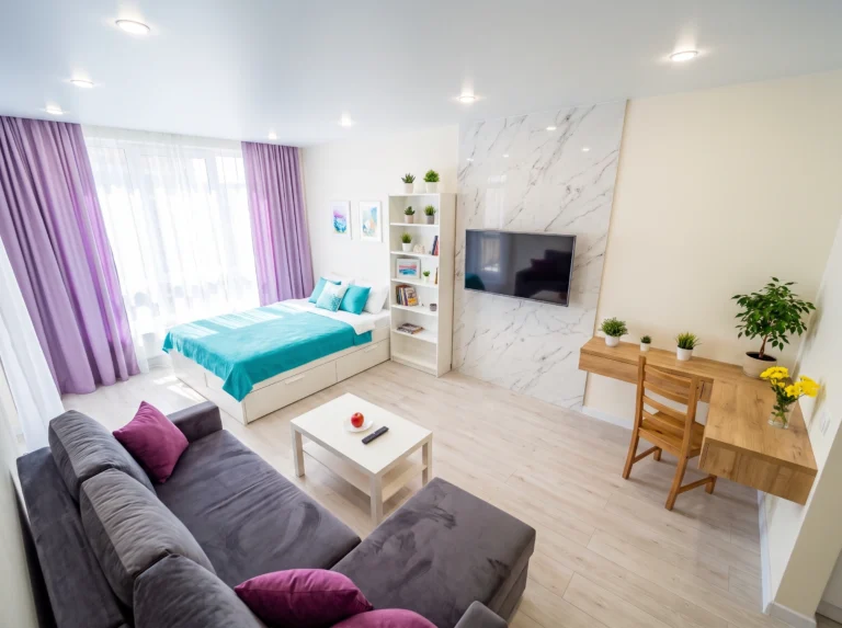
10. Coastal Turquoise and White
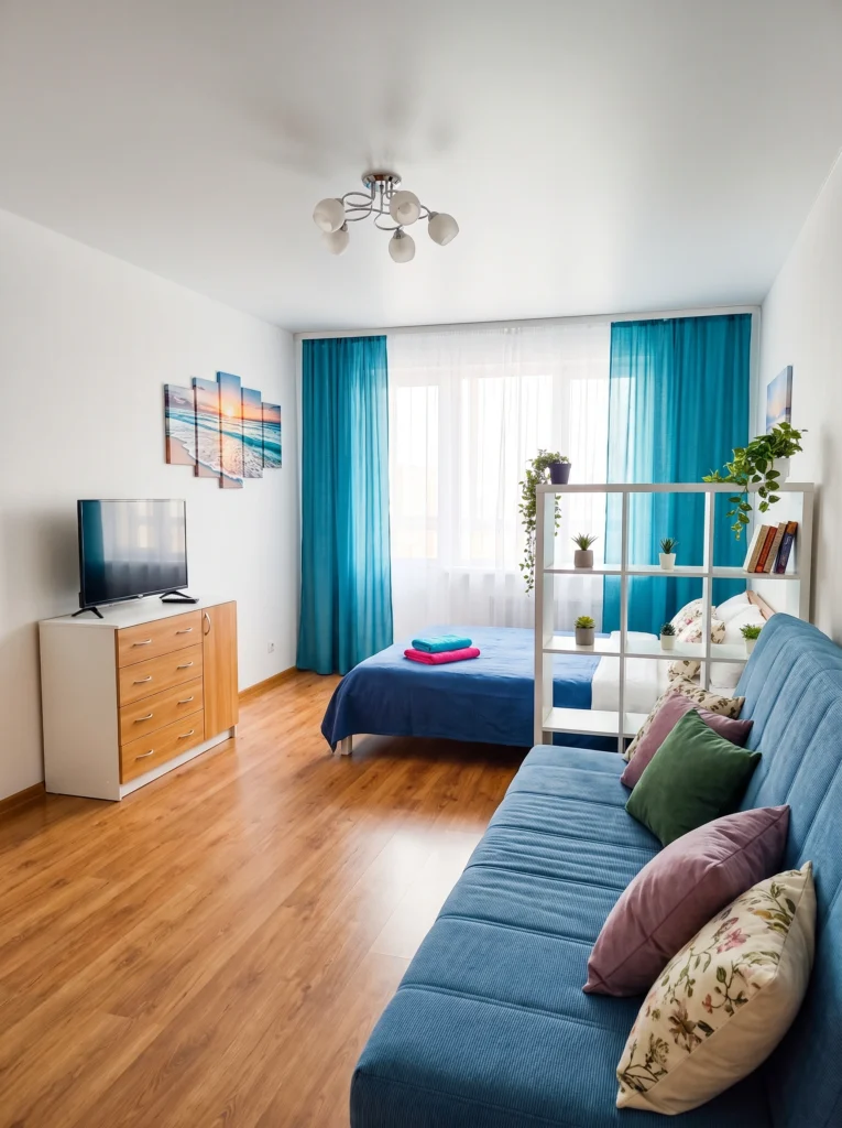
Turquoise is one of those colors that feels simultaneously bold and airy — it carries the openness of the ocean and sky. Paired with white walls and a white shelf divider, this palette keeps the studio bright while giving it a strong identity. The shelf does double duty as a room divider and display surface, and because it’s open, light passes right through. Beach-inspired art ties the theme together without overdoing it.
Don’t waste your money on: Solid room dividers in a studio. An open shelving unit like a Kallax lets light and sightlines flow through while still creating zones.
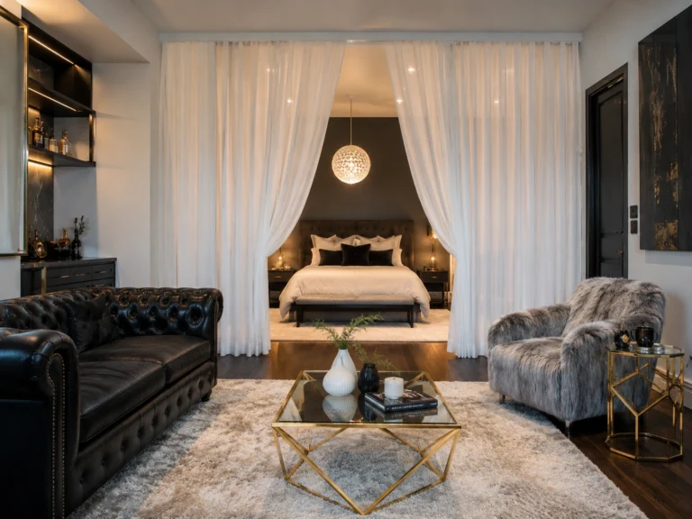
11. Black, White, and Grey Monochrome
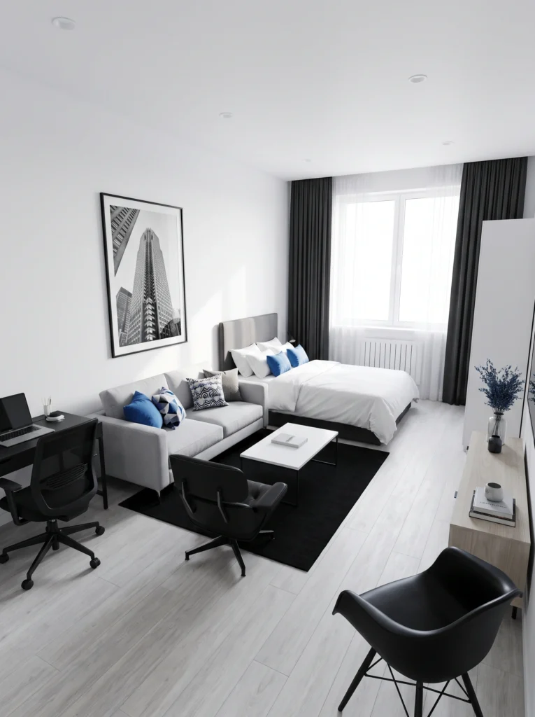
You’d think a dark palette would shrink a room, but this monochrome approach works because the contrast is sharp and deliberate. White bedding and light floors reflect light, while the black rug and desk anchor specific zones — giving the space structure without walls. The large-scale black-and-white art draws the eye up and adds drama. A few blue accent pillows break the monochrome just enough to keep it from feeling sterile.
Renter-friendly alternative: Can’t paint or hang heavy art? A large-format framed print leaned against the wall creates the same impact with zero holes.
Final Thoughts
Color is the most powerful (and cheapest) decorating tool you have in a studio apartment. You don’t need to paint every wall or buy new furniture — sometimes it’s as simple as swapping your curtains, adding the right throw, or choosing bedding that works with your floors instead of against them. The palettes that make a studio feel bigger all share one thing: they create flow instead of friction. Pick colors that talk to each other, keep your biggest surfaces light, and let your accent pieces do the talking.
The right color palette won’t add square footage to your studio — but it’ll make you forget you ever needed it.