15 Visual Tricks Interior Designers Use to Make Small Studios Look Bigger
Small studios get a bad reputation. People assume they’re cramped, dim, and impossible to make beautiful — but the truth is, the best interior designers in the world have been making tiny spaces feel huge for decades. They just don’t tell you the tricks. Here’s the thing: most of these moves cost almost nothing, and a few of them you can pull off this weekend. Below are 15 of my favorites, pulled from real studios that actually live well.
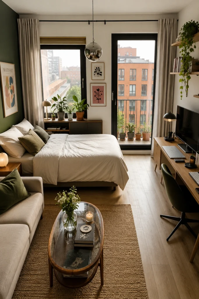
1. Use Bold Color in Tall Vertical Stripes
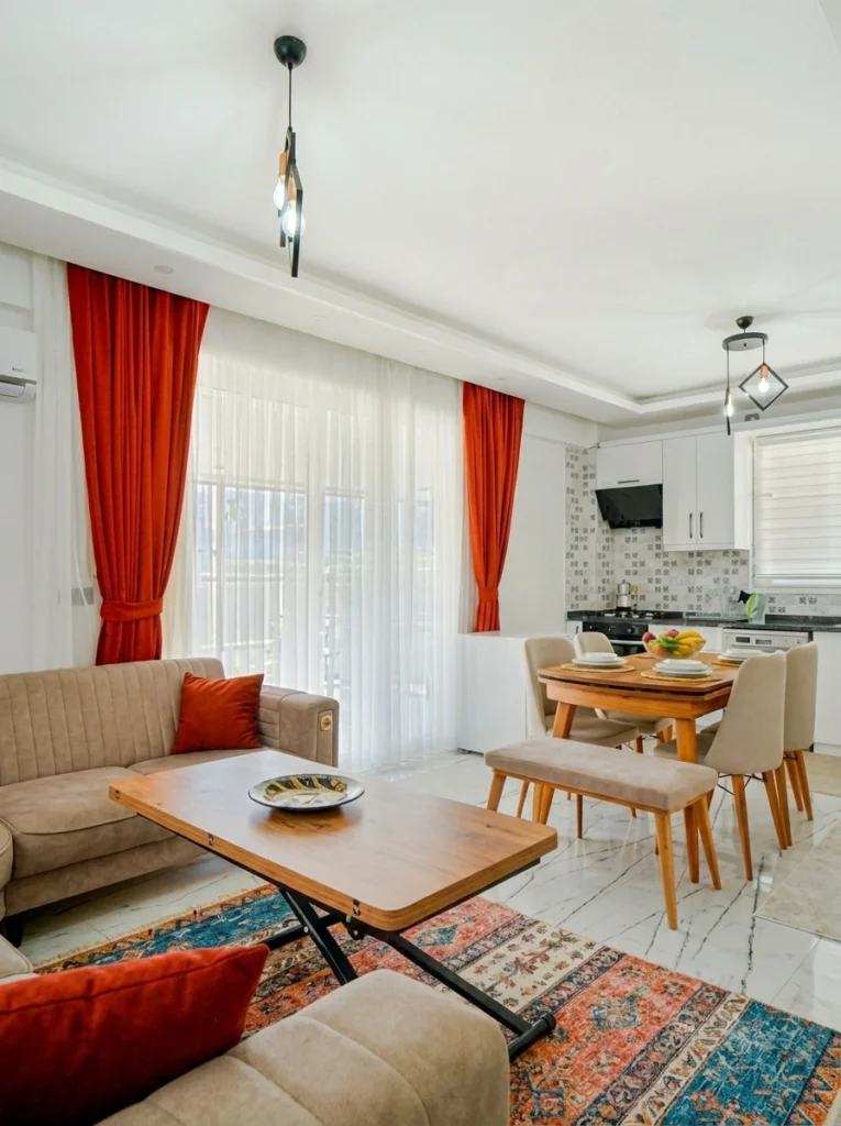
I know — bold color feels counterintuitive in a small space. But look at those tall red curtains. They aren’t shrinking the room; they’re stretching it upward. The secret is verticality. Hanging long curtains high (well above the actual window frame) and letting them puddle slightly at the floor tricks your eye into reading the wall as taller than it is. The room instantly feels grander.
Pair the boldness with crisp whites and one colorful rug for grounding, and suddenly your studio reads as designed — not just decorated.
2. Lean Into Floor-to-Ceiling Sheer Curtains
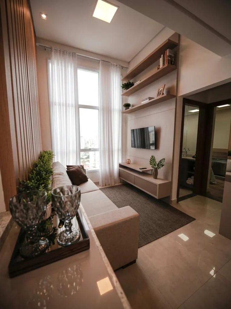
If your studio is on the narrow side, sheer curtains running floor-to-ceiling are your best friend. They filter light beautifully, soften the architecture, and — most importantly — pull your eye upward. Pair them with vertical wood slats like you see here, and the entire room reads as twice as tall as it really is.
Pro tip: Skip blackout panels in tight spaces. They feel heavy and absorb light. A layered combo of sheer plus a thin linen panel gives privacy without weight, and the room never feels closed in.
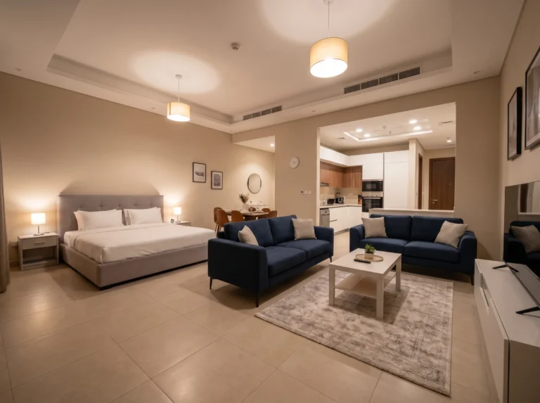
3. Hang a Cluster of Exposed Bulbs at Different Heights
A single ceiling fixture is the most common lighting mistake in a small studio — it flattens the whole room into one even, boring layer of light. A cluster of bulbs at staggered heights, on the other hand, does something magical: it creates depth your eye reads as space. Warm Edison bulbs give that golden, restaurant-at-night glow without costing much.
My tip: Aim for three to five bulbs, hung at different drops. The varied heights are what makes it work. One bulb hung alone always looks like an afterthought; a cluster looks intentional.
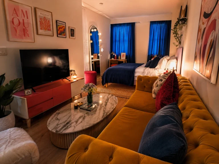
4. Combine an Accent Wall With Statement Pendants
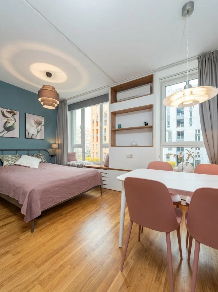
One painted wall — just one — is one of the cheapest tricks in the book. It anchors the sleeping zone without needing a divider, and it gives a small studio actual character instead of beige sameness. Add two statement pendants (one over the bed area, one over the dining spot) and suddenly your studio has two clear rooms even though it’s still technically one.
Pick deep, saturated colors over pastels for accent walls in small spaces. Pastels can feel washed out; rich tones add depth.
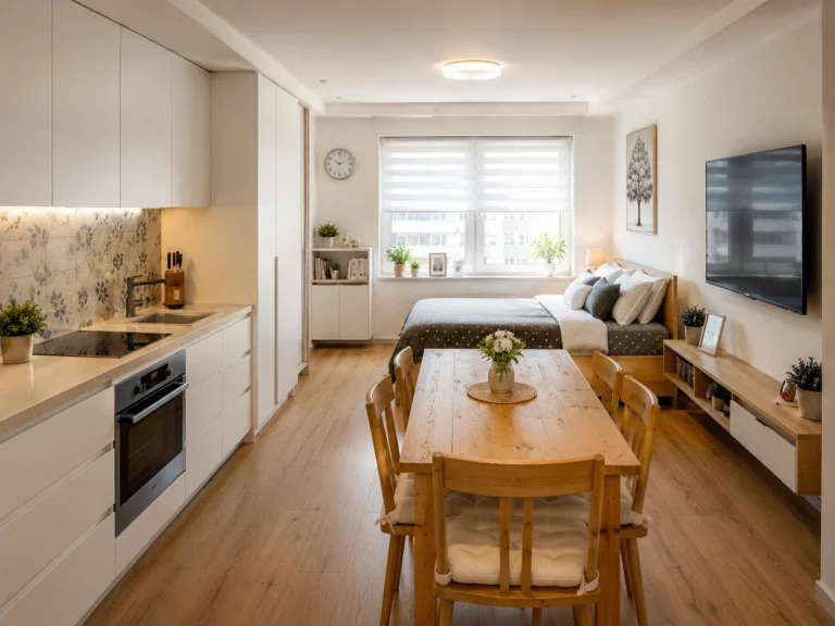
5. Layer Recessed and Cove Lighting
This is the move most people skip — and it’s exactly why their studio feels flat. Recessed lights alone give you that office-building vibe nobody wants. But add a strip of cove lighting (those LED strips tucked into a ceiling tray) and the whole room softens. The indirect glow bounces off the ceiling and makes it feel taller.
Renter-friendly alternative: You don’t need to rebuild your ceiling. Stick-on LED strips tucked behind a curtain rod or above a tall shelf give a similar effect for under $30. Trust me on this one.
6. Use Two Symmetrical Lamps Instead of One Big Light
Symmetry is shorthand for calm. In a tight room, two matching lamps placed evenly — on bedside tables, on a console, flanking a sofa — make the space feel intentional and balanced instead of cramped. The matching lamps also serve a quiet visual purpose: they pull your eye outward instead of toward a single bright source.
My tip: Lampshades matter more than the lamp base in small rooms. Linen or paper shades diffuse light gently. Glass or plastic shades create harsh hot spots that magnify how tight a room feels.
7. Add a Full-Wall Mirror to Double the Space
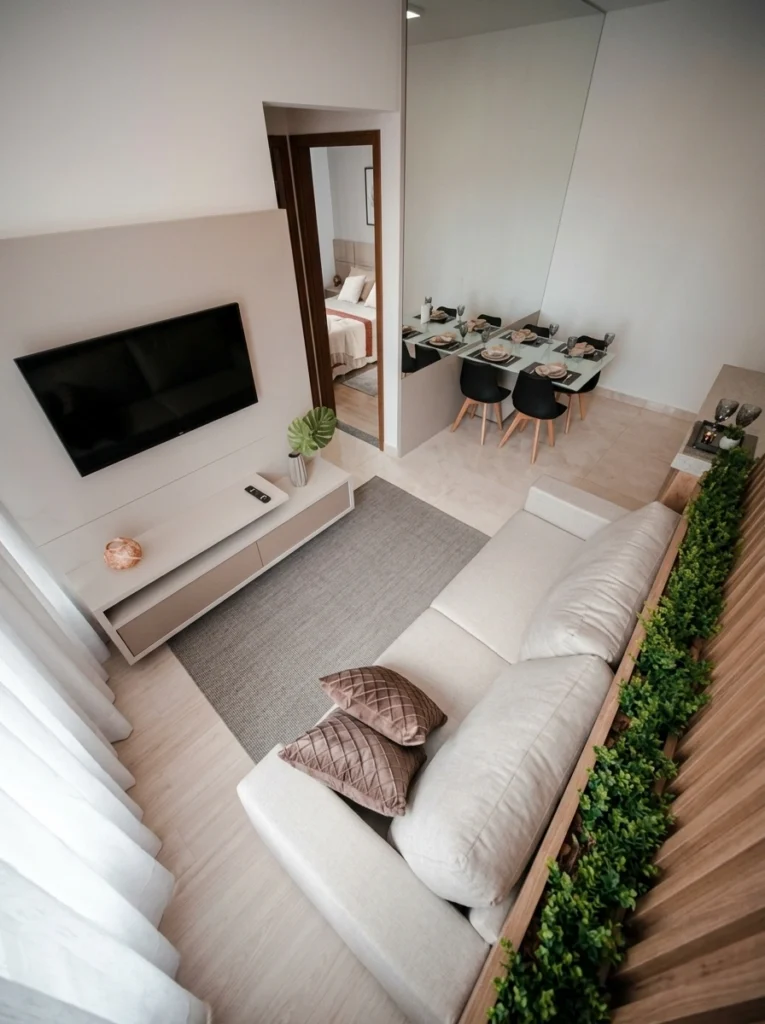
This is the single most effective trick on the entire list. A full-wall mirror genuinely doubles a small studio — not metaphorically, visually. Place it perpendicular to your main light source (a window, ideally) and the reflection multiplies daylight throughout the space. Look at this photo: the mirror creates a phantom dining room that gives the eye somewhere to travel.
Pro tip from someone who learned the hard way: Don’t put a mirror opposite the bed. It works in dining and living zones; in bedrooms it can feel disorienting at night. Save it for shared areas.
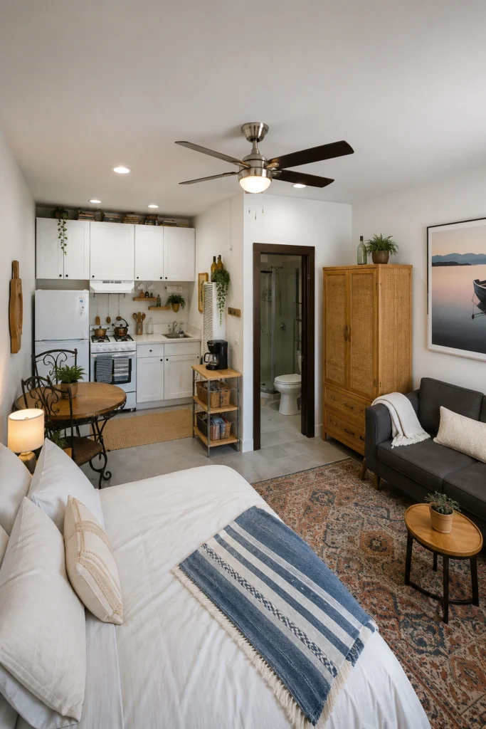
8. Carve Out a Sitting Zone Beside the Bed
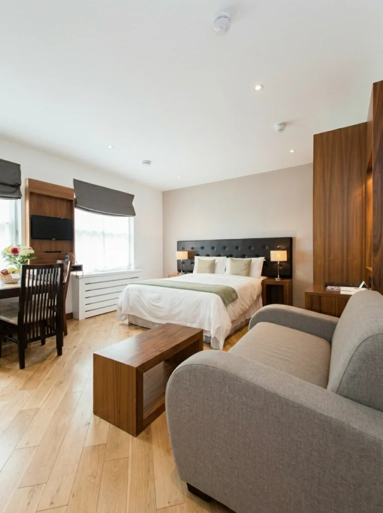
A studio that’s just a bedroom feels like a dorm. A studio with a clearly carved-out sitting zone feels like an apartment. Even a single armchair and a small coffee table is enough — it signals to your brain that you have somewhere other than the bed to land. The trick is keeping the sitting piece compact: an armchair with slim legs, not a chunky loveseat.
A reading chair is the single most underrated piece of furniture in a small studio. It makes the whole space feel like a real home.
9. Anchor the Room With an Arc Floor Lamp
An arc lamp is the cheat code for studios without a ceiling fixture over the sofa. The long, curving arm reaches over the seating area exactly where a pendant would go — without the drilling, the wiring, or the landlord drama. The bonus? Arc lamps create a strong vertical line that pulls the eye up to the ceiling and makes the whole room feel taller.
Renter-friendly alternative: IKEA’s REGOLIT arc lamp is under $50 and looks like it costs ten times that. It’s the first thing I’d buy for a new studio.
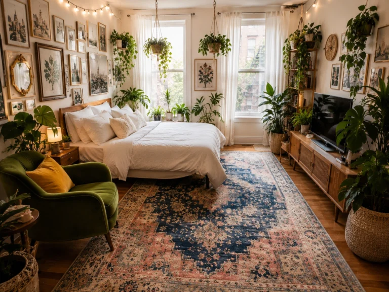
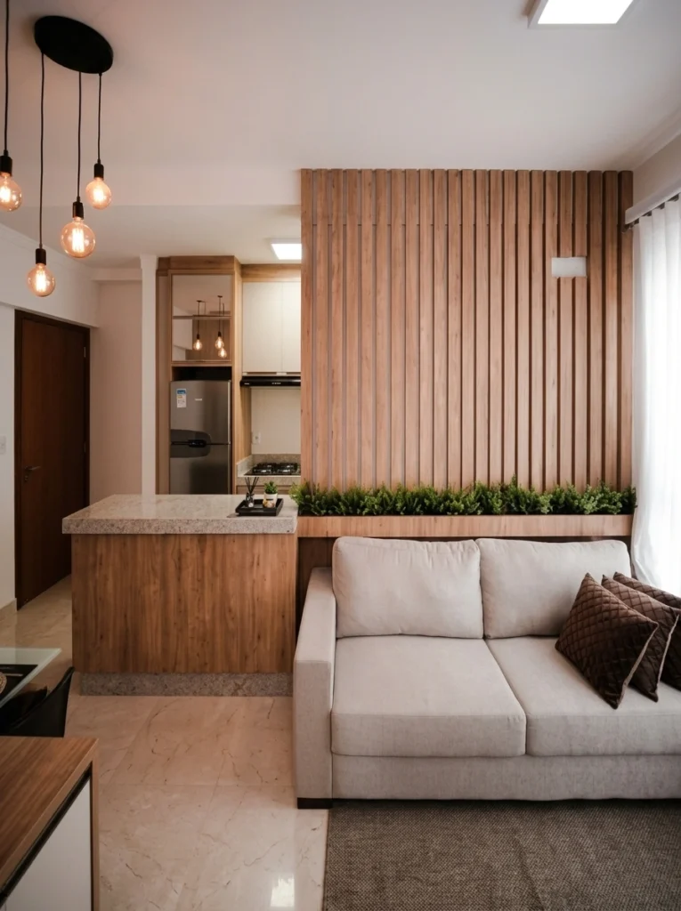
10. Pile on the Plants — But Keep Them Vertical
Plants make a small space feel alive. But the mistake people make is spreading them horizontally across every surface, which actually eats floor space and visually clutters the room. Instead, stack them vertically: a tall shelf with trailing plants, plants lined up on the windowsill, one floor plant in a corner. Your eye reads the green as a column instead of a mess.
My tip: Trailing plants like pothos and ivy do the heaviest lifting. They draw the eye downward in long ribbons of green that soften every hard edge in the room.
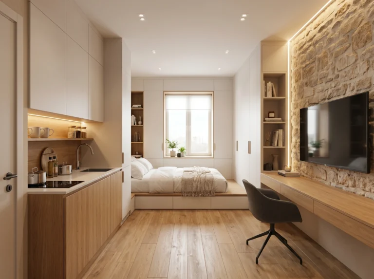
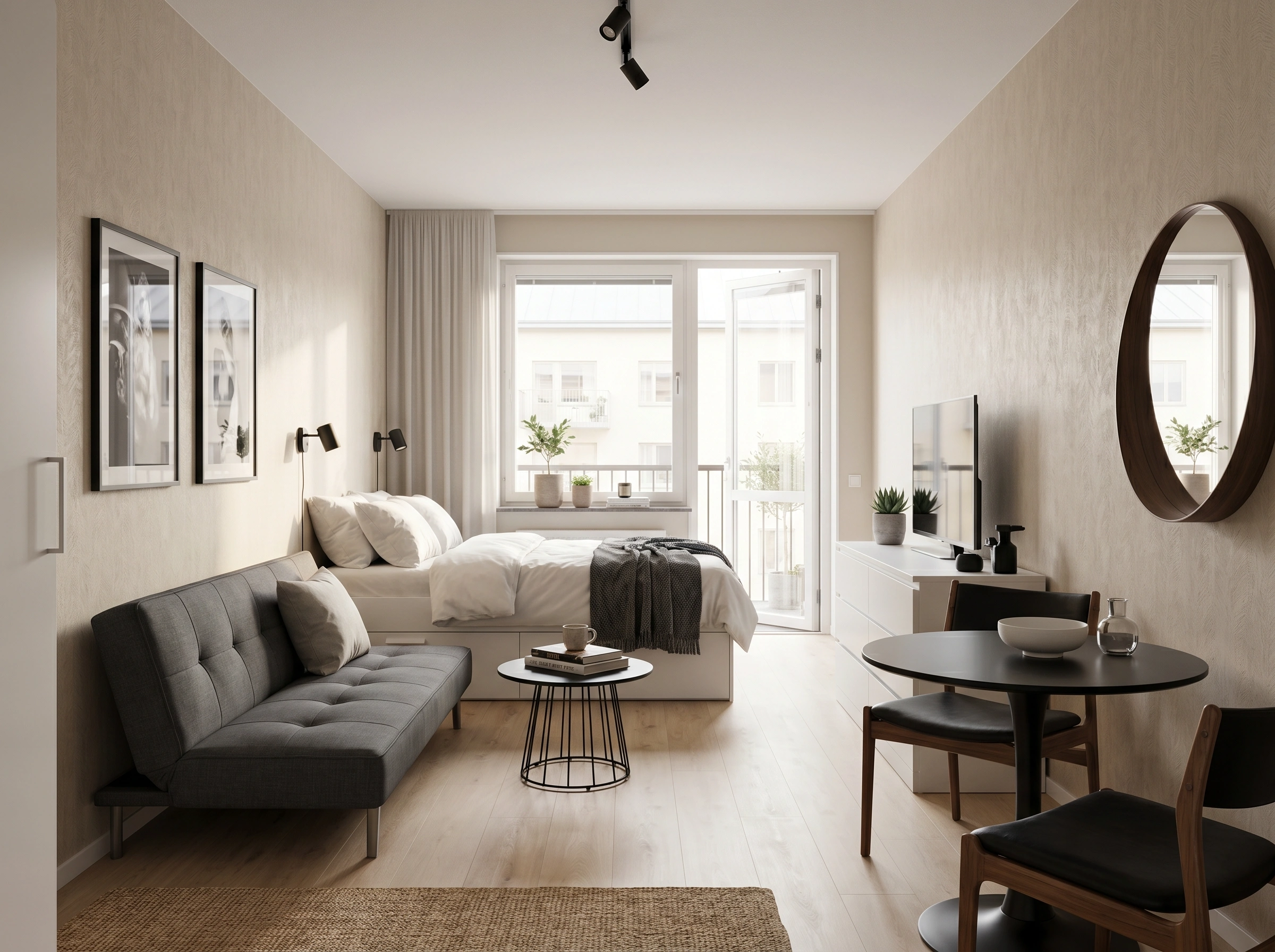
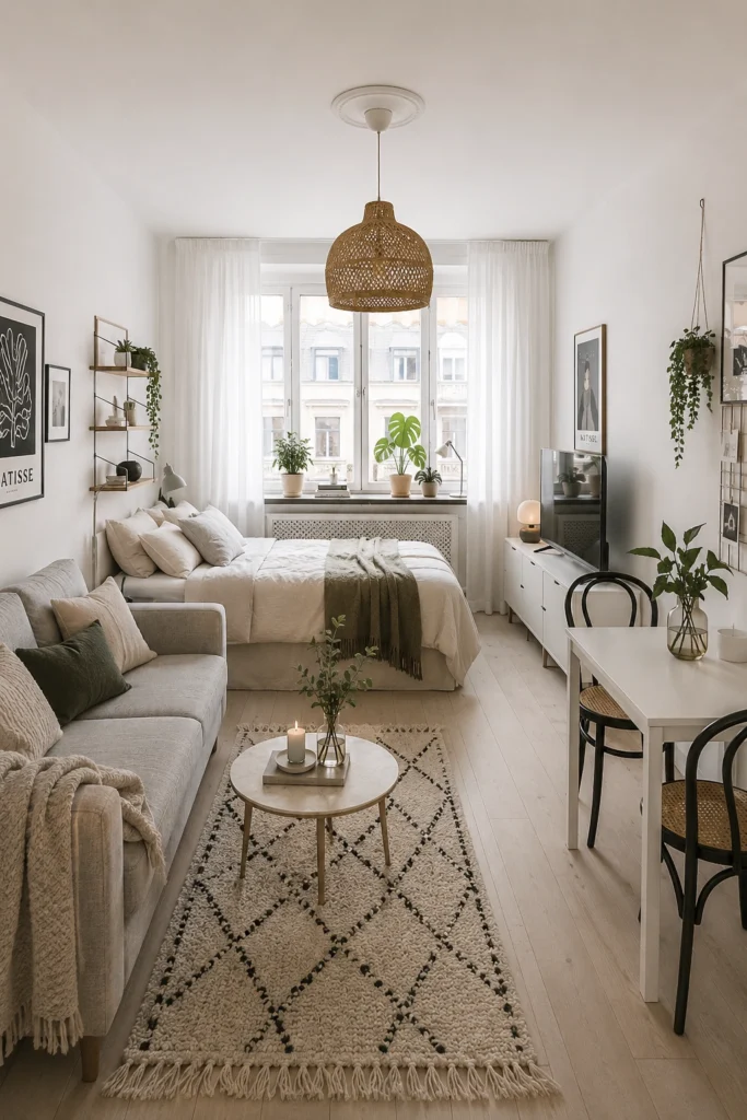
11. Stick to a Tight, Neutral Palette
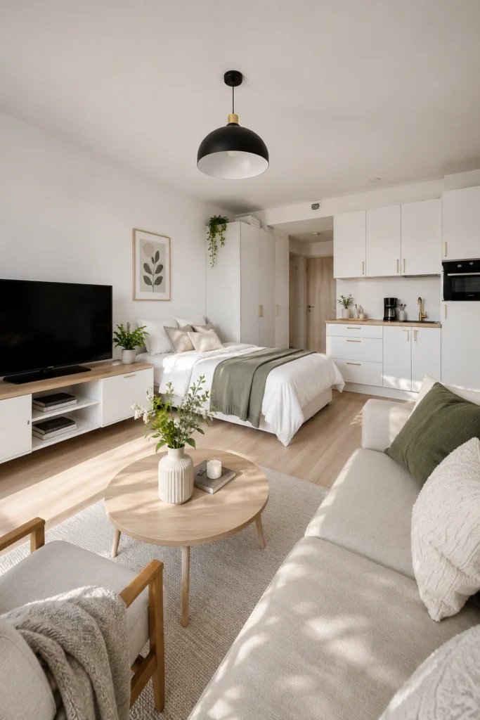
When the entire room shares the same palette — warm whites, light wood, one accent color — it reads as bigger. The eye isn’t constantly stopping to process new colors, so the space feels continuous and calm. Notice how this studio uses sage green as the only accent, repeated three or four times. That repetition is doing the work.
Pick three colors and stick to them ruthlessly. Most cluttered-looking studios aren’t actually cluttered — they just have too many competing colors trying to be the star at once.
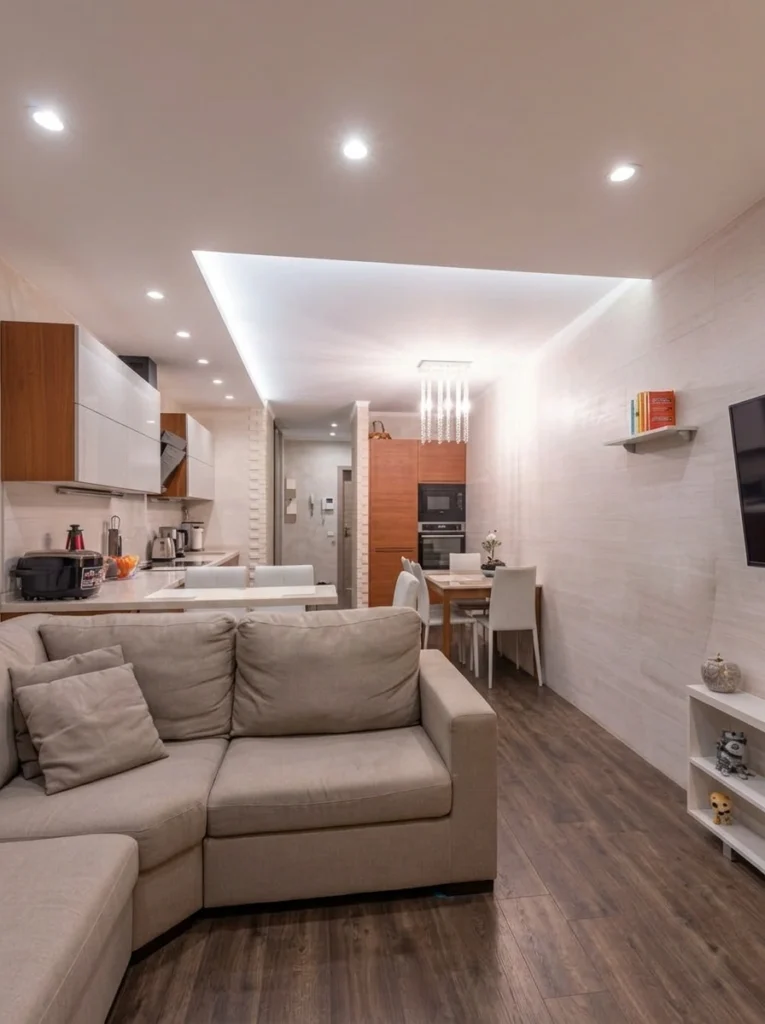
12. Use a Real Rug to Define Zones in One Room
In a studio, rugs do something walls can’t — they create rooms without taking up an inch of space. A real, intentional rug under the sofa area says “this is the living room.” Another under the dining set says “this is where we eat.” Suddenly your one room reads as three.
Pro tip: Go bigger than feels comfortable. The most common rug mistake is buying one too small — it makes the whole zone look stranded. The front legs of your sofa should sit firmly on the rug, not float in front of it.
13. Mix Bold Pattern With Pops of Saturated Color
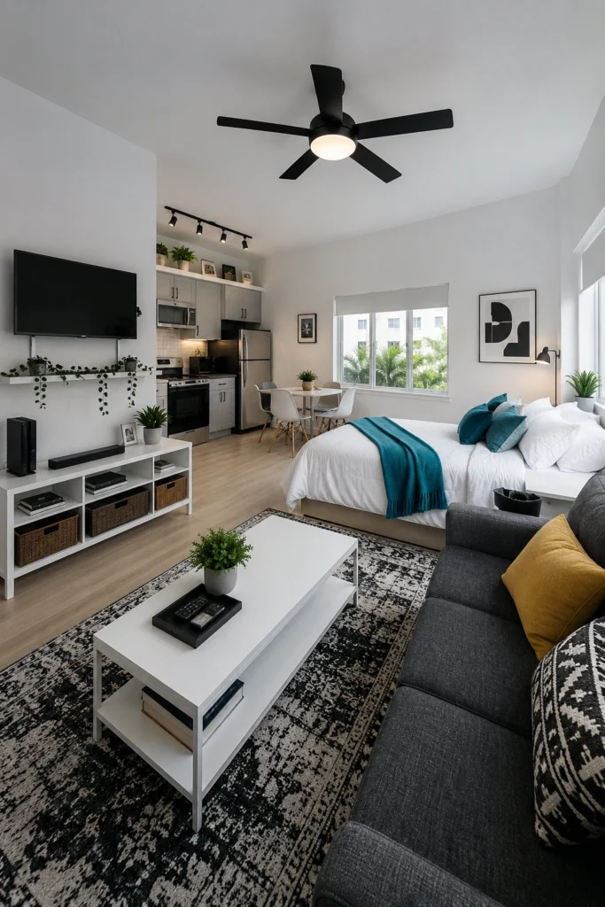
Tight spaces often feel under-decorated and overwhelming at the same time — too plain on the surfaces and too cluttered in the corners. A patterned rug plus two saturated accent colors (here, teal and mustard) fixes both problems at once. The pattern adds visual interest without adding objects, and the saturated pops give your eye specific places to land instead of wandering anxiously around the room.
My tip: Pull your accent colors from the rug itself. If you copy two colors already in the pattern and repeat them in pillows and throws, the whole room locks together effortlessly.
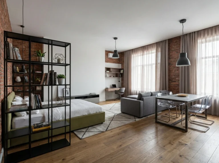
14. Let Furniture Pull Double Duty as a Divider
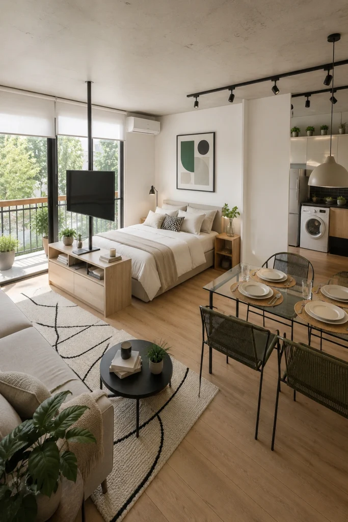
A TV mounted on a low console that separates the bed from the sofa is one of the cleverest moves in modern studio design. The piece works as storage, entertainment center, and a room divider — all without sacrificing the open, airy feel that a full wall would absolutely kill. The genius detail is the swivel mount: you can watch comfortably from either side.
Half-walls and dividers make studios feel smaller. Furniture-as-divider keeps the openness while still giving your brain that satisfying “two-room” cue. It’s the best of both.
15. Let Negative Space Breathe
Negative space — the empty parts of the room — is what makes everything else look intentional. Cram a small studio full and even beautiful pieces start to feel like clutter that you have to apologize for. Leave breathing room and those same pieces suddenly look curated. Notice how this room has plenty of stuff (plants, a sofa, art, a dining set) but never feels packed. The floor has visible space. The walls have pauses.
Pro tip: If you can’t decide between two decor items, buy neither. Restraint is what separates designed from decorated.
Final Thoughts
A small studio isn’t a design limitation — it’s a design challenge, and challenges are where the most interesting homes get made. Every single trick on this list comes back to the same three ideas: pull the eye up, give it somewhere to travel, and don’t fight the size. Work with what you have and your studio will start to feel less like a compromise and more like a tiny, intentional world.
Pick one trick. Try it this weekend. The first one always feels like the biggest change — after that, the rest happen naturally.
Your studio doesn’t need to be bigger. It just needs to feel like it was made for you.
— Sofia