How to Fit Everything Into a 200 Sq Ft Studio Apartment
Two hundred square feet sounds impossible until you actually live in it — and then you realize the problem isn’t the size. It’s the layout. Most tiny studios fail because they’re treated like one cramped room instead of three small ones working together. Here’s the thing: a well-planned 200 sq ft studio can feel calm, complete, and weirdly spacious. I’ve toured a lot of them, and these thirteen layouts get it right.
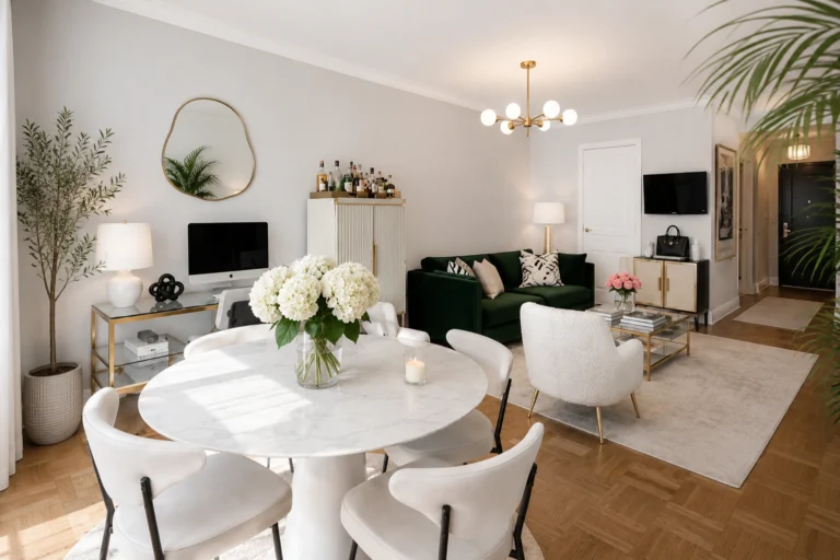
1. Hide the Kitchen, Don’t Highlight It
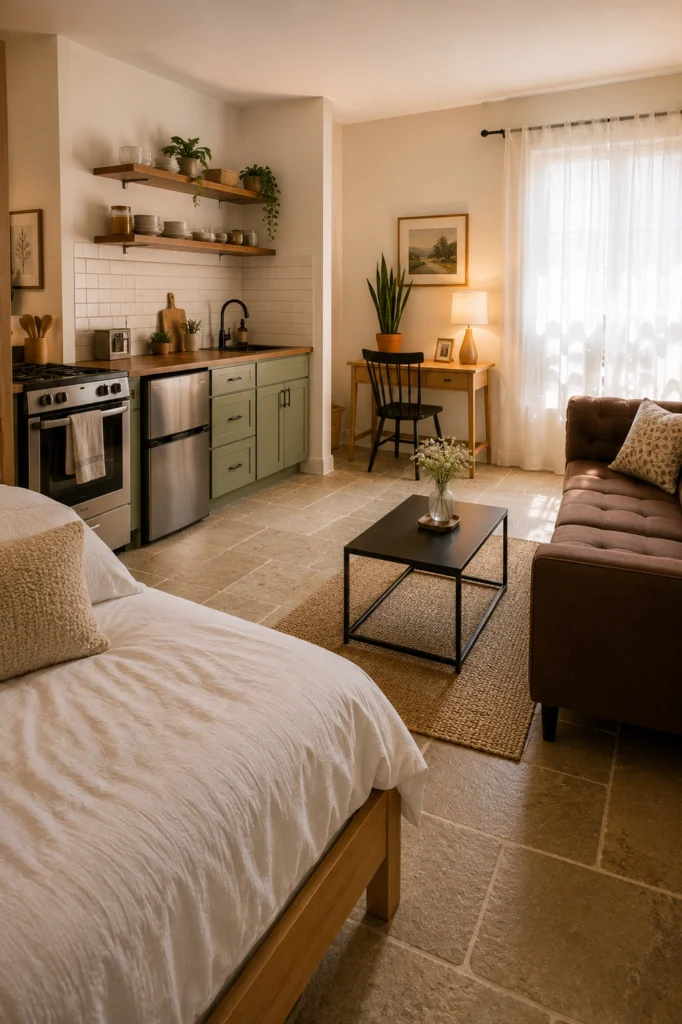
If your kitchen is in your living room (and in 200 sq ft, it is), the goal is to make it feel like cabinetry, not a kitchen. Soft sage green cabinets, warm wood counters, a couple of plants on the open shelf — and suddenly it reads as built-in storage. No stainless-steel everything, no clutter on the counters, no shouting appliances. The minute your kitchen visually quiets down, the whole studio feels twice as livable.
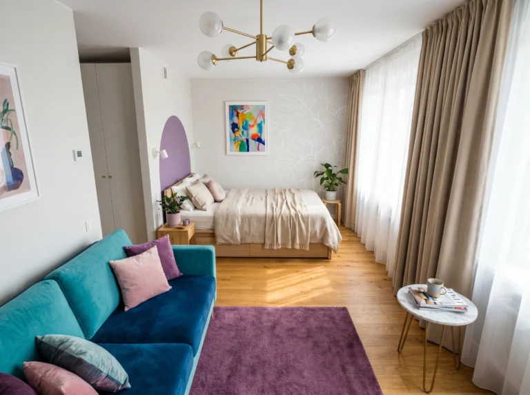
2. Float the Bed Into the Living Layout
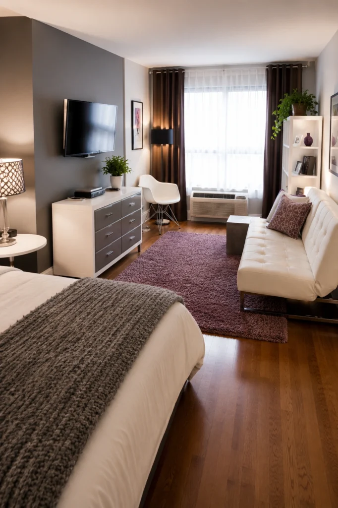
You don’t always need a divider. Sometimes the smartest move is just turning the bed sideways so it reads as a daybed from the sofa angle. The mounted TV faces both zones. The dresser doubles as a media console. The rug anchors the seating area and stops it from blurring into the bedroom.
Renter-friendly alternative: if you can’t mount the TV, use a low slim console — same visual effect, no drilling.
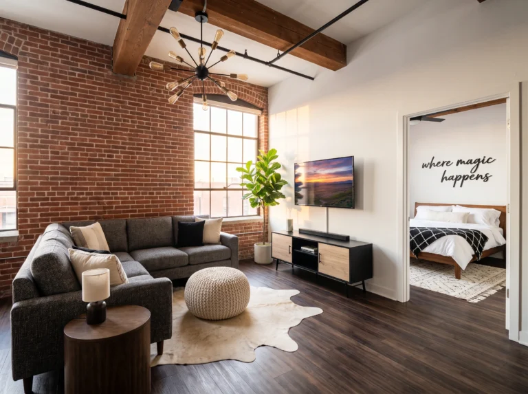
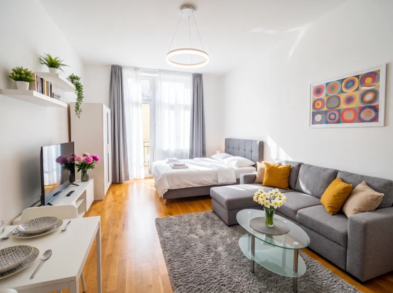
3. Choose One Big Sofa Over Two Small Pieces
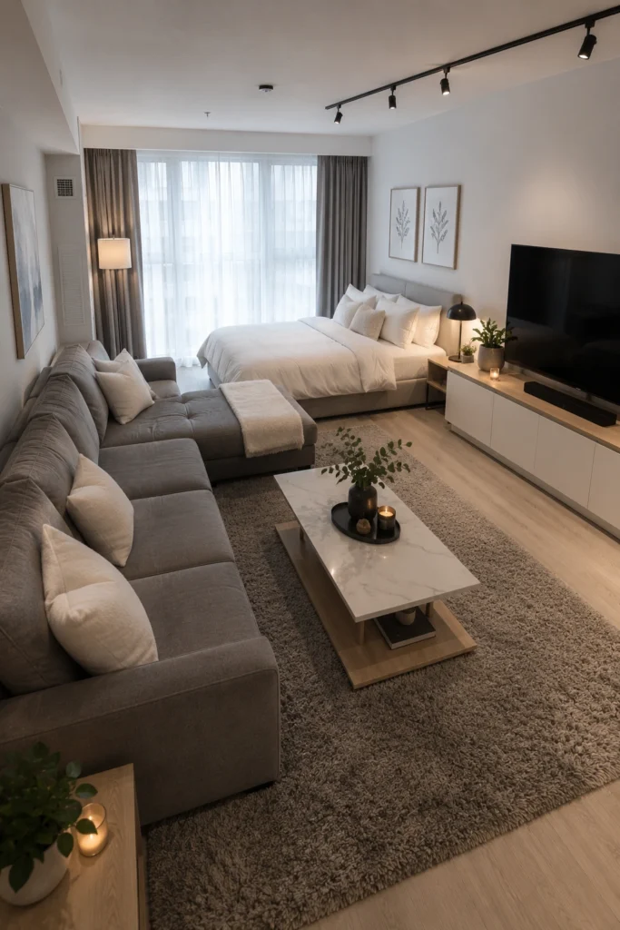
Counterintuitive, I know. But in a tiny studio, one generous sectional reads as calm and intentional, while a sofa-plus-chair combo reads as cluttered. This layout backs the sectional against the bed (it becomes the bed’s “headboard wall”) and frees up the rest of the floor entirely. The result is a studio that lives bigger than its square footage — and a couch you can actually nap on, which matters more than you think.
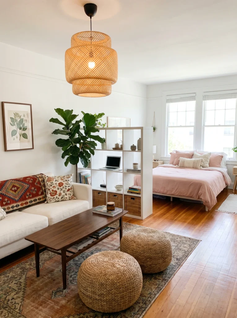
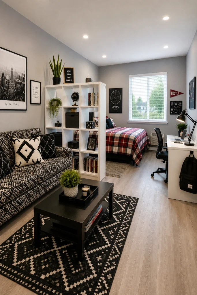
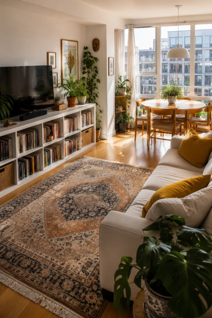
4. Use a Cube Shelf as a Soft Room Divider
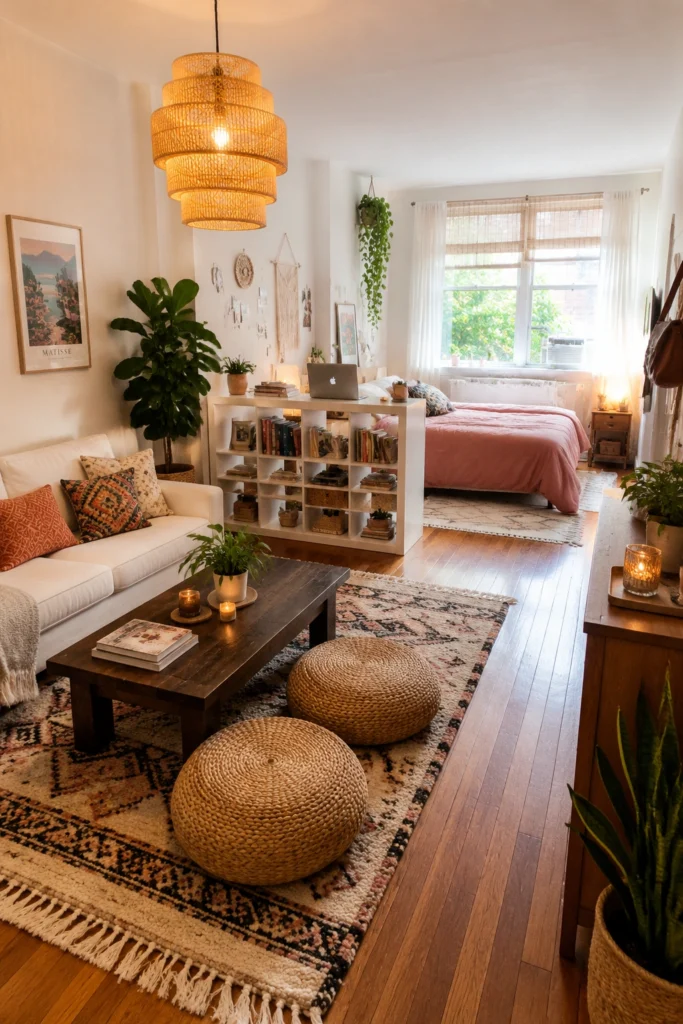
The single best move in a tiny studio is defining zones without building walls. A low cube bookshelf (IKEA’s KALLAX is the classic choice for a reason) splits the bed from the sofa, hides messy bedding from the sofa view, and pulls double duty as storage. You still get airflow, light, and that open feel — but psychologically, you’ve got two rooms. The pink bedspread peeking over the top reads as a separate space, not a mattress in your living room.
5. Anchor the Layout With One Statement Pendant
When your whole apartment is one room, your eye needs somewhere to land first. A large woven pendant — like the IKEA SINNERLIG — pulls the eye up, makes the ceiling feel taller, and instantly says “intentional.” Without it, this same layout would feel like a furniture showroom.
Pro tip: in a tiny space, oversized lighting actually makes the room feel bigger, not smaller. Tiny lamps shrink a room. A statement pendant expands it.
6. Carve Out a Real Workspace, Not a Laptop-on-the-Couch Situation
If you work from home, skip the couch-as-office routine — your back and your sanity will thank you. Even in 200 sq ft, a narrow desk pushed against the window (where the natural light is) and a proper task chair earn their footprint. This one tucks the desk behind the sofa, so it’s invisible from the bed. That’s the trick: separate “work mode” from “rest mode” visually, even if they’re three feet apart.
7. Let One Existing Feature Do the Heavy Lifting
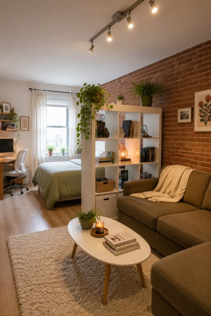
If you’ve got exposed brick, original molding, or a great window — build the room around it. Don’t fight it with busy art or competing colors. The brick wall here is the star, so the sofa is a quiet olive, the coffee table is a simple oval, and the cube divider stays white. Everything else recedes.
Sofia honest take: the worst tiny studios are the ones trying to do too much. One bold feature, three calm choices. That’s the formula.
8. Go Vertical or Go Home
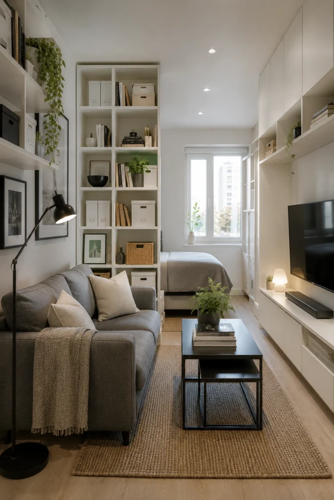
In 200 sq ft, the floor is sacred — every square inch you cover is one less you can walk on. So push everything up. Floor-to-ceiling shelves, wall-mounted TV, lamps mounted to the wall instead of standing on the floor. This narrow studio works because the eye keeps traveling up. You read the ceiling height before you register how small the footprint is. Lower furniture lines plus tall storage equals visually doubled space.
9. Pick a Palette and Stick to It
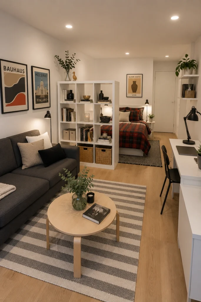
In a small space, more than three or four core colors will make your brain tired the second you walk in. This Scandi studio nails it: pale wood, soft white, charcoal gray, and one warm red from the plaid. That’s it. The posters add personality without breaking the palette.
Budget vs. splurge: save on the rug and the posters, splurge on a sofa in a timeless neutral. You’ll restyle around it for years.
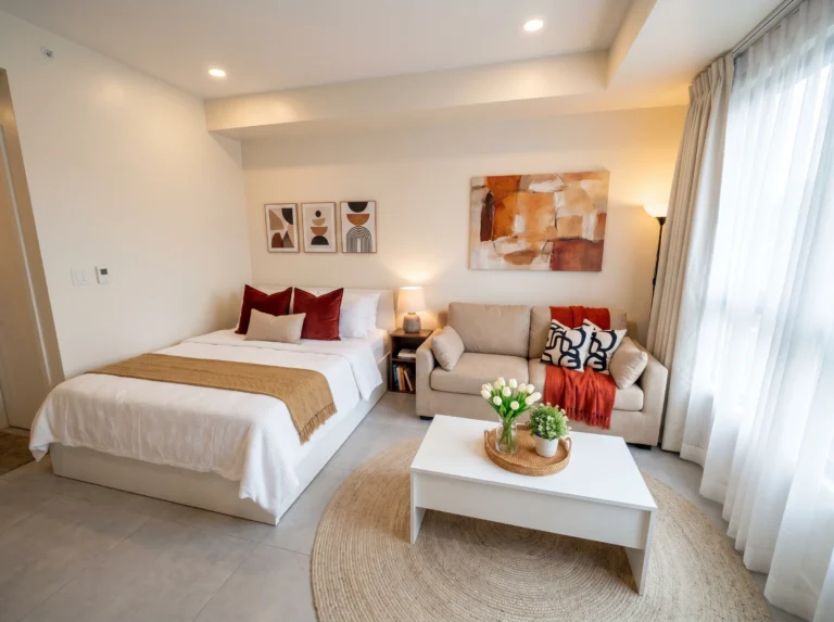
10. Let the Sun Do Half the Decorating
If your studio has good light, don’t block it. No heavy drapes, no tall furniture against the windows, no dark walls eating the glow. Use a low bookshelf as a TV stand so the sightline stays open. Keep one chunky vintage rug to ground the space. The mustard pillows are the only “loud” choice — and they only work because the sun is doing 70% of the warmth. Lean into your light. It’s the cheapest decor you own.
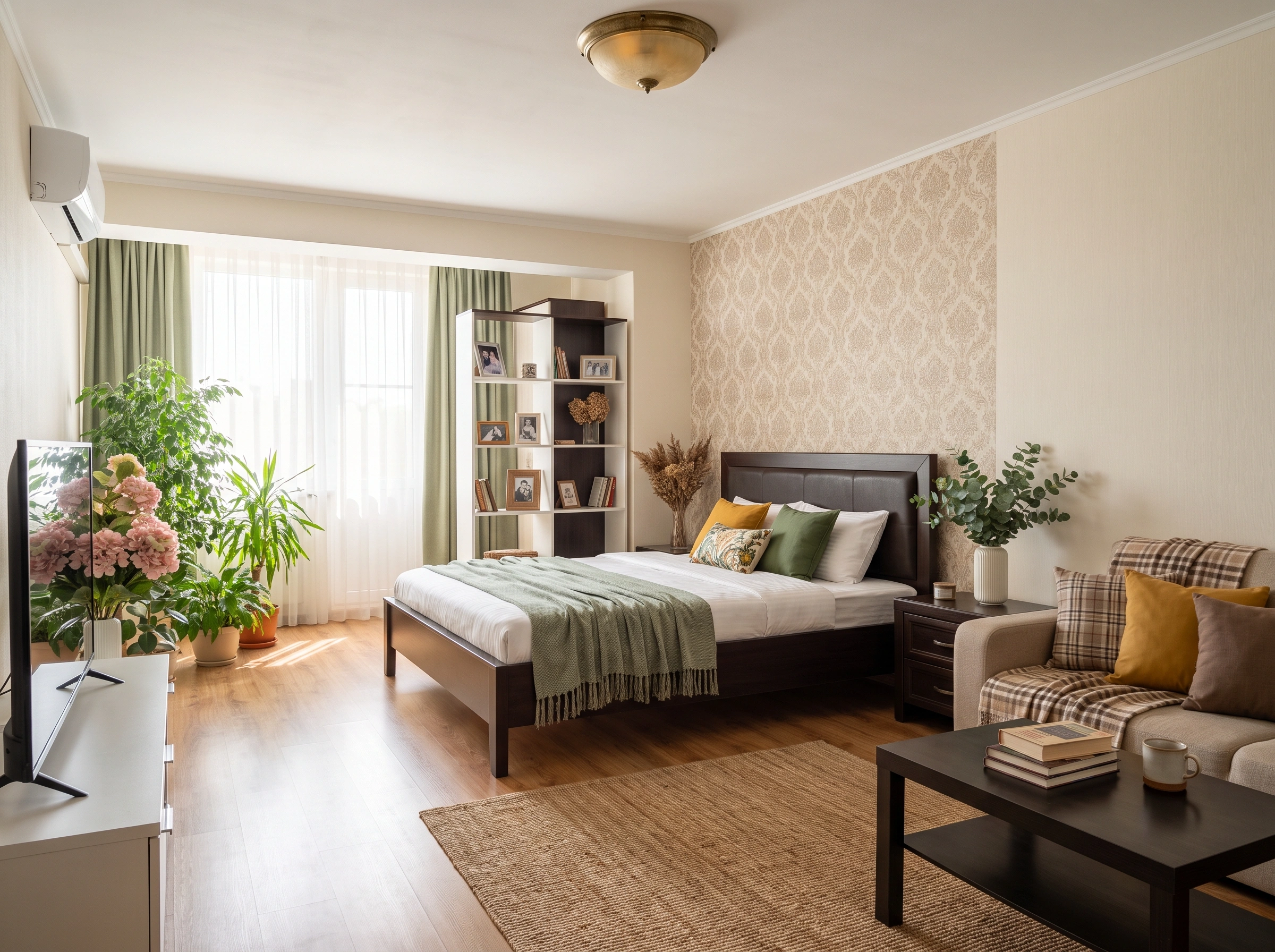
11. Mix Old and New So It Doesn’t Feel Like a Showroom
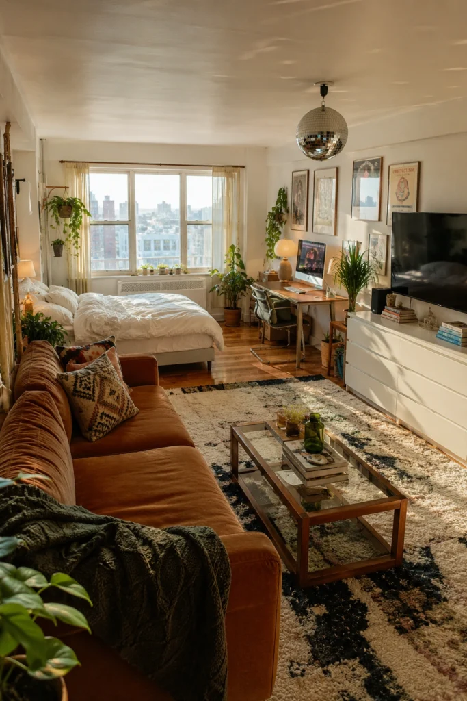
The studios that feel like homes always mix eras. A vintage glass-and-brass coffee table next to a modern velvet sofa. A disco ball next to a clean white dresser. Old posters on a freshly painted wall. This is the part most people skip — and that’s exactly why their studio feels like a hotel room. One or two genuinely old pieces (thrift store, flea market, grandma’s attic) will save you from the everything-bought-this-month flatness.
12. Bring in Reflective Surfaces to Bounce Light
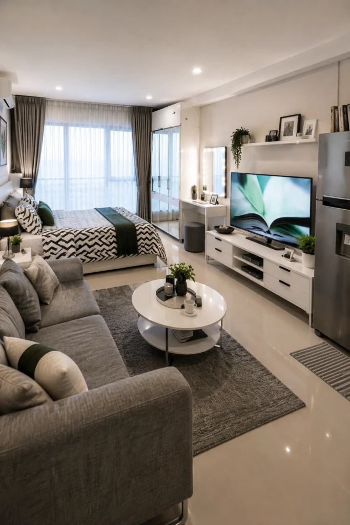
A glossy floor, a mirrored wardrobe, a vanity mirror — these aren’t just style choices, they’re square-footage hacks. Every reflective surface effectively doubles the light and tricks the eye into reading more depth. This studio leans hard into it: mirrored closet, glossy tile, lacquered TV console. Yes, it shows every speck of dust. But the brightness payoff is real.
Pro tip: even one large floor mirror leaned against a wall can change how a tiny space feels by 30%.
13. Cover the Walls With Things You Actually Love
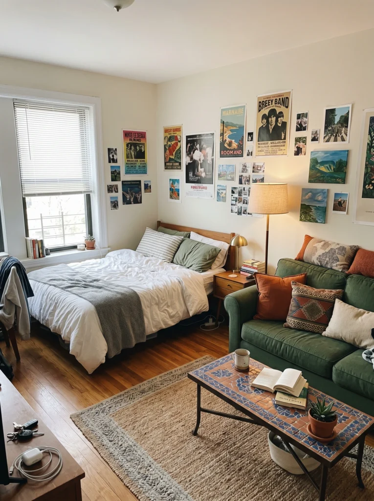
Forget matching frames and gallery-wall rules. The most alive tiny studios are the ones where the walls tell a story — concert posters, film prints, polaroids, paintings from a flea market in another country. It feels personal because it is personal.
I’d rather walk into a chaotic wall of meaningful art than a tasteful, anonymous one with three matching botanical prints. A small studio with personality always beats a small studio that looks “designed.”
Final Thoughts
Two hundred square feet isn’t a punishment — it’s a constraint, and constraints make better design. The studios I keep going back to in my head aren’t the biggest or the most expensive ones. They’re the ones where every choice felt deliberate: one good pendant, one bold rug, one wall of art that actually means something. Start with the layout, then the light, then the personality. In that order.
Pick one idea from this list. Just one. Try it this weekend.
A small home isn’t a smaller life — it’s a more edited one. And edited, done right, is always