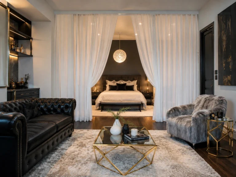
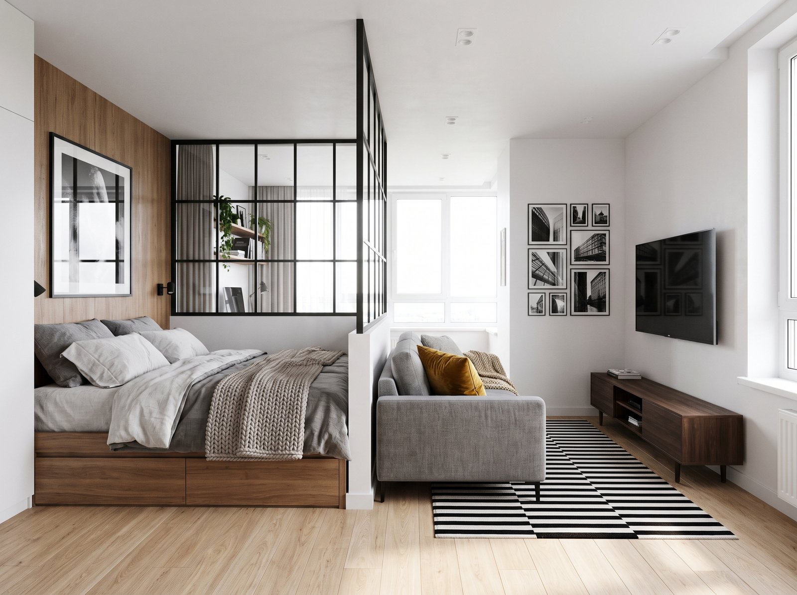
14 Smart Studio Apartment Layouts for Compact Living
Studio living asks a lot of a room. One space has to sleep you, feed you, host you, and maybe fit a desk in there too. Here’s the thing — a good studio isn’t about squeezing everything in, it’s about laying it out smart. These 14 layouts show how to zone, divide, and arrange a compact space so it actually feels like a home instead of a hallway with furniture.
1. The Alcove Bedroom + Open Living Zone
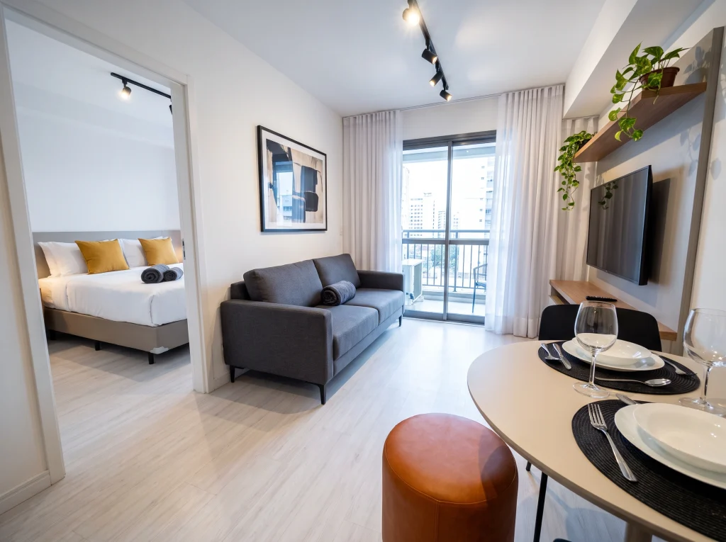
If your studio has even a small architectural nook, use it as your bedroom. Tucking the bed into its own alcove gives you real separation without adding walls. Here, sheer floor-to-ceiling curtains stretch the ceiling, a slim gray sofa takes up almost no visual space, and a round dining table shares the wall with the mounted TV. Every zone gets its own purpose without stepping on the next.
2. Loft Layout with Rug-Defined Zones
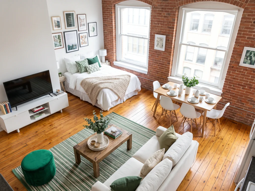
In a wide-open loft, rugs do the work walls can’t. This layout uses a green striped rug to anchor the living area, an oak dining table to claim the window corner, and the bed pressed against the brick wall to define sleep. Nothing overlaps. The gallery wall above the bed doubles as a headboard alternative — smart in a space where every square foot needs to earn its spot.
3. Back-to-Back Bed and Sofa
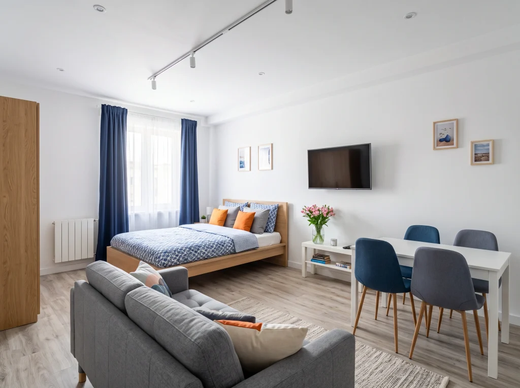
Here’s a layout that works when your studio is more square than long. The bed sits in the middle of the room, and the sofa is placed back-to-back against it — instantly creating two distinct zones from a single furniture pairing. The dining table doubles as a workspace, and the wardrobe tucks against the entrance wall.
Pro tip: placing the sofa against the bed frame saves you from needing a divider at all.
4. The Classic NYC Perimeter Layout
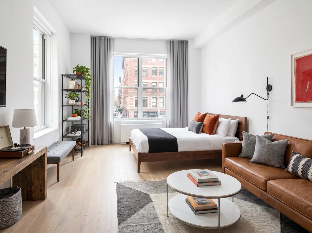
This is the layout every NYC studio dweller learns eventually. The bed runs perpendicular to the window wall, a leather sofa sits back-to-back with it, and everything else — a slim console, a wire shelf, a small bench — hugs the perimeter. The result? Your bed becomes the “backrest” of your living room during the day. Layered lighting through wall sconces and floor lamps keeps things soft at night.
5. The Hotel Suite Layout
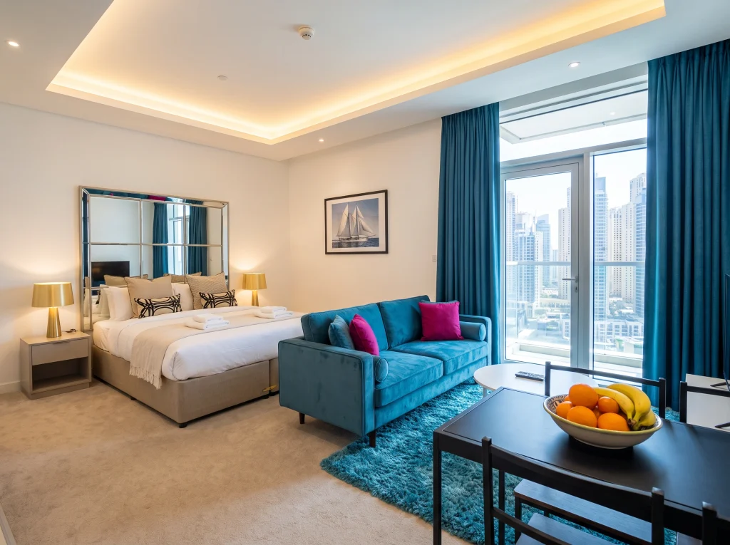
If you love the hotel-suite feel, take a page from this layout. The bed anchors one side of the room, a velvet sofa faces the balcony from the middle, and the mirror behind the headboard bounces daylight everywhere. What makes it work? The sofa acts as a soft, invisible line between “sleep” and “lounge” — you feel the shift without any actual physical barrier. Trust me, mirrors save small spaces.
6. Side-by-Side with a Slim Divider
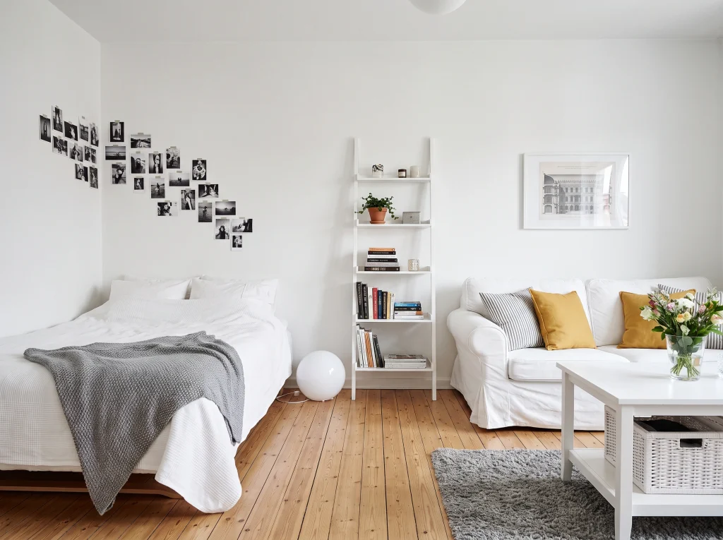
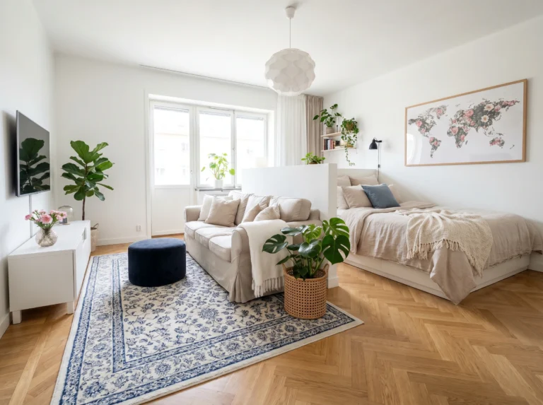
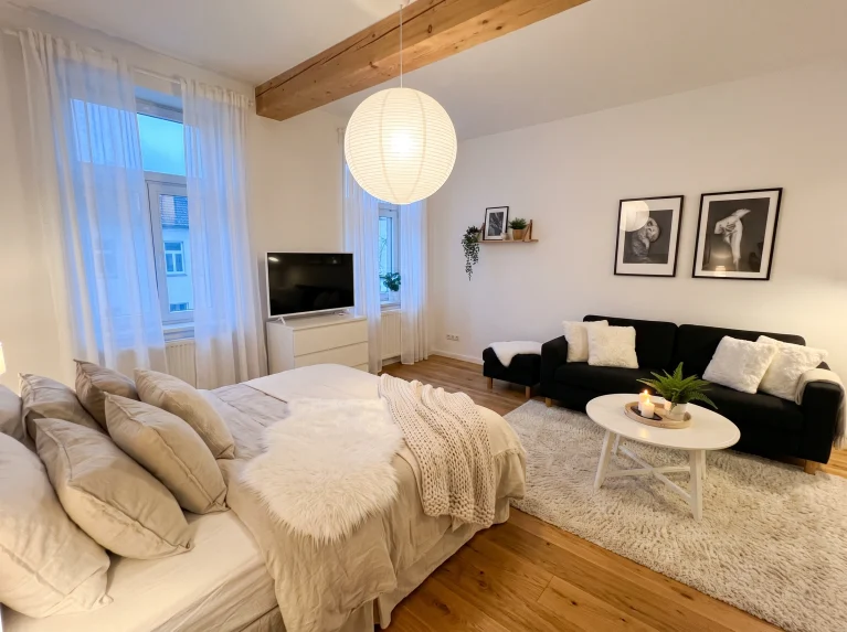
Sometimes the smartest divider is barely a divider at all. Here, a slim white ladder bookshelf slips between the bed and the sofa — enough to visually separate the two without cutting off light or air. White walls, honey wood floors, and a big black-and-white photo cluster make the whole space feel bigger than it is. If your studio is narrow, this side-by-side layout might be your answer.
7. The Wooden Slat Room Divider

If your budget stretches a little further, a wood-slat divider is the move. It defines the sleeping zone without blocking light or airflow — you get the feeling of a separate bedroom without losing the openness of a studio. The curved leather sofa faces away from the bed, creating a proper lounge on the other side. This layout works especially well in wider studios with high ceilings that can carry the vertical element.
8. Industrial Studio with Built-In Dividers
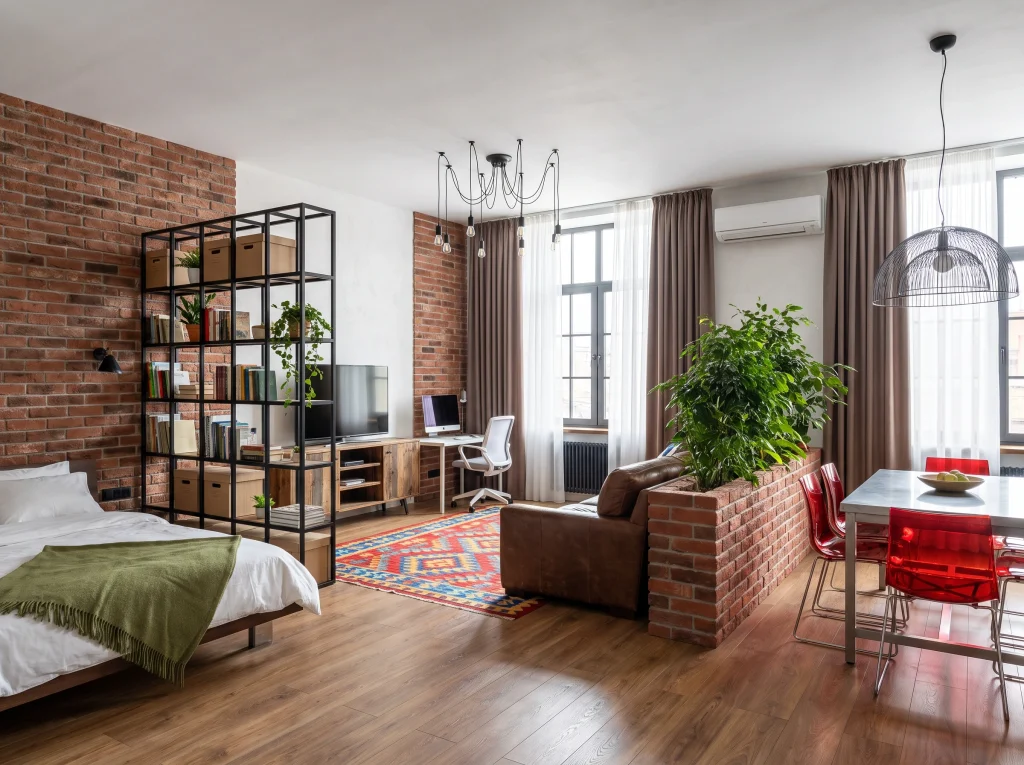
Industrial studios have a secret advantage — you can use existing architecture as your divider. This layout puts the bed in one corner, a tall metal grid shelf between the bed and the living zone, and a low brick planter defining the dining area. Nothing feels closed off, but every zone reads clearly. The kilim rug and colorful chairs keep it from feeling too cold. Function and character, together.
9. Low Bookshelf as a Multi-Tasker
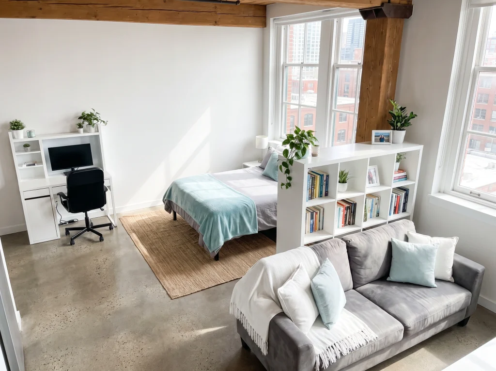
Here’s a divider hack that pulls double duty: put a low bookshelf between the bed and the sofa, and it becomes storage, a sofa backrest, and a room divider all at once. The white finish keeps it feeling open, and the cubbies handle books, plants, photos — all the personal stuff that makes a studio feel like yours. A small desk in the opposite corner completes the three-zone layout.
10. Open Layout, No Divider Needed
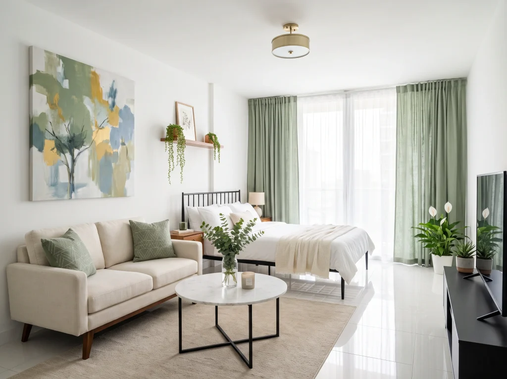
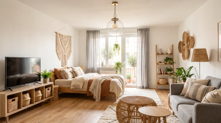
Not every layout needs a divider. Sometimes the smartest move is to lean into the openness and let the furniture do the zoning. Here, the sofa faces away from the bed toward a small TV setup, and floor-to-ceiling sage curtains soften the whole window wall. Plants scattered throughout add depth without taking up floor space. The result feels more like a boutique studio than a compromise space.
11. The Foot-of-Bed Sofa Setup

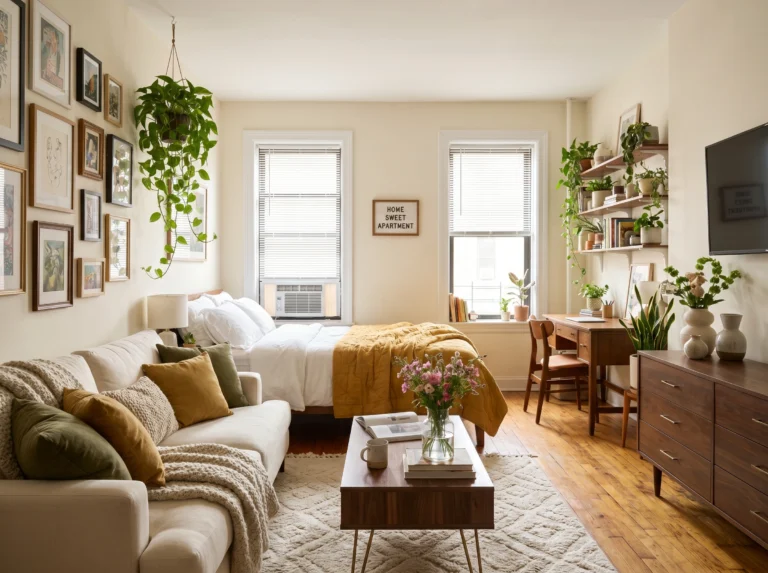
Working with a really small footprint? Put the sofa perpendicular at the foot of the bed and let color do the heavy lifting. This studio uses a mustard sofa, an emerald bedspread, and orange pillows to give each zone its own personality — even though everything is inches apart. A tall bookshelf against the wall handles storage without eating floor space. Small space, big attitude.
12. Kitchen on One Wall, Bed on the Other

If your studio has an open kitchenette, run all the “wet” functions along one wall — kitchen, dining, TV — and put the bed on the opposite side. This layout keeps cooking smells away from your pillows and gives the bed its own quiet zone by the windows. Navy curtains layered with white sheers add drama and privacy at night. Clean, adult, and easy to live with.
13. Sofa-in-Front-of-Bed for Entertaining

For a studio that entertains, try the classic sofa-in-front-of-bed arrangement. The bed sits against the window wall and the sofa faces outward — turning the bed area into a proper living zone during the day. On the other side, a round dining table with black chairs feels formal enough for dinner guests. Crystal chandelier, white walls, sheer curtains — this is a studio that dresses up nicely for company.
14. The Warm Mid-Century Layout
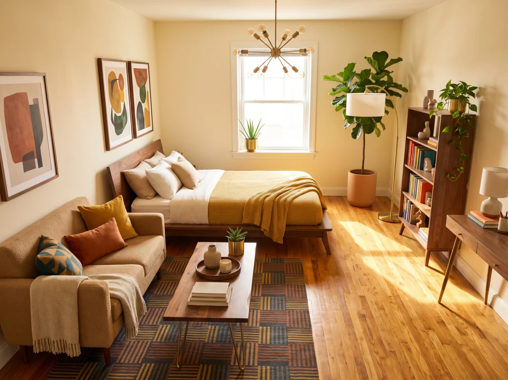
Warm, warm, warm — that’s the whole point of this mid-century layout. The walnut bed frame runs along one wall, the small boucle sofa sits at the foot of the bed, and a tall bookcase and desk fill the opposite corner. The sputnik chandelier centered over the window makes the ceiling feel taller. Butter yellow walls tie everything together. Compact living doesn’t have to feel compact.
Final Thoughts
A well-planned studio doesn’t feel cramped — it feels intentional. Whether you use a bookshelf as a divider, layer sheer curtains for softness, or lean into the openness with strategic furniture placement, the goal is the same: create zones your body understands even when the walls don’t exist. Pick the layout that fits your floor plan and try shifting just one piece this weekend. You’ll be surprised how much a smarter arrangement changes the whole feel of home.
Your studio doesn’t need to be bigger — it just needs to be smarter. Layout is everything.