What Layout Works Best for a Studio Apartment? 9 Setups Worth Stealing
You can have the prettiest sofa and the dreamiest bedding in the world, and your studio will still feel cramped if the layout is wrong. Here’s the thing — in a studio, your floor plan is your decor. The way you place the bed, sofa, and storage decides whether the space feels open or claustrophobic, restful or chaotic.
Below are nine studio layouts I’d actually live in — each one suited to a different room shape, lifestyle, and personality. Find the one that matches yours.
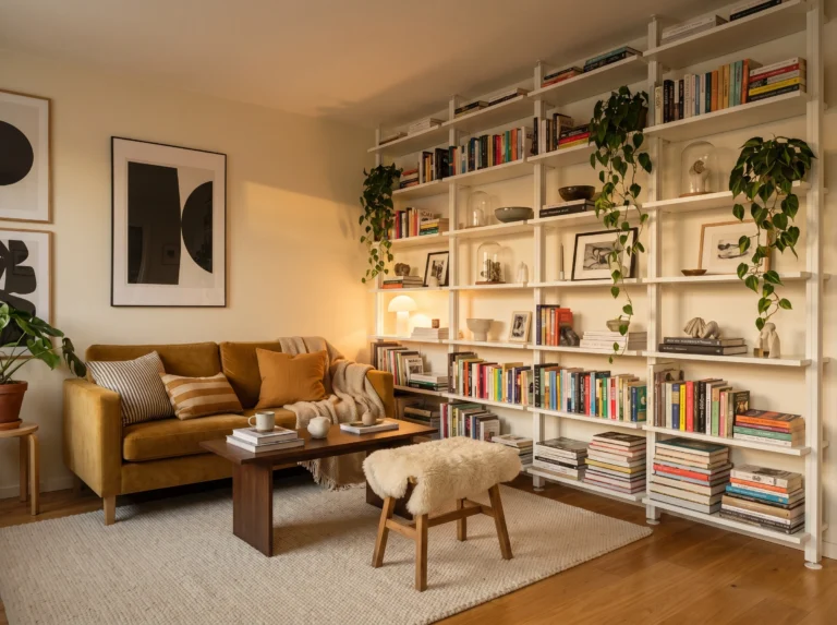
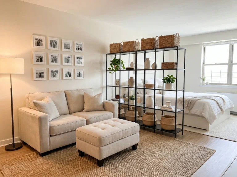
1. The Cube Shelf Divider
This is the classic small-studio move, and it works because it does two jobs at once. The white cube unit splits the room into a living zone and a sleeping zone, and gives you eight cubbies of actual storage. Notice how the bookshelf and the side of the cube shelf form an L — that L is what creates the illusion of separate rooms.
The striped kilim rug grounds the living area, the trailing monstera softens the divider, and the warm lamp glow makes the whole thing feel like a tucked-in apartment, not a single room with furniture floating around the middle of it.
2. The Open Parallel
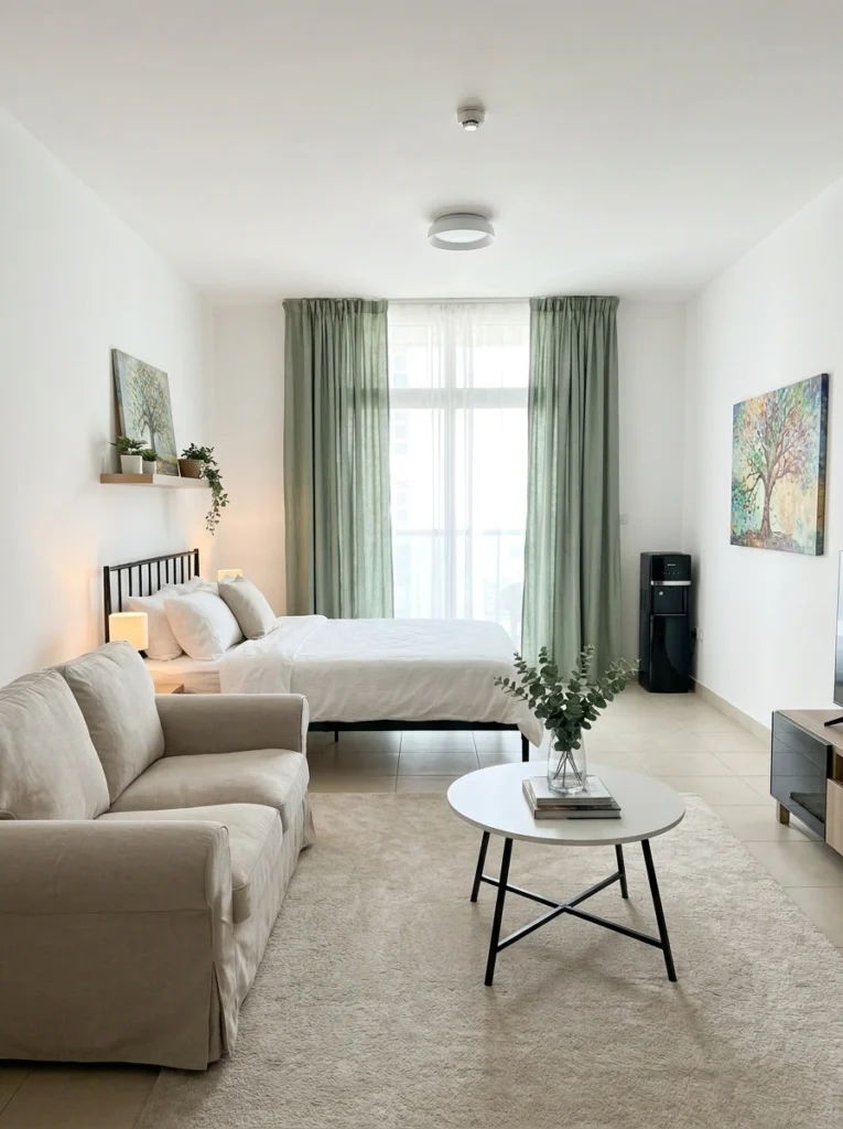
If your studio is on the smaller side, or you just crave a calm, airy feel, skip the dividers altogether and embrace the openness. Here, the bed and the slipcover sofa share the same room without trying to hide from each other. Those sage green curtains run the full height of the wall, which makes the ceiling feel taller, and the soft beige rug under the sofa visually carves out a “living” zone without a single piece of architecture.
Sofia’s honest take: Open layouts are gorgeous when minimal and brutal when messy. If you’re tidy by nature, this is the move.
3. Bed and Sofa Face Off
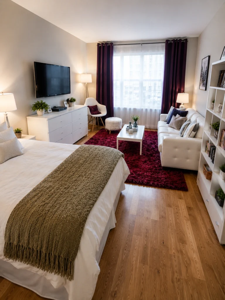
Here’s a layout I love for square-shaped studios: bed on one wall, loveseat directly across, TV mounted in between so it serves both. You essentially get a bedroom and a den in the same footprint, with the rug acting as the connector. The burgundy curtains and matching shag rug pull the whole thing together — without that pop of color, the white walls and white furniture would feel like a hotel. Notice how the coffee table sits low and small so it doesn’t block the sightline.
Pro tip: In a face-off layout, keep the coffee table under knee height. Anything taller visually chops the room in half.
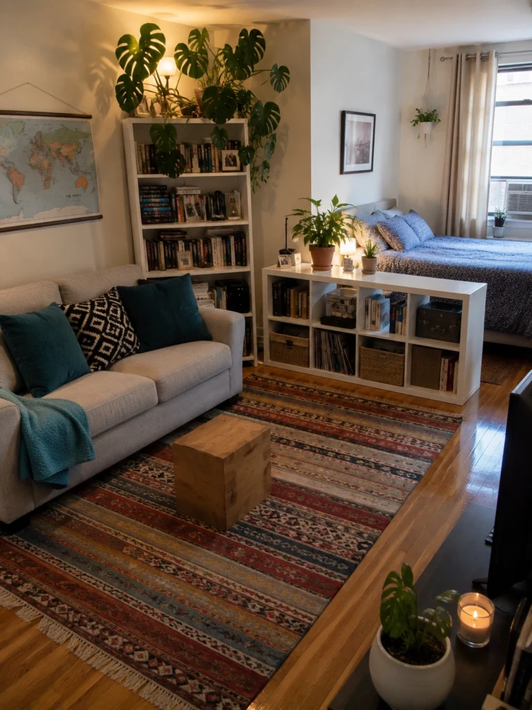
4. The Long Galley
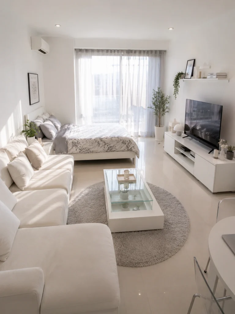
In a long, narrow studio, lean into the shape instead of fighting it. This setup runs everything along one axis: sectional sofa on the left, TV console on the right, bed tucked at the far end by the natural light. The round shaggy rug under the coffee table is the genius move — circular shapes break up the rectangular floor plan and stop the whole space from reading like a hallway.
Going all-white isn’t for everyone, but in a narrow studio it’s a real trick: light surfaces bounce daylight around and visually widen the room. Bring color through art and pillows instead.
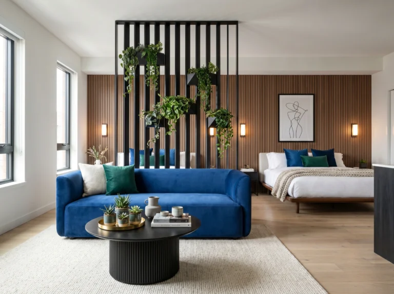
5. The Sofa-as-Divider
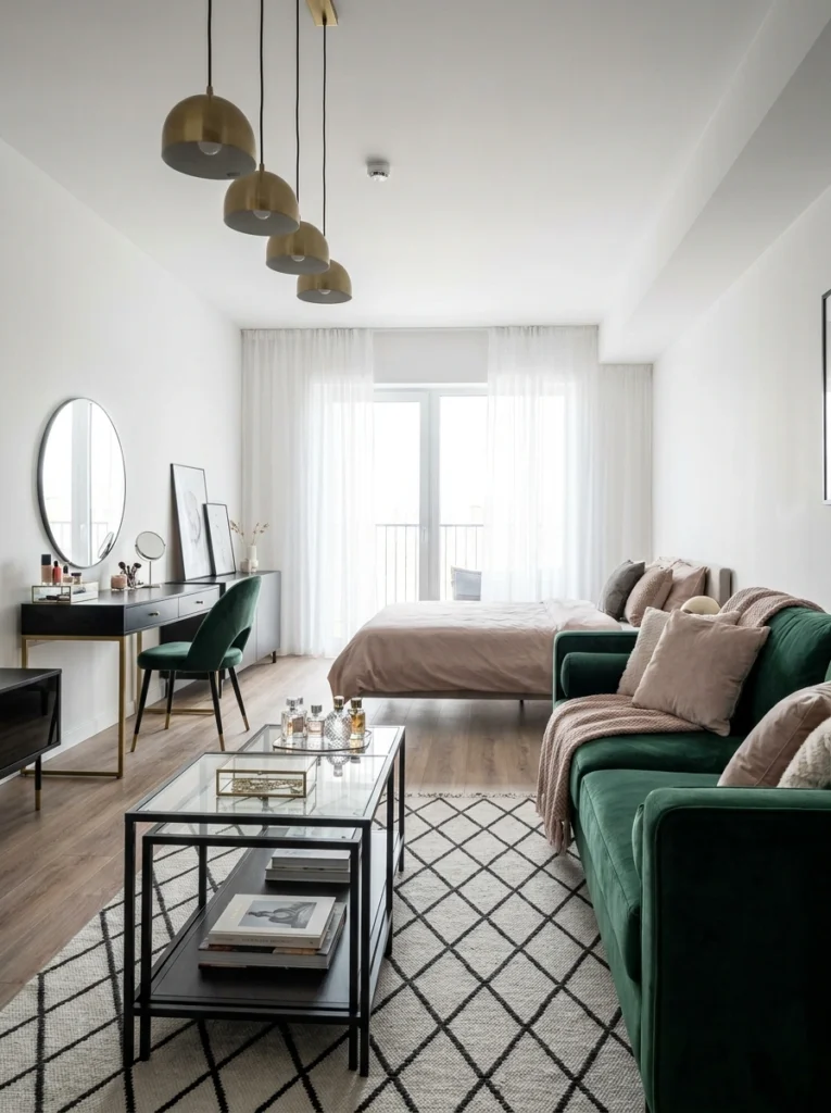
No bookshelves, no screens — just the back of a sofa doing all the work. Place the sofa perpendicular to the bed, and its backrest becomes the boundary between the living zone and the sleep zone. That emerald velvet sofa, the brass cluster pendant, and the diamond-patterned rug make the whole thing feel intentional rather than improvised. The vanity tucked against the side wall doubles as a desk, which is exactly the kind of dual-duty thinking that makes studio living work.
Renter-friendly alternative: If you can’t install pendant lights, anchor the seating area with a tall arc floor lamp instead. Same effect, zero drilling.
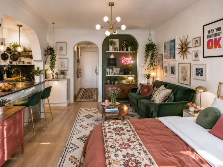
6. The Back-to-Back
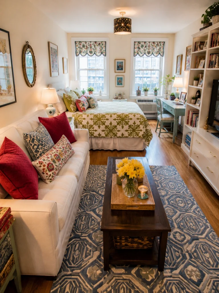
This is the tiniest layout in the bunch, and the cleverest. The sofa sits directly in front of the bed, both facing the same direction toward the TV — two pieces of furniture stacked along one wall. You lose nothing in square footage and gain a full living room. Patterns and color do the heavy lifting here: the green quilt on the bed, the red and floral pillows on the sofa, the blue patterned rug. They distract the eye from the back-to-back trick.
Sofia’s honest take: This layout only feels good if you commit to color and texture. Done in beige, it would look like a furniture showroom that collapsed.
7. Living Room First
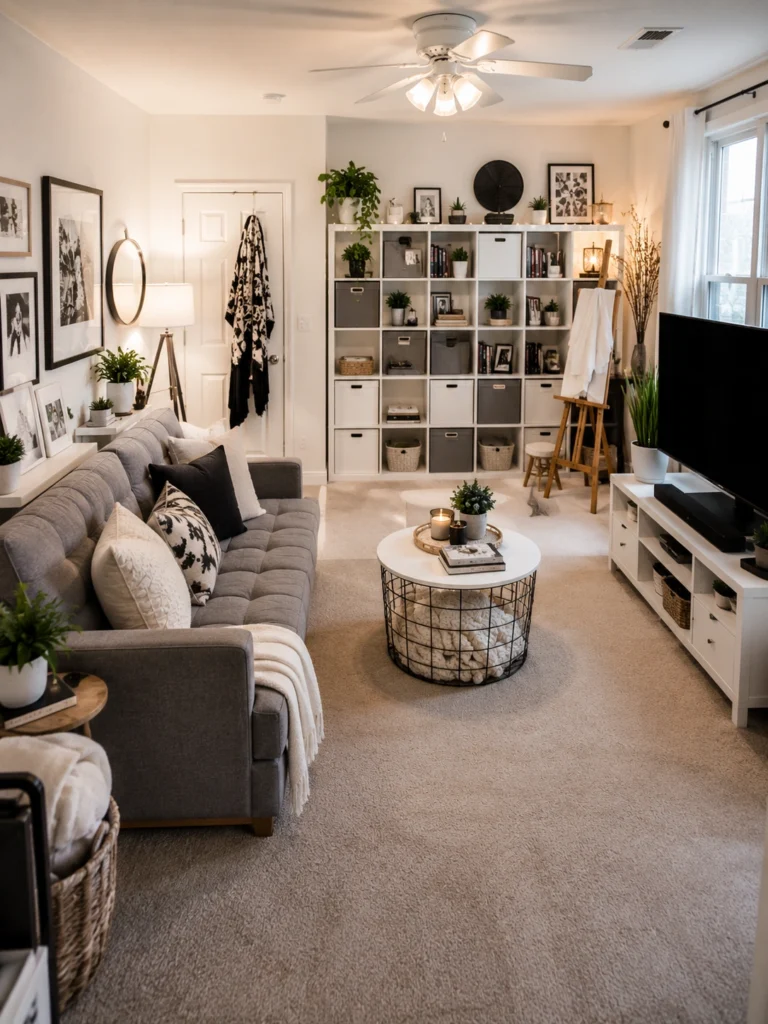
If you work from home or host more than you sleep, flip the priority: build the layout around the living room and let the bed find its corner. Here, a wall-sized cube shelf is the main feature — it stores everything you own, doubles as decor, and anchors the seating area. The gray tufted sofa, the round wire-base coffee table, and the gallery wall finish the look. The bed isn’t in frame because in this kind of layout, it shouldn’t be.
Pro tip: If your studio has any nook, alcove, or half-wall, that’s where the bed goes. The living room earns the open floor.
8. The Screen Divider
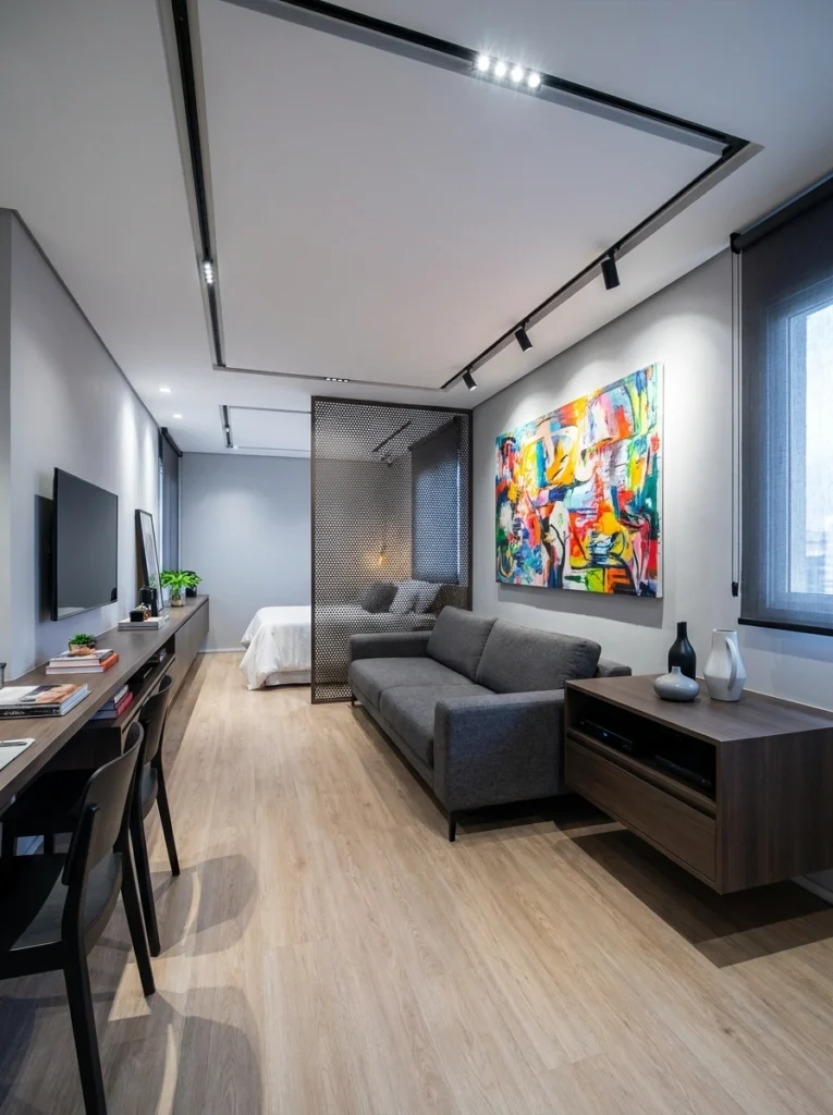
For long, modern studios with high ceilings, a partial wall or perforated screen is unbeatable. This metal panel gives the bed area real visual privacy without sealing it off — light, air, and a sliver of view still pass through. The clever part is that the screen doesn’t touch the ceiling, so it reads as architectural rather than imposing. On the other side, the layout is a clean sequence: long desk, sofa, console — everything pushed to the perimeter to keep the center floor open.
Renter-friendly alternative: Swap the metal panel for a tall freestanding cane or rattan screen. Same separation, zero installation.
9. The 90-Degree Split
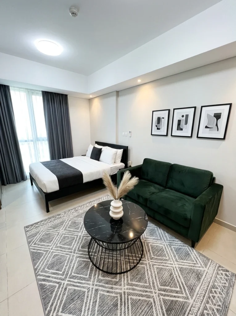
Sometimes the best divider is no divider at all — just a smart angle. Here, the bed runs along one wall and the green velvet loveseat sits at a perfect 90 degrees to it, sharing the same rug. That shared rug is what makes this layout work; it ties the two zones into one composition instead of leaving them looking like awkward, unrelated pieces. The tight black, white, and forest green palette keeps it feeling designed, not random.
Pro tip: In any divider-free layout, the rug is your most important piece of furniture. Size up, not down — a rug that’s too small makes even a great layout feel like dorm furniture.
So Which One Is Right for You?
There’s no universal “best” layout — only the one that fits how you actually live. A few quick prompts:
- Need privacy? Go with a divider — cube shelf, screen, or sofa-back.
- Need light? Skip dividers and go open.
- Long, narrow shape? Galley layout.
- Square shape? Face-off or 90-degree split.
- Work from home a lot? Living-room-first.
- Pure minimalist? Open parallel.
- Maximalist who loves pattern? Back-to-back with bold textiles.
Before buying a single piece, walk through your space with painter’s tape on the floor and map the layout out at full scale. Trust me on this one — measuring twice has saved me from at least three sofa returns.
Final Thoughts
A studio isn’t a smaller version of a regular apartment — it’s its own animal, with its own rules. The layout you pick says everything about how the space will feel: cozy or crammed, restful or chaotic, designed or just decorated. Choose the one that matches your real life, not the one that looks best on Pinterest. And if your first attempt doesn’t work? Move things around again. That’s the joy of a studio — the whole apartment is one weekend project away from a brand-new floor plan.
Your home should make you happy, not impressed strangers. Start with the layout, and everything else falls into place.
Happy decorating, Sofia