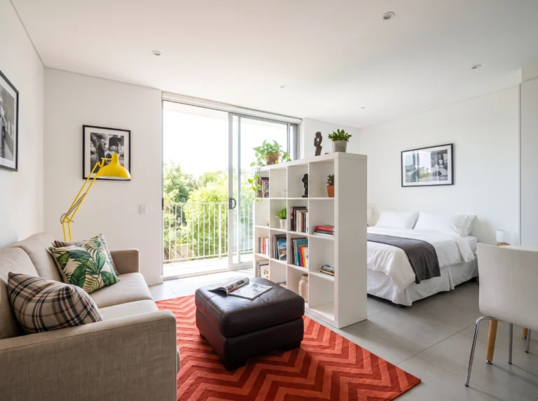
17 Open Concept Studio Apartment Ideas That Actually Work in Real Life
Living in a studio gets a bad rap. People picture a sad mattress shoved next to a microwave and call it a day. But here’s the thing — an open concept studio, done right, can feel airier, calmer, and more put-together than a lot of two-bedrooms I’ve walked into. The trick isn’t more square footage. It’s smarter choices.
These 17 ideas come from apartments I’ve seen, lived in, or wished I’d thought of first. Pick one, try it this weekend, and watch your studio start to feel less like a dorm and more like yours.
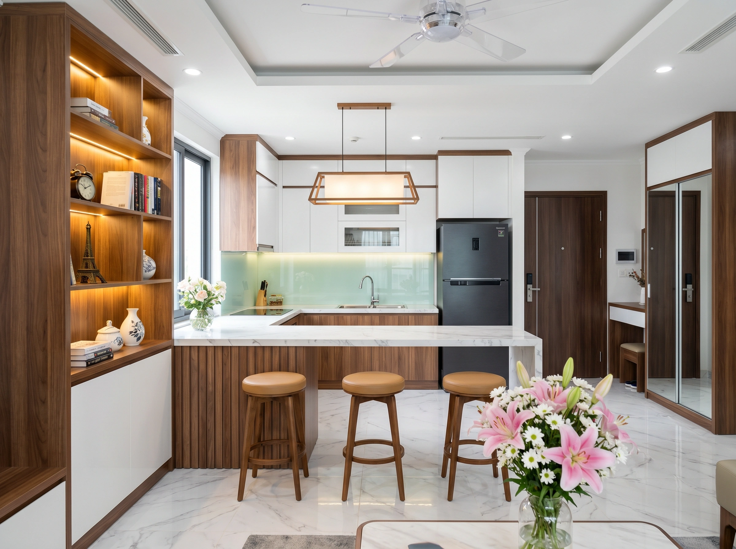
1. Build a Half-Wall Kitchen Counter as the Main Divider
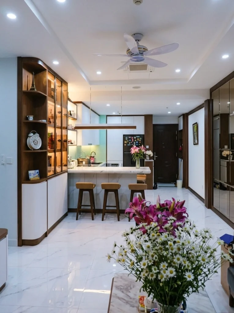
If your studio has the bones for it — or you’re choosing one to rent — a kitchen island or peninsula with bar stools is the gold standard open-concept move. It physically separates kitchen mess from the rest of the room without closing anything off. You cook on one side, your friend perches on a stool on the other side with a glass of wine, you can still see each other. That’s the whole dream.
Even if you can’t build one, you can fake it with a console table behind your sofa, a narrow bar cart, or a counter-height IKEA shelf. The point is to create a line between zones, not a wall.
2. Layer Your Zones Without Walls
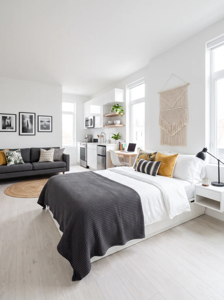
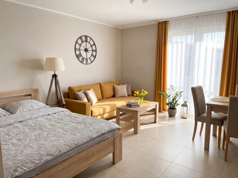
The best open-concept studios don’t feel like one big room — they feel like three small ones. A jute rug anchors the living area, a low platform bed defines sleeping, a desk tucked behind signals work. No walls needed. Let the furniture do the dividing, and tie it together with one consistent accent color threading through every zone.
Pro tip: Hang art in clusters, not scattered. Each zone gets a focal point without cluttering the sight lines.
3. Carve Out a Dedicated Work Zone
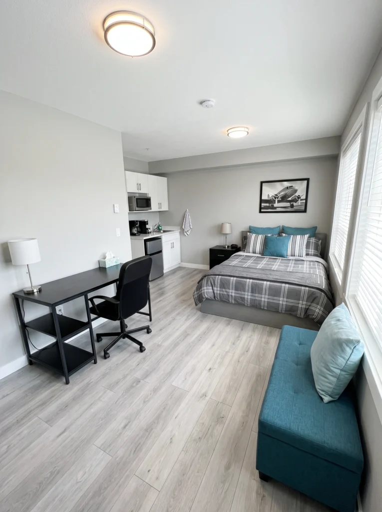
The number one thing that makes a studio feel chaotic? Work stuff bleeding into sleep space. A dedicated desk — even a slim 48-inch console — signals where work happens. Position it so your back faces the bed during work hours. A storage bench at the foot of the bed doubles as extra seating and keeps the mental separation physical.
Budget vs. splurge: Save on the desk (IKEA Alex, $229). Splurge on the chair — your back will thank you.
4. Let an Exposed Brick Wall Do the Heavy Lifting
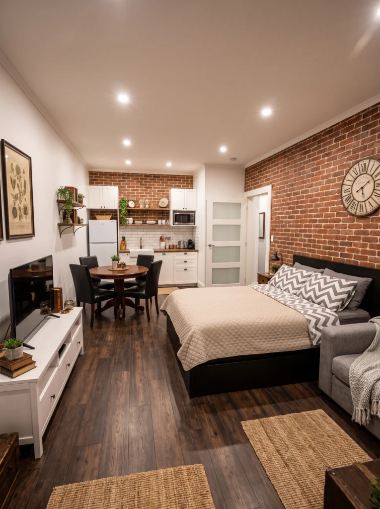
If your studio has exposed brick, treat it like a gift. Brick brings warmth and texture no paint fully replicates — and in an open plan, it anchors the entire space effortlessly. Let it run through multiple zones. Pair it with warm hardwood floors, white cabinets, and round wood furniture to soften the industrial edge.
I’ve tested this: Botanical art prints in simple frames look stunning against brick — better than abstracts or photography prints I’ve tried.
5. Use an Accent Wall to Define the Kitchen Zone
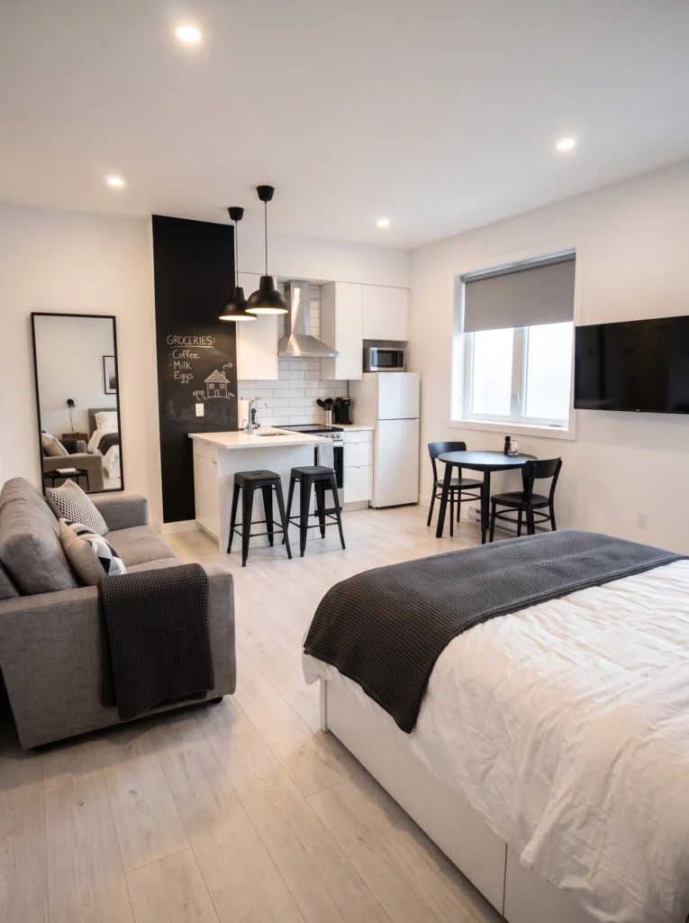
In an open studio, the kitchen can disappear into the background — or it can hold its own. A bold accent wall signals “cooking zone” without a door or partition. Here, a full-height chalkboard wall with matte black pendant lights makes the kitchen feel editorial and intentional. Functional too — grocery list right there on the wall.
Renter-friendly alternative: Peel-and-stick chalkboard contact paper gives you the same look without touching the paint.
6. Commit to One Statement Wall in the Sleeping Zone
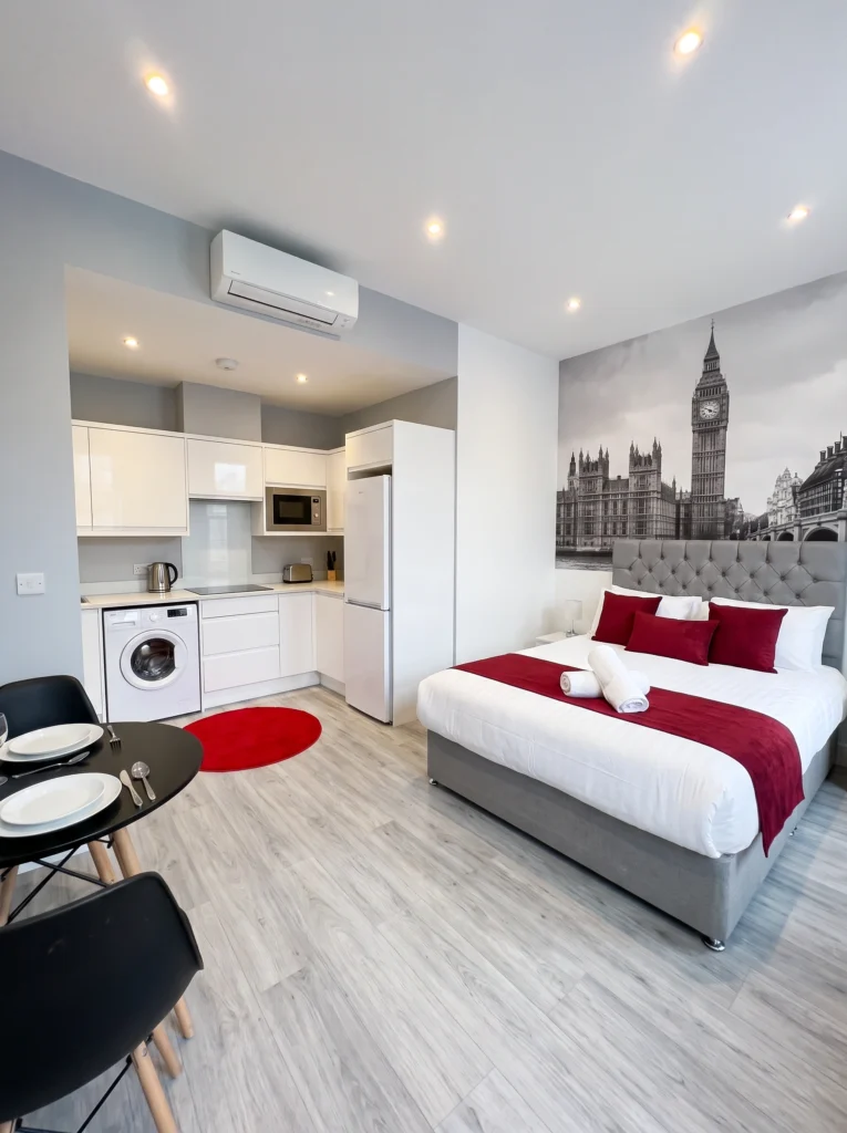
When everything is visible at once, you need a visual anchor — something telling the eye where to rest. A wall mural above the bed transforms the sleeping zone into the room’s centerpiece. Go big or it reads as a poster. This oversized cityscape fills the wall completely, making the bed feel like a destination.
Sofia’s honest take: Removable wallpaper murals exist in every print now. Order a custom size, install in an hour, peel off cleanly when you leave.
7. Contrast Dark Cabinets Against Light Walls
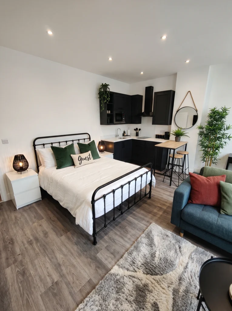
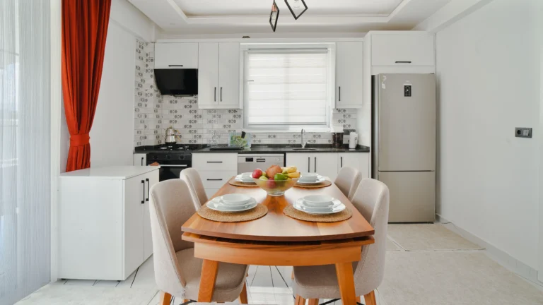
Most small-space advice says go light everywhere. Here’s the thing — dark kitchens in all-white studios look sharp. The contrast creates zone separation without a physical barrier. Black cabinetry reads as deliberate when surrounding walls are bright white. Layer in a few accents — deep green velvet pillows, a dusty teal sofa, a trailing pothos — and the room feels collected, not random.
My tip: Keep the floor light to stop a dark kitchen from feeling like a cave.
8. Go Warm and Neutral for a Gallery-Ready Studio
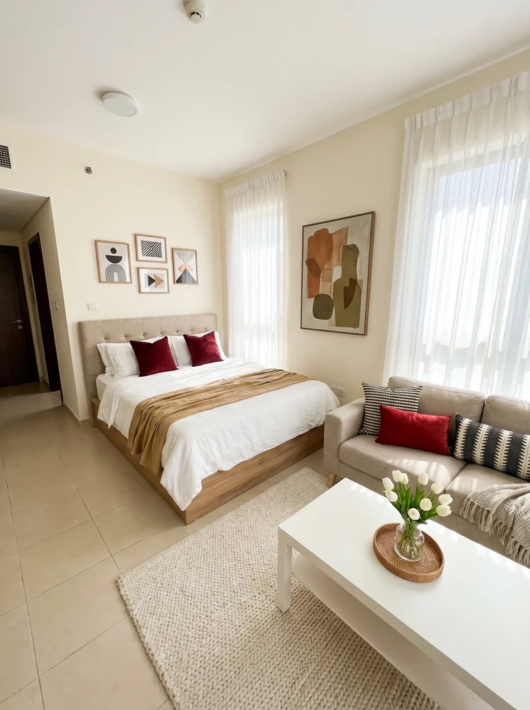
A warm neutral palette — cream walls, linen bedding, oatmeal rugs — makes everything read as one continuous, breathable space. Then use art to add personality. A curated gallery wall above the bed and a single large abstract print by the window give the room two focal points that pull the eye around naturally, making it feel larger than it is.
Don’t waste your money on: Matching art sets from big-box stores. Mix frames and sizes — it looks ten times more intentional.
9. Anchor the Living Zone with a Statement Sofa
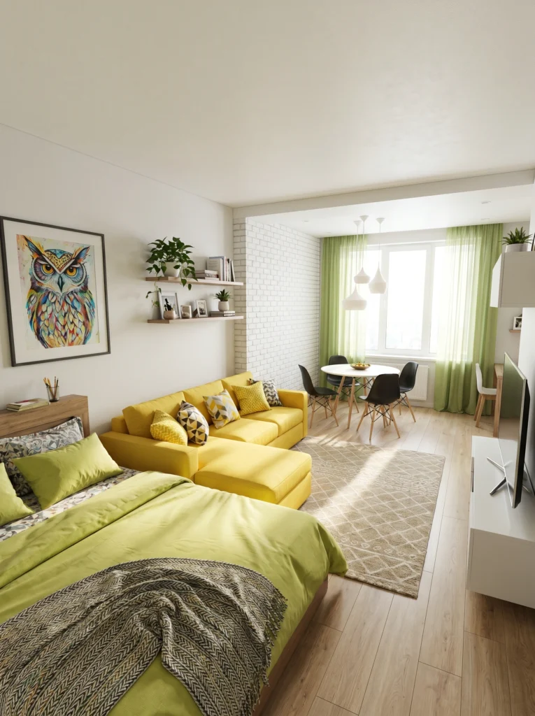
In an open-concept studio, the sofa is the first thing people see — it sets the entire color story. Going bold (mustard yellow, emerald green, terracotta velvet) is almost always the right call. A neutral sofa in a neutral room just reads as beige. A statement piece creates instant definition for the living zone and gives every other piece something to respond to.
My favorite: A sectional with a chaise defines the corner without needing a coffee table, freeing up floor space.
10. Layer Rugs and Textiles to Define Zones Softly
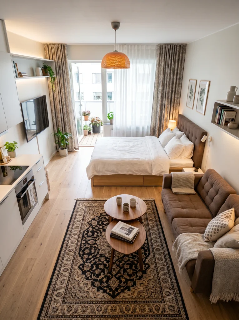
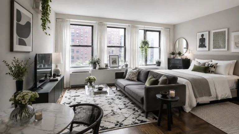
When you can’t build walls, build with texture. A Persian-style rug under the sofa and coffee table creates a defined living room that feels separate from the sleeping zone. Layer in heavy curtains alongside sheers, a woven pendant above the seating area, and a throw on the sofa arm. The space gains warmth and dimension no paint color can manufacture.
Pro tip: One large rug beats two small ones. Multiple small rugs chop up the floor and make the space feel cramped.
10. Carve Out Zones With Rugs, Not Walls
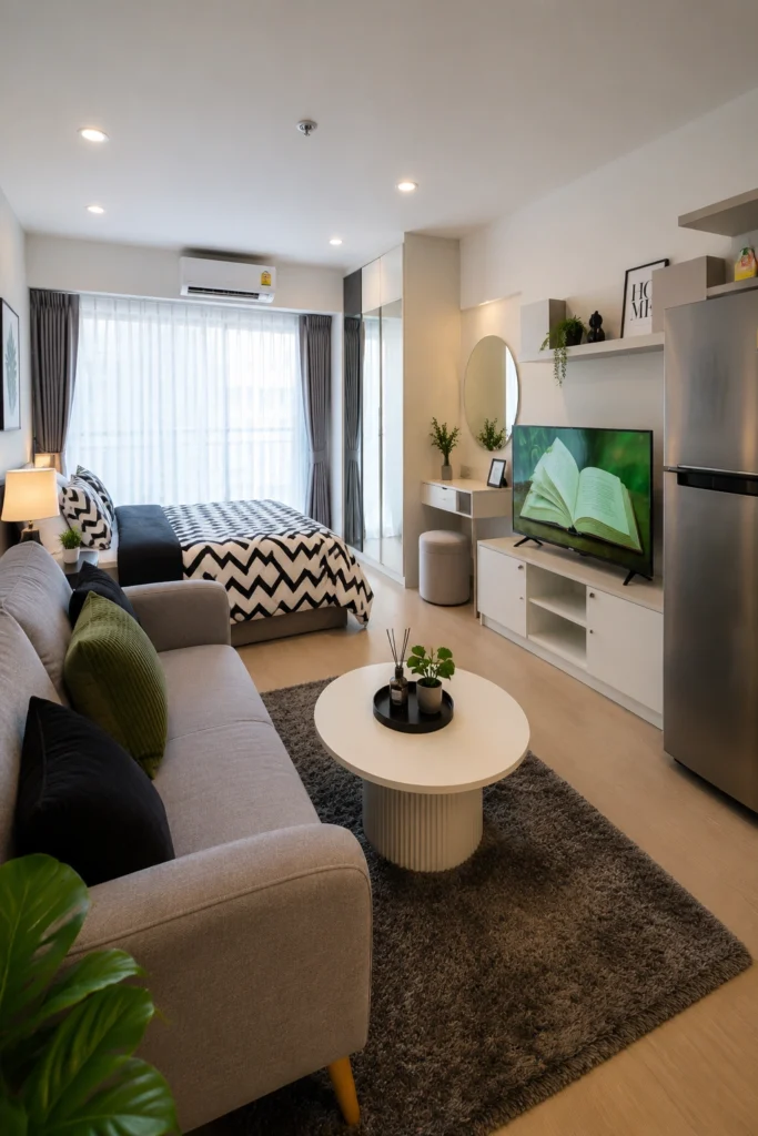
If you only do one thing in a studio, do this. Rugs are the cheapest, easiest, most renter-friendly way to define zones in an open layout. A plush rug under the sofa and coffee table tells your brain “this is the living room.” A different rug, or just bare floor, under the bed tells it “this is where I sleep.” No drywall required.
The rug under the seating area should be big enough that the front legs of the sofa sit on it. Smaller than that and it looks like a bath mat that wandered into the wrong room. Trust me on this one — rug size is the thing most studio dwellers get wrong.
11. Let One Statement Light Fixture Run the Show
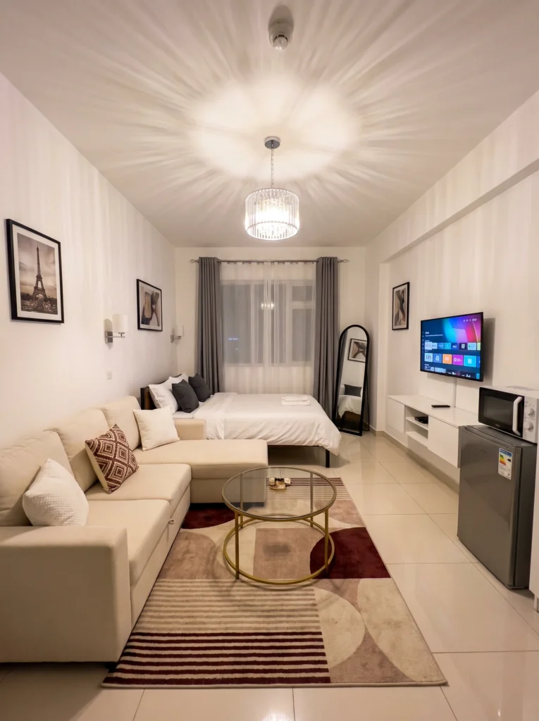
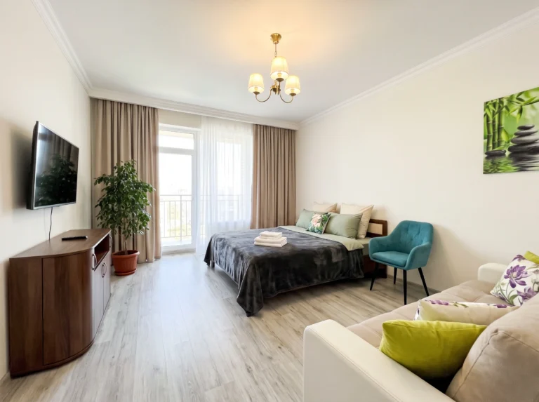
In a long, narrow studio, ceiling lights tend to feel like an afterthought — boring builder-grade fixtures spaced evenly along the ceiling, doing nothing for the mood. One good statement fixture changes the entire room. A chandelier, a sculptural pendant, even a vintage drum shade. It draws the eye up, makes the ceiling feel taller, and gives the space a focal point that isn’t the TV.
In a studio, that statement light works hardest if you hang it over the seating area, not dead center in the room. You want the gathering zone — wherever you actually sit — to feel like the “main room.”
Renter-friendly alternative: Most ceiling fixtures swap out in about 20 minutes with a screwdriver. Keep the original, install yours, swap back when you move out. Game changed.
12. Keep the Palette Tight (Three Colors, Tops)
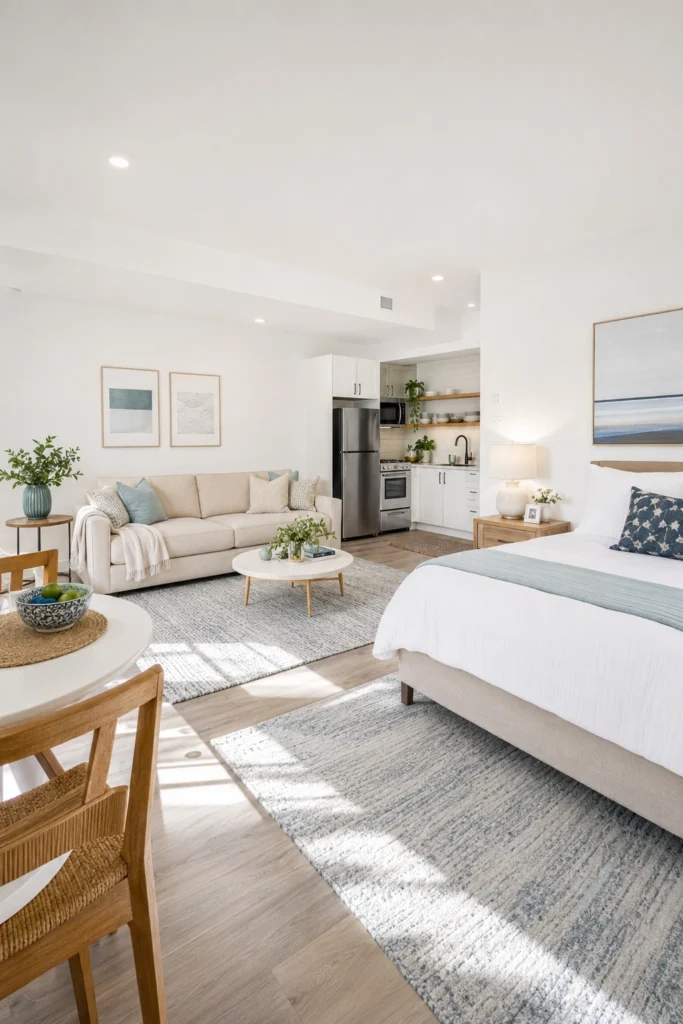
In a small open space, every color you add fights every other color for attention. The result is visual noise — even if each piece is beautiful on its own. The fix is almost embarrassingly simple: pick three colors and stop.
Try a soft neutral base (white, cream, oatmeal), a grounding tone (warm wood, taupe, charcoal), and one accent color you actually love. That’s your palette. Throw pillows, art, bedding, even your dish towels — everything plays inside those three notes.
I’ve watched people spend hundreds on furniture and still hate their space because the colors don’t agree. A free decision (a palette) does more work than a $400 chair.
13. Let One Anchor Piece Do the Heavy Lifting
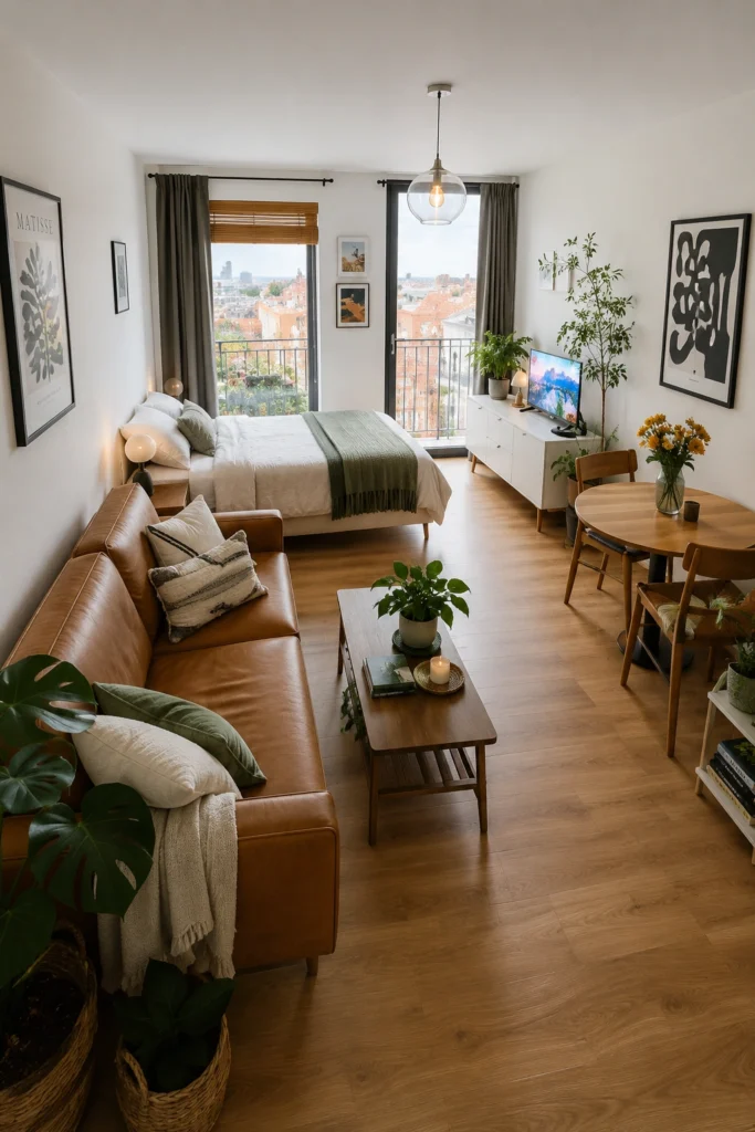
In a studio, you don’t have room for ten statement pieces. You have room for one. So make it count. A caramel leather sofa, a sculptural pendant light, a beautiful vintage table — whatever speaks to you, let it lead and let everything else play backup.
The studio above gets it right. The tan leather sectional is the boss of the room. Everything else — the bed linens, the coffee table, the side chairs — stays quiet and lets the sofa shine.
If you’re shopping right now, put 60% of your furniture budget into one really good piece. The rest can be IKEA, thrifted, or hand-me-down. Nobody will notice.
14. Use the Kitchen Island as a Room Divider
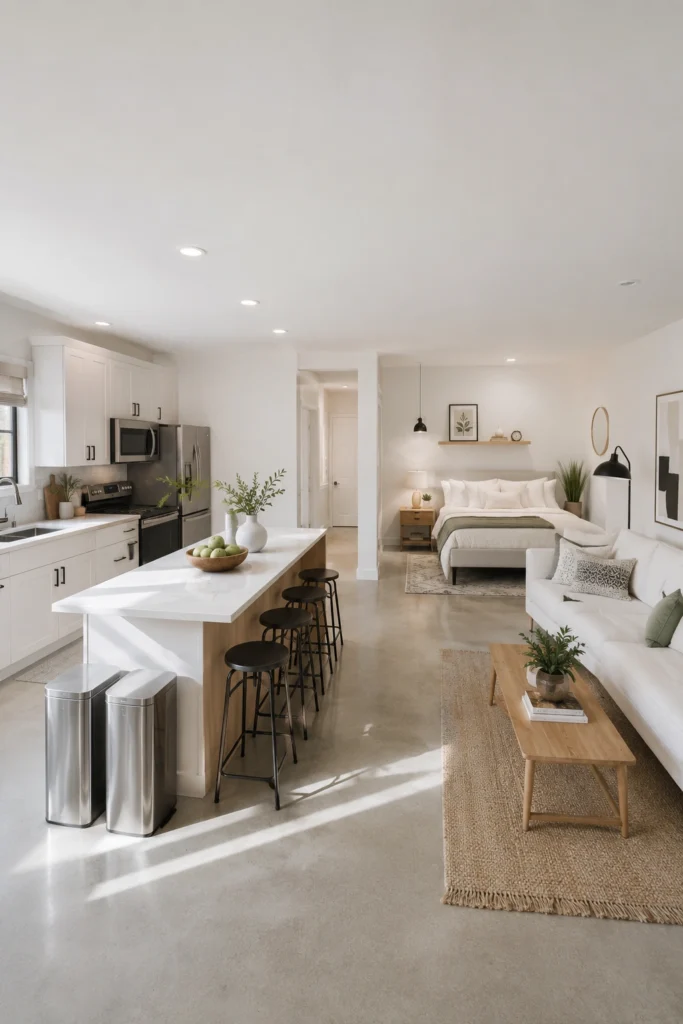
If your studio has a kitchen island, congratulations — you have a free architectural divider, and most people waste it. The island isn’t just for cooking. It’s the soft border between the kitchen and the living zone, and styling it that way makes both areas feel more defined.
A couple of bar stools on the living-room side. A bowl of fruit, a small plant, a stack of cookbooks on top. That’s all you need. Suddenly the island is a peninsula, the kitchen has a clear edge, and the rest of the studio reads as a separate space — without a single wall going up.
15. Choose Furniture That Pulls Double Duty
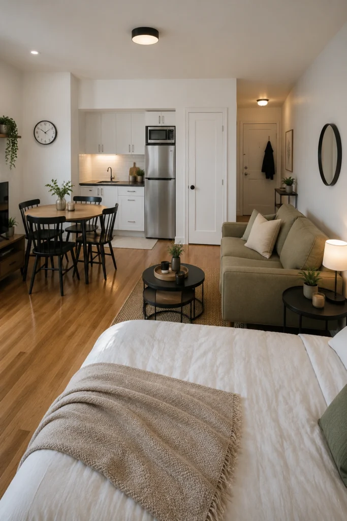
In a studio, every piece of furniture has to earn its rent. A coffee table with hidden storage. A bed frame with drawers underneath. A bench at the foot of the bed that doubles as extra seating when friends come over. An ottoman that’s a footrest, a side table, and a place to stash blankets.
Don’t waste square footage on furniture that only does one thing.
Budget vs. splurge: Save on the dining table (small and simple is fine). Splurge on a really good storage bed — you’ll use the storage every single day, and a wobbly frame will drive you crazy within a month.
16. Hang Art at the Right Height (Lower Than You Think)
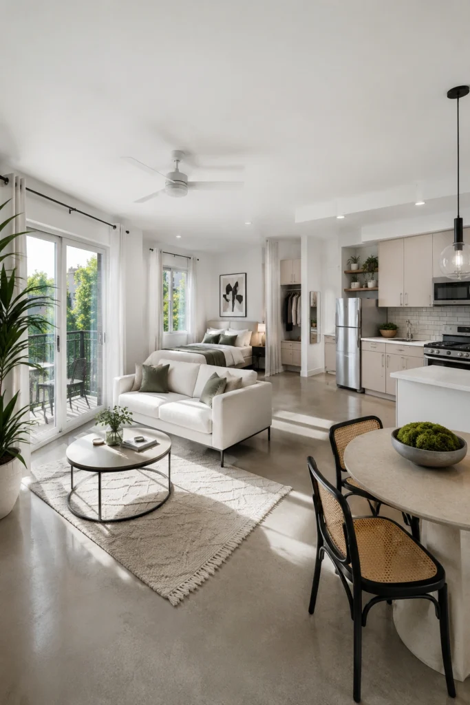
This is the part most people skip, and it’s exactly why their walls feel off. Art should be hung so the center of the piece sits at roughly eye level — about 57 to 60 inches from the floor. Most people hang it way too high, leaving a sad gap of empty wall between the top of the sofa and the bottom of the frame.
In a studio, art also helps zone the space. A big piece over the bed says bedroom. A pair of smaller framed prints over the sofa says living room. Even though they share the same four walls, the art tells your eye where you are.
17. Edit Ruthlessly, Then Edit Again
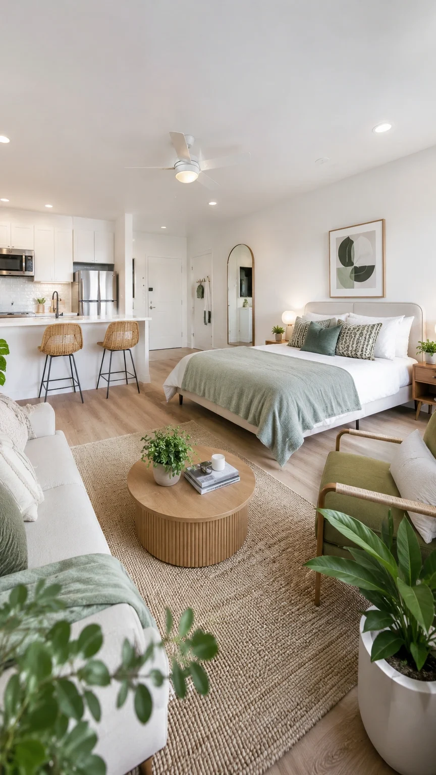
Here’s the secret nobody talks about: the best-looking studios aren’t the ones with the most stuff. They’re the ones where someone made hard choices about what not to keep.
Walk around your studio with a basket. Anything that doesn’t have a home, doesn’t get used, or doesn’t make you happy goes in the basket. Donate, sell, or store what’s inside it. Do this once a season.
In an open-concept space, clutter has nowhere to hide. Every surface is on display. Less stuff isn’t a minimalist aesthetic — it’s just survival.
Your home should make you happy, not impressed strangers. In a studio, that means choosing carefully and letting the room breathe.
Final Thoughts
A studio apartment isn’t a starter space you have to “make do” with. With the right choices — layered lighting, defined zones, a tight palette, and a little ruthless editing — it can be one of the most personal, well-edited homes you’ll ever live in.
Pick one idea from this list. Just one. Try it this weekend. You’ll feel the difference, and once you do, the rest will follow naturally.
The smallest homes, done with care, can hold the biggest lives.
— Sadik Sofia
Image credits: All photos courtesy of the author’s personal collection.