17 Studio Apartment Home Office Ideas Without Sacrificing Living Space
You need a real workspace. You also need a couch that doesn’t double as your desk chair. In a studio apartment, both feel like competing demands — but they don’t have to be. The trick isn’t finding more space. It’s being smarter about the space you already have. Here are 17 ideas that prove you can work and live well in the same room.
1. Use a Bookshelf to Divide Your Desk from the Living Zone
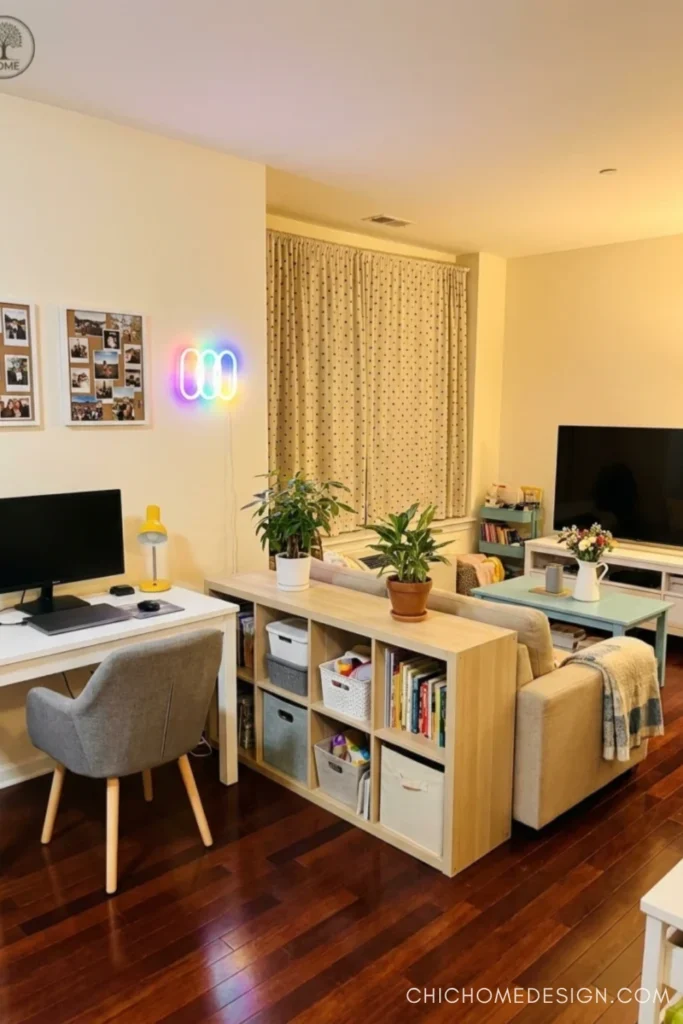
A low cube bookshelf behind the sofa does two things at once: it separates your work zone from your relaxing zone and gives you built-in storage. This setup keeps the visual line clear — when you’re on the couch, you’re not staring at your monitor. Tuck fabric bins on the lower cubes to hide clutter, and top the shelf with a plant or two to soften the divide. Functional and surprisingly polished.
2. Go Aerial — The Bird’s-Eye Layout That Actually Works
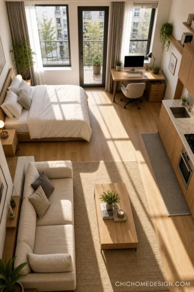
Before you buy a single piece of furniture, sketch your layout from above. The best studio setups hug the walls with functional zones — sleeping here, seating there, desk tucked near natural light. This aerial-friendly arrangement keeps the center of the room open, which is what makes a small space feel breathable instead of suffocating. The desk near the window works because natural light makes long work sessions infinitely more bearable.
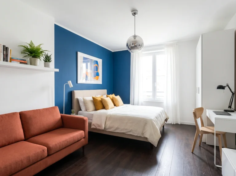
3. Lean Into Color Zoning — The Green Wall Trick
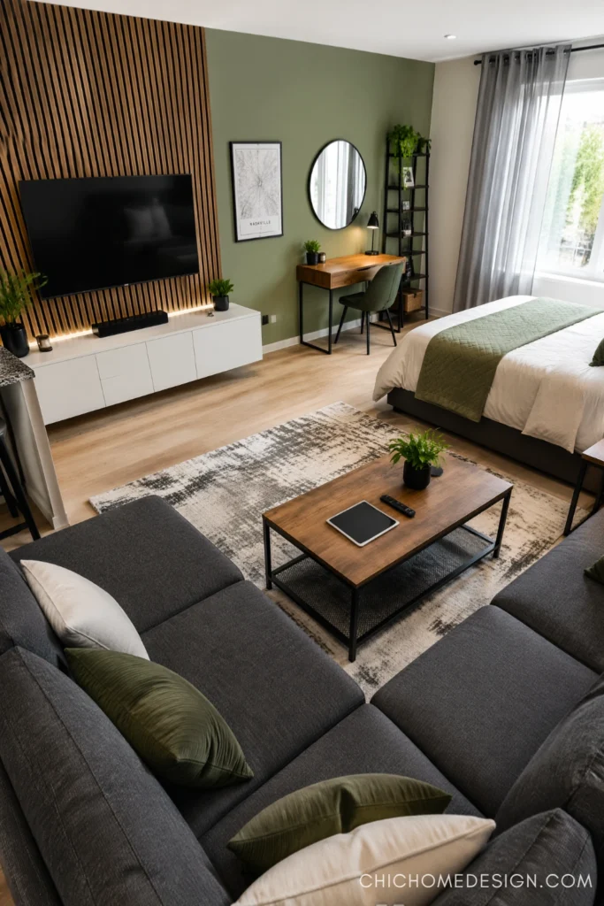
Here’s the thing — you don’t need walls to create separate zones. A single painted accent wall does the job. In this setup, sage green signals “this is the bedroom-slash-workspace,” while the rest of the room reads as living space. The wood slat TV panel anchors the living area visually. Two distinct areas, zero construction. A bold rug can do the same work if you’re renting and can’t paint.
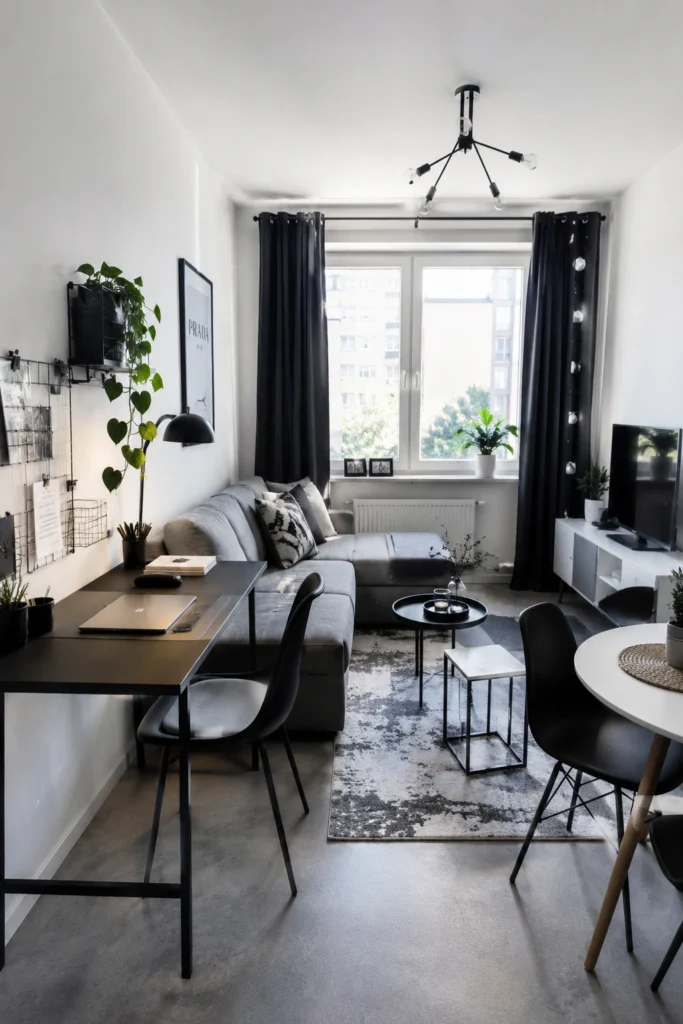
4. The Long Narrow Room Deserves a Dedicated Work End
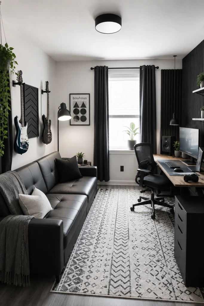
Narrow rooms have a secret advantage: the far end naturally becomes its own zone. Anchor a desk at the window end where the light is best, and let the seating float in the middle. Black on white keeps everything visually tight — no color confusion about what’s workspace and what’s downtime. Wall-mounted guitar storage is a bonus touch here: personal, space-saving, and far more interesting than a blank wall.
5. The Minimalist Shelf-Plus-Desk Setup
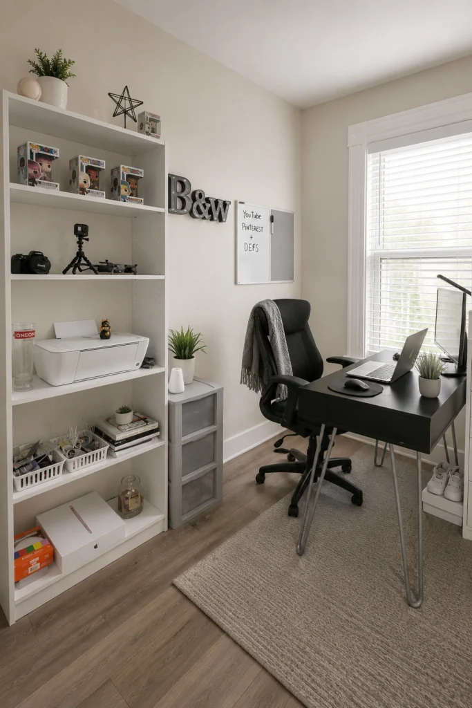
If you’ve only got a corner to spare, this is the move. A floor-to-ceiling bookshelf next to a simple desk creates a compact, organized workspace that looks intentional rather than improvised.
Pro tip: mix functional items (printer, supplies) with a few personal ones (collectibles, a small plant) on the shelves — it stops the space from feeling sterile. The hairpin desk legs keep it light and open, which matters in a tight room.
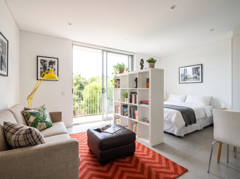
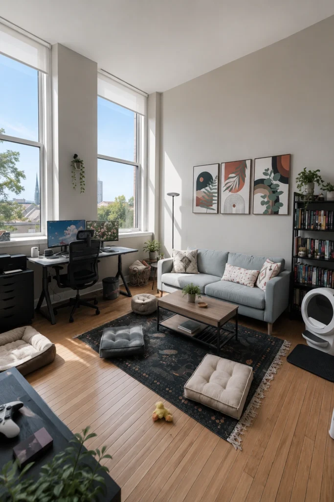
6. The Shelf Room Divider — Your Best Rental Trick
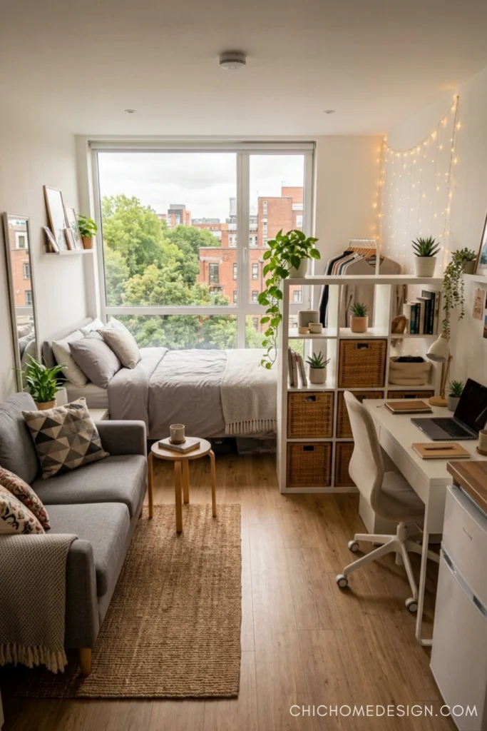
An open cube shelf positioned perpendicular to the wall is the renter’s answer to permanent walls. It creates visual separation without blocking light, doubles as storage on both sides, and comes apart if you ever move. String lights draped above add warmth without any drilling. This setup in particular shows how the sleeping zone, desk zone, and sitting zone can all coexist in a single compact room — all three feel distinct without ever feeling cramped.
7. The Statement Rug That Anchors Your Living Zone
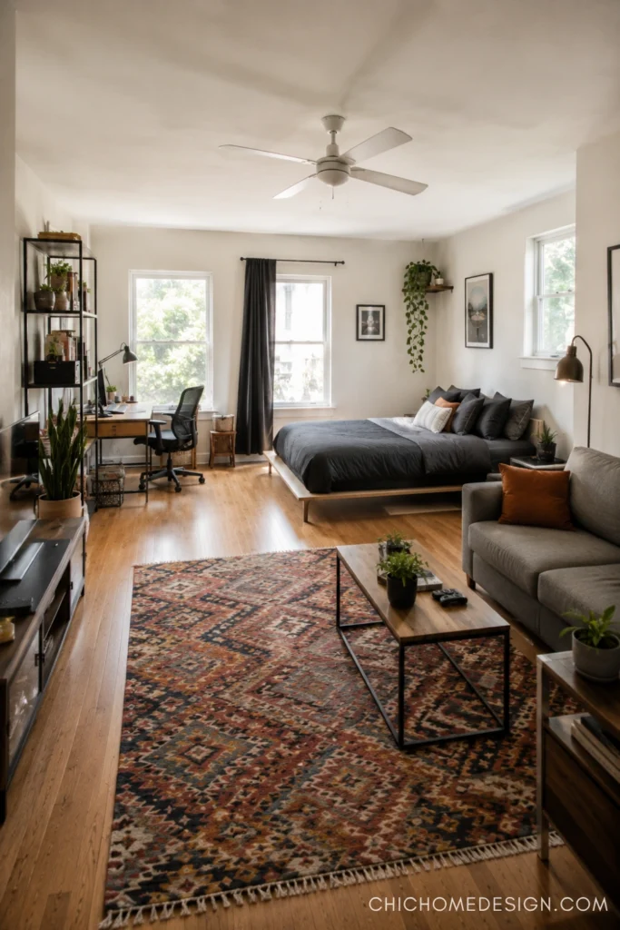
A large, bold rug is one of the most powerful zoning tools you have — especially in an open studio. Here, an earthy Kilim-style rug immediately tells you: this is the living space. Everything outside that rug is a separate zone. Your eyes read it as two rooms even though the walls say one. Keep the desk and bed on the perimeter, and let the rug define the social center. Don’t underestimate what a single textile can do for a floor plan.
8. Two Zones, One Window — The Smart Shared-Light Setup
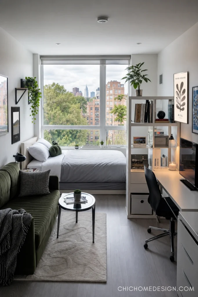
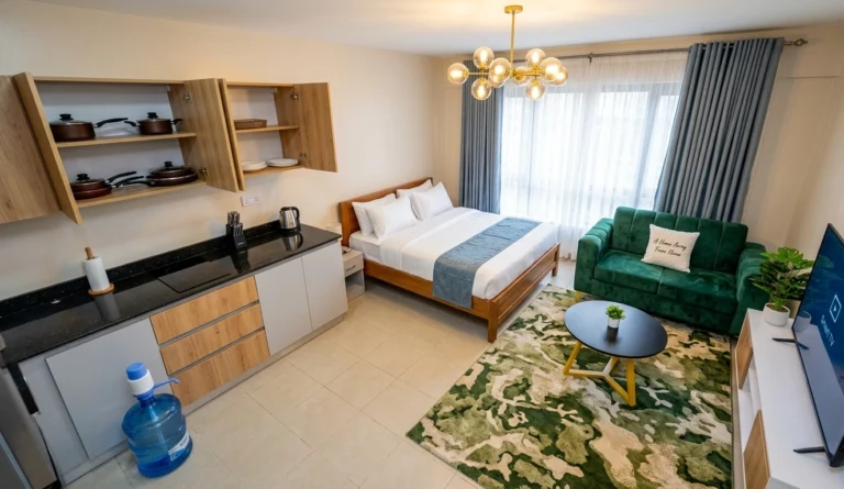
When you’ve got one good window, don’t waste it on just one zone. This layout puts the bed facing the window for morning light, and slides the desk alongside — both get natural light, neither blocks the other. The open shelf between them creates a soft boundary while keeping books, art, and plants accessible from both sides. A velvet green sofa pulls the look together without crowding the floor plan. Tight, intentional, and very liveable.
9. The Bright Spare Room That Does Double Duty
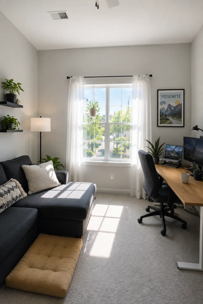
Not everyone has a true studio — some have a spare bedroom that needs to function as both office and hangout. The rule here is simple: let natural light be the design anchor. Sheer white curtains flood the room, keeping it from ever feeling like a cave. Add a sofa or sectional for the lounge half, a clean desk for the work half, and hang a few floating shelves with plants to fill the vertical space. The result is a room that genuinely serves two purposes without feeling compromised.
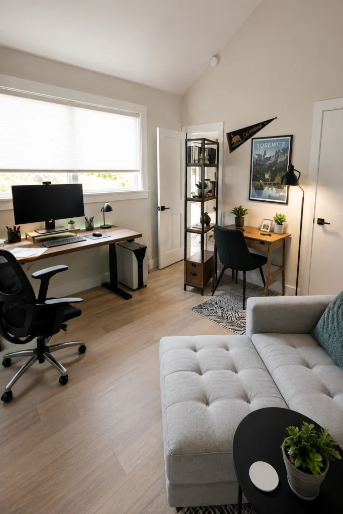
10. High Ceilings, Double Function — Make the Volume Work
High ceilings are free real estate most people ignore. Use them: tall bookshelves, statement art hung high, a floor lamp that reaches upward. In this space, the floor-to-ceiling windows do most of the heavy lifting — the room breathes because of the vertical height, even with a full desk setup, sofa, and extra seating on the floor.
floor cushions are genuinely underrated for small spaces. Stack them against the wall when not in use, pull them out when people come over.
11. The Two-Desk Room — When You Work and Create
Sometimes one desk isn’t enough. If you work from home and have a creative hobby or side project, two separate workstations can share a room without chaos — as long as they anchor different walls. Keep them visually distinct: one ergonomic and functional (standing desk, monitor), one smaller and more personal (writing desk, lamp, a few meaningful objects). The sofa in the center acts as a neutral transition. This room works because nothing is competing — everything has a designated place.
12. The Bright Studio That Fits Everything Without Trying Too Hard
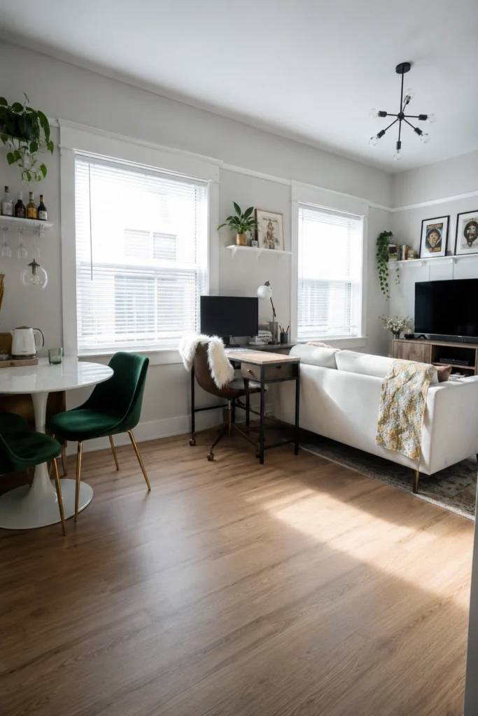
This room pulls off something most small apartments can’t: dining, working, and lounging in a single open space that still feels airy. The secret is restraint — a compact round dining table, a small desk tucked between windows rather than pushed against a wall, and a neutral sofa that doesn’t dominate. Everything gets natural light. Nothing competes.
Pro tip: round tables take up less visual space than rectangular ones in tight rooms. Worth the switch if you’re working with limited square footage.
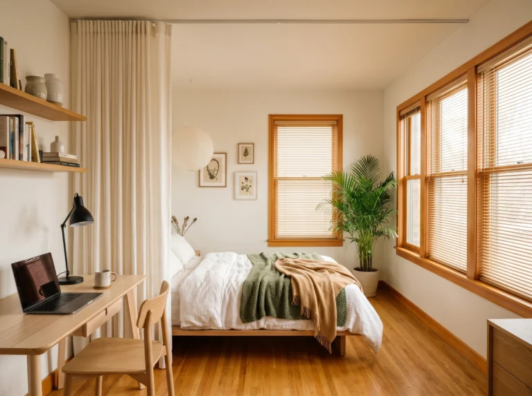
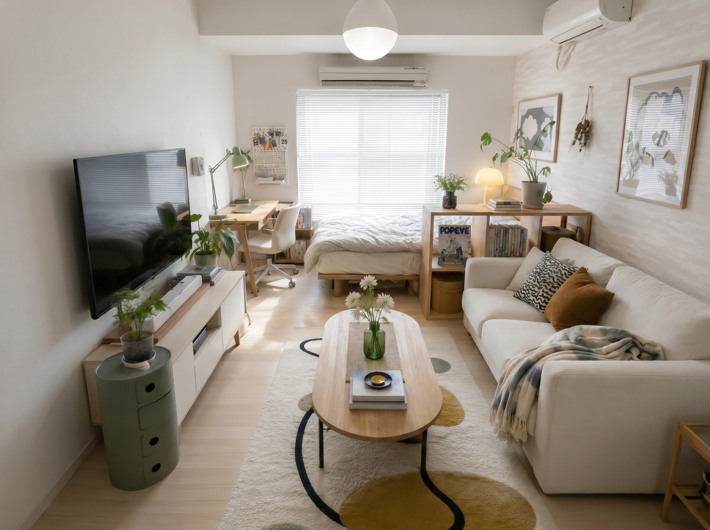
13. The Japanese-Inspired Small Space That Nails It
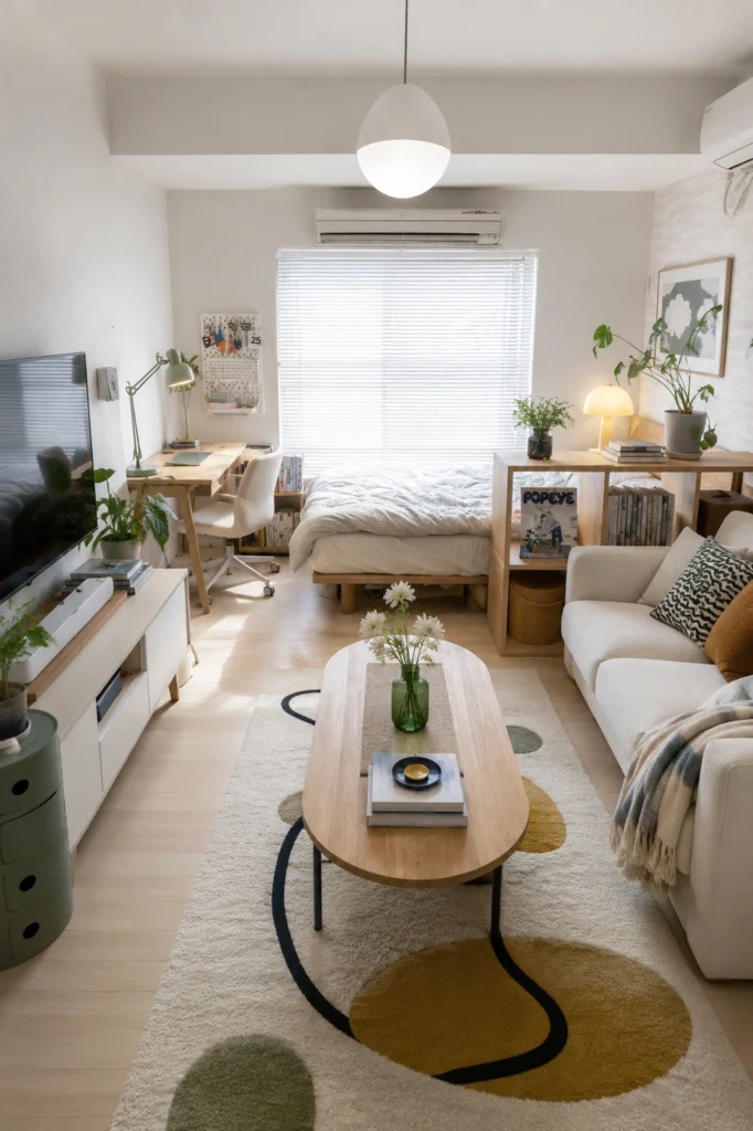
This is what Muji would look like if it moved into a 350-square-foot apartment and actually lived there. Pale wood tones throughout, a statement rug that grounds the seating area, and a low platform bed tucked toward the back — everything intentional, nothing extra. The desk near the window is compact but fully functional. What makes it work is the consistency of materials: wood, white, soft green from the plants. One cohesive palette in a small space creates calm instead of clutter.
14. The Monochrome Studio That Punches Above Its Weight
Black, white, and a dramatic Sputnik ceiling light. That’s the whole mood here, and it absolutely works. Committing to a tight monochrome palette in a tiny space is a bold move, but it creates a sense of cohesion that makes the room feel designed — not assembled. The dark sectional would typically “shrink” a small room, but the white walls and high contrast keep it feeling open. If you’re going dark, go all in. Half-measures are what actually make rooms feel small.
15. The Lived-In Studio That Got It Right
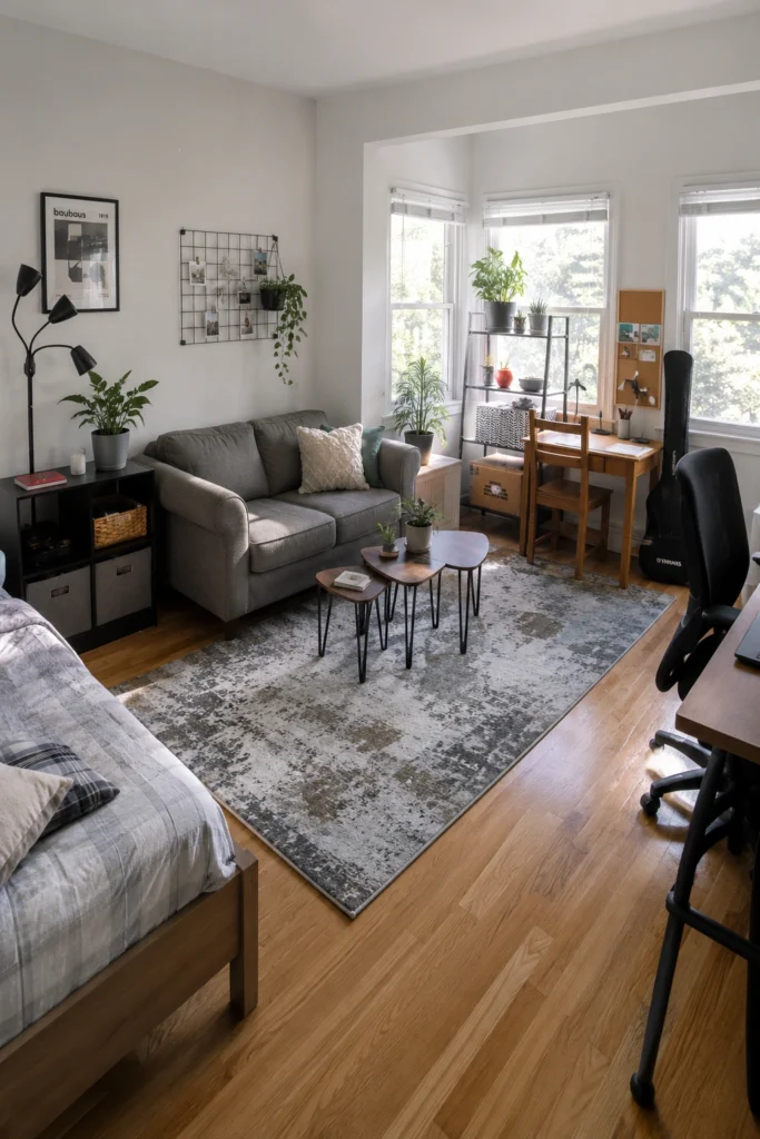
This one’s for the people who feel like their space is “too casual” to be worth decorating. It isn’t. This studio has a mismatched desk, a wire grid wall organizer, nesting coffee tables, and approximately seven plants — and it looks great. Because it looks lived in. The key is plants (they add life to anything), natural light, and a rug that ties the seating zone together. You don’t need to start over. Sometimes you just need to lean harder into what you already have.
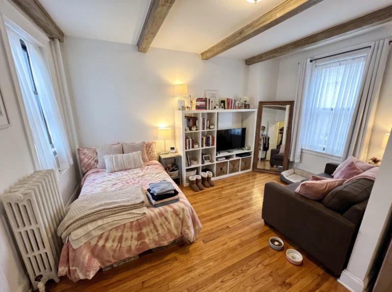
16. The NYC Brick Wall Studio — Personality at Full Volume
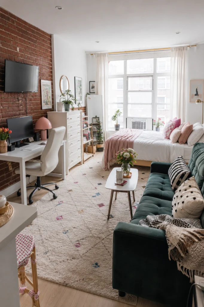
Not every studio comes with exposed brick, but if yours does — lead with it. This apartment makes the brick the entire focal point of the work side: TV mounted on it, desk beside it, warm dome lamp casting light against the texture. The rest of the room is deliberately soft: pink bedding, a white Moroccan rug, trailing plants in baskets. Hard and soft, dark and light. When a space has architectural character, the furniture’s job is to frame it — not compete with it.
17. The Evening Studio — When the Work Day Is Done
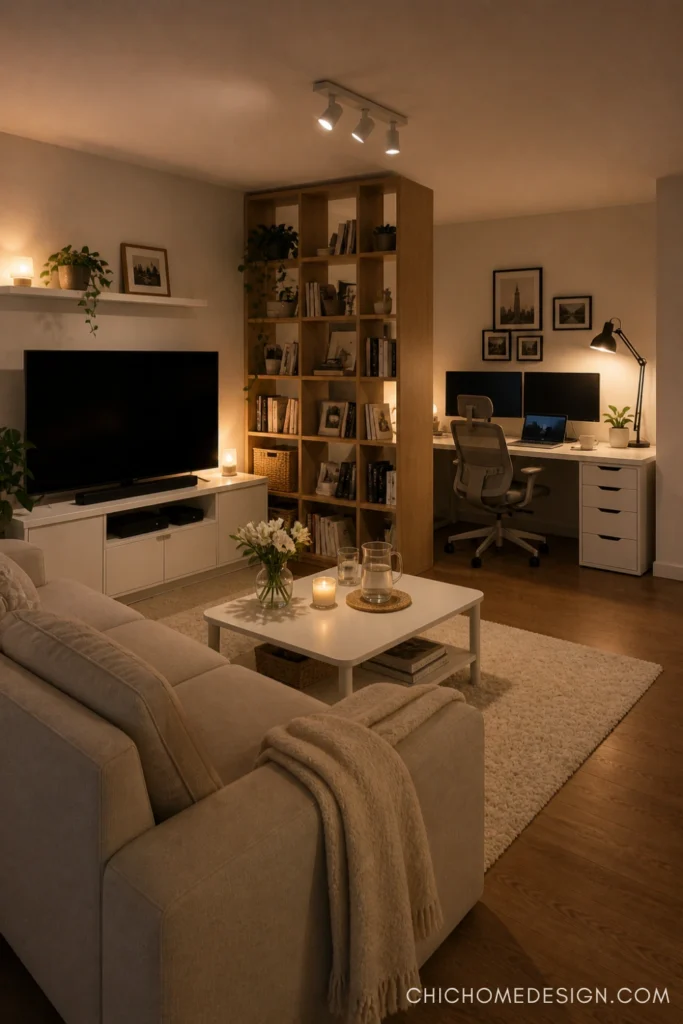
The best thing about a well-designed studio? It looks completely different at night — and that’s a feature, not an accident. Warm candlelight on the coffee table, a glowing desk lamp tucked behind the bookshelf divider, track lighting angled just right. The workspace is still there, but it recedes. The living space comes forward. This is what layered lighting does: it lets one room serve two very different needs depending on the hour. Get your lighting right, and your studio apartment will feel twice its size.
Final Thoughts
A studio apartment doesn’t ask you to choose between working well and living well — it just asks you to be a little more deliberate about both. The 17 spaces here all prove the same thing: zones don’t require walls, storage doesn’t have to be ugly, and a well-placed lamp can change everything.
Pick one idea from this list. Just one. Try it this weekend. Once you feel the difference a single intentional change makes, the rest gets easier.
Your home is where you work, rest, and actually live your life — it deserves to do all three well.
Happy decorating, — Sofia