How to Pick a Cozy Color Palette for Your Studio Apartment
Here’s the thing about color in a studio apartment — it’s the fastest way to make a small space feel like yours. Not staged, not stark, not another beige rental. The right palette can make 400 square feet feel warm, calm, or wildly cheerful, depending on what you’re after. And you don’t need to repaint everything to pull it off.
Here are 12 cozy color palettes I keep coming back to, each pulled from a real studio.
1. Warm Orange and Fresh Green on a Neutral Canvas
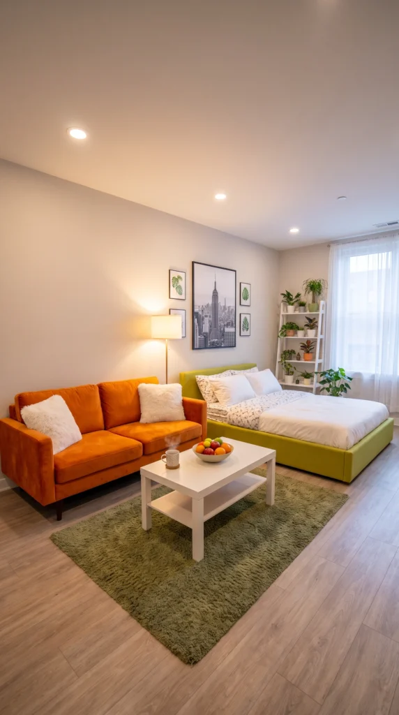
This palette works because the walls stay quiet while the furniture does the talking. An orange velvet sofa and a lime-green upholstered bed sound bold on paper, but grounded by soft grey walls and warm wood floors, they read as playful, not chaotic. The olive shag rug ties both bright tones back to earth. It’s a palette that says the person here has personality — and isn’t apologizing for it.
Pro tip: Pick your two bold colors first, then choose a rug that contains a muted version of both. That’s the piece that makes everything else feel intentional.
2. Head-to-Toe Sunshine Yellow
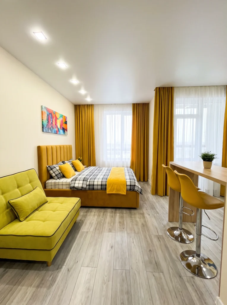
Monochromatic palettes are the sneaky trick for making a studio feel cohesive. Here, mustard curtains, a chartreuse chaise, a golden headboard, and matching bar stools all live in the same yellow family — but each in a slightly different shade. The result feels intentional instead of matchy. Cream walls and pale wood floors keep it from tipping into overwhelming. If yellow makes you happy, don’t be shy about committing.
Sofia’s honest take: Monochromatic doesn’t mean identical. If everything is the exact same yellow, the room will feel flat. Vary your shades — one mustard, one chartreuse, one honey — and the whole palette suddenly has depth.
3. Dusty Rose with Chocolate Brown Grounding
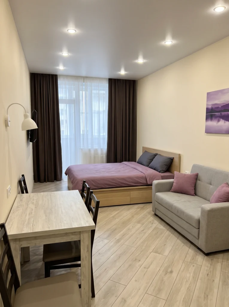
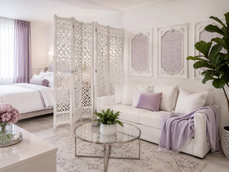
Soft mauve bedding, blush pink accents, and cream walls could easily feel too sweet — until you add rich brown curtains. That deep chocolate tone anchors everything and keeps the palette from floating away. Pale honey wood floors bridge the two. It’s a grown-up pink, the kind that works in a rental because you’re layering fabric and art, not painting walls. Cozy without ever crossing into cutesy.
My tip: If a pastel palette feels too soft, add one dark neutral — brown, forest green, or black. That single deep tone will do more grounding work than a whole gallery wall.
4. Buttery Cream with Cherry Red Pops
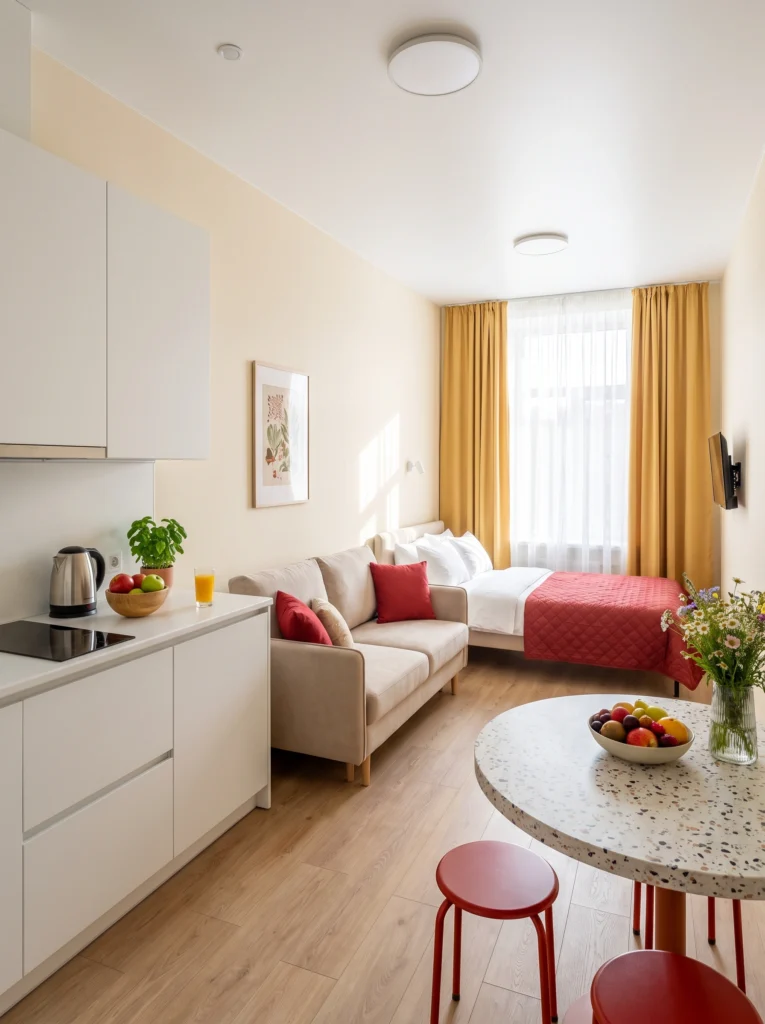
Cream walls, mustard curtains, and warm wood create a soft glow, and then cherry red pillows and a matching bedspread wake the whole room up. The red stools by the terrazzo table repeat the accent color, so nothing feels random. This palette proves you don’t need cool tones to make a small kitchen area feel bright — you just need warm hues that talk to each other from every corner.
My favorite: Repeating one accent color at least three times around the room. Red pillows, red bedspread, red stools — your eye connects the dots and the palette suddenly reads as designed.
5. Coral and Deep Blue Complementary Balance
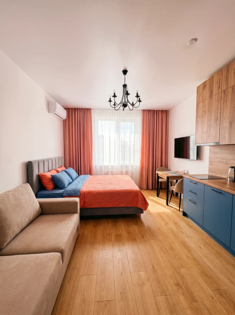
Coral curtains and a matching bedspread bring instant warmth, while the deep navy kitchen cabinets and blue accent pillows keep it from feeling one-note. Cream walls and light wood floors give the eye somewhere to rest between the two saturated colors. It’s a complementary pairing — warm and cool sitting across the color wheel — and it works because both tones are equally strong. Neither wins, and that’s the point.
Budget vs. splurge: Splurge on the anchor pieces you’ll keep for years — the bed frame, the sofa. Save on the coral throws and pillows, since you’ll want to swap them out when a new palette calls.
6. Botanical Greens with Rich Dark Wood
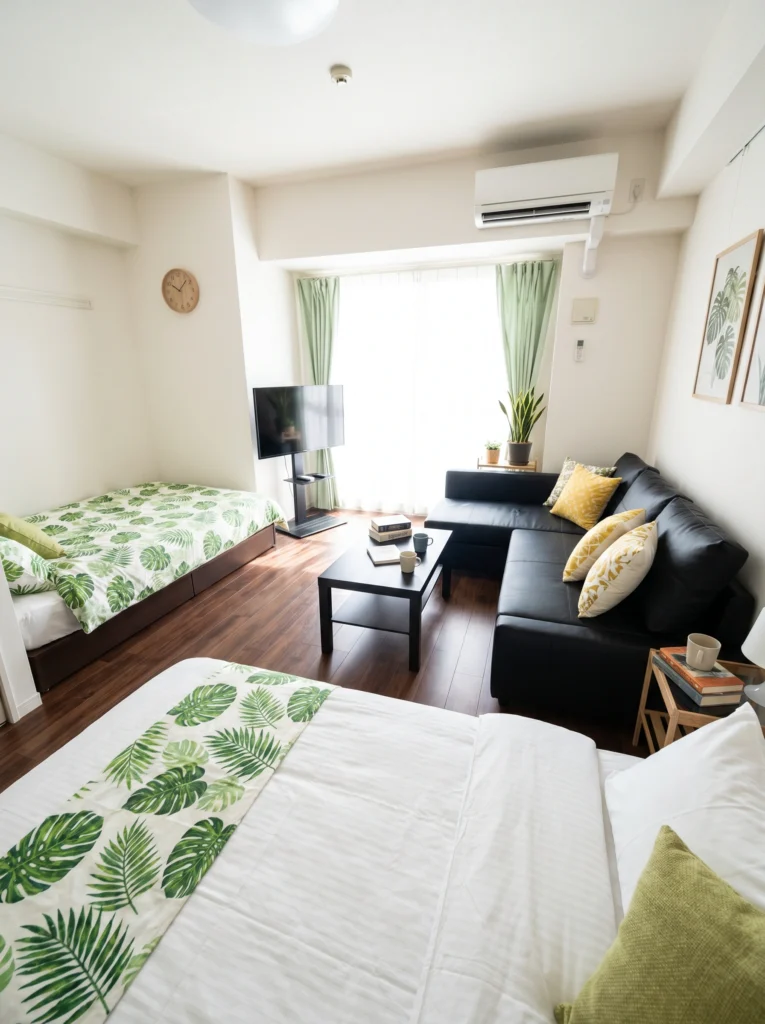
White walls, dark walnut floors, and black leather furniture form the neutral backbone here. The greens do all the emotional work: leafy bedding, a live snake plant, framed monstera prints. Mustard pillows add just enough contrast to keep it from feeling like a jungle. It’s a palette that pulls the outside in without going full tropical — botanical calm with real grounding. Perfect if you want restful, not sleepy.
Renter-friendly alternative: Can’t afford to swap floors or furniture? Get the same botanical vibe with peel-and-stick leaf wallpaper on one accent wall and a few real plants — the palette still lands.
7. Blush Pink Monochromatic with Gold Details
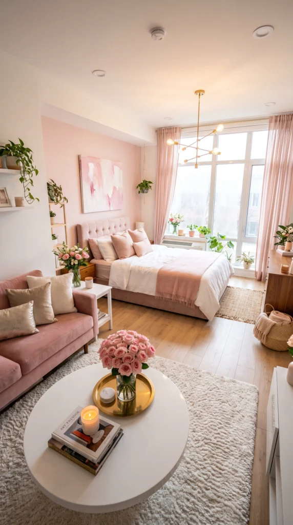
Layering multiple shades of pink — from dusty rose sofa to blush bedding to pale wall paint — creates depth instead of monotony. Gold accents in the light fixture and coffee tray add just enough shine to feel curated, not saccharine. Warm wood floors and cream throws break up the pink so it reads as considered, not costume-y. This is the palette for anyone who’s always secretly loved pink.
I’ve tested this: Gold is the metal that plays nicest with pink. Silver can go cold and rose gold competes with the pink itself. A little brushed gold — one fixture, one tray — is all it takes.
8. Butter Cream with Terracotta and Sage
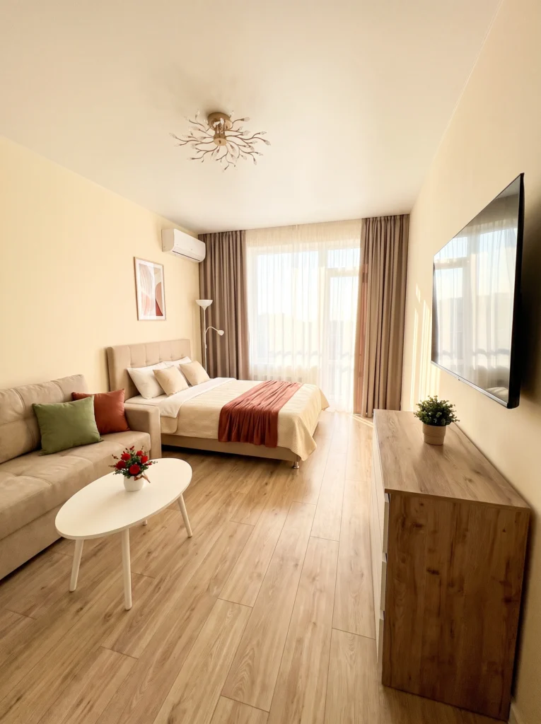
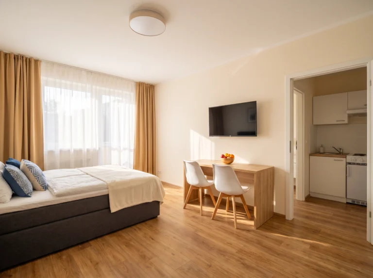
Warm butter walls set a soft, sunlit tone from the start. A beige sofa keeps things quiet, and then terracotta throws and a small sage green pillow bring in that earthy contrast. It’s a nature-inspired palette — think autumn leaves and sunbaked clay — but softened for indoor living. Great for renters, since the color comes entirely from textiles you can swap out any time the mood shifts.
Don’t waste your money on: A fully painted terracotta accent wall. Textiles give you the same warm color story for a fraction of the cost — and your landlord won’t send you an email about it.
9. Turquoise and Mustard Yellow Retro Pop

Bright turquoise curtains and a matching sofa play against mustard yellow bedding and accent pillows. It’s a bold retro combo that could feel loud in a bigger room, but in a compact studio the tight color story actually pulls everything together. Cream walls and light wood floors soften the contrast. Add plants for a little green relief between the two dominant colors — that’s what keeps it feeling fresh.
Pro tip: When you commit to two saturated colors, stop there. Adding a third bold shade will tip the whole room into chaos. Keep everything else — walls, floors, wood tones — quiet and neutral.
10. Mustard, Rust, and Warm Neutrals
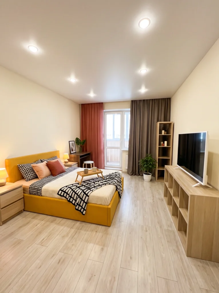
A mustard upholstered bed frame becomes the anchor here, echoed by a rust-colored curtain on one side and a cooler grey curtain on the other. The black-and-white checkered throw adds graphic contrast without introducing a new color. Everything else — walls, floors, bookshelf — stays in the warm neutral family. It’s a palette that feels lived-in and grounded, the kind of room you actually want to nap in on a Sunday.
Sofia’s honest take: Two different curtain colors on the same window wall feels chaotic in a big living room, but in a tight studio it reads as intentional zoning — one side sleep, one side lounge. Weirdly, it works.
11. Turquoise on Warm Beige
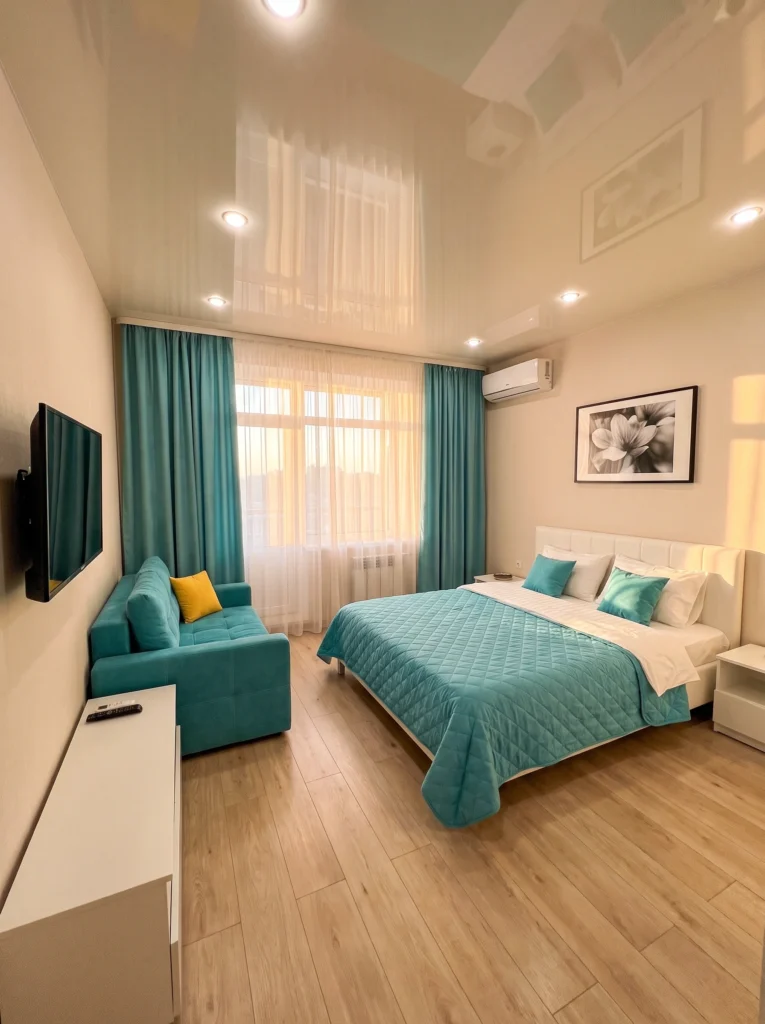
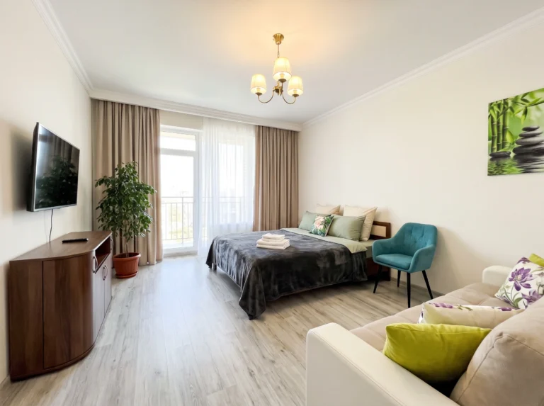
When you want one bold color to lead, this is how you do it. Turquoise shows up in the curtains, the sofa, the bedding, and the accent pillows — repeated four times across the room. Cream walls and warm oak floors keep it from feeling cold. A single mustard pillow adds just enough warmth to balance the coolness. Coastal calm without any beach clichés — no seashells required.
My favorite: Pairing a cool color like turquoise with warm wood floors instead of cool grey ones. The wood adds the coziness the palette would otherwise lack. It’s the whole difference between spa-cold and just-right.
12. Orange and Teal Eclectic Rainbow
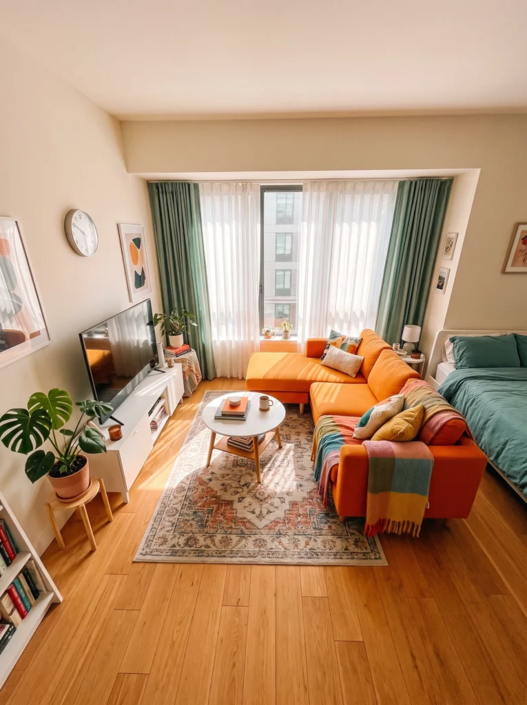
This is a palette for people who don’t want to pick just one color. Orange sofa, teal bedding and curtains, plus a rainbow throw that ties in every accent shade in the room. The warm wood floors and cream walls give the eye a place to breathe between the pops of color. A vintage-style rug pulls the whole scheme down to earth. Bold, cheerful, and unapologetically personal.
Renter-friendly alternative: Not ready to commit to a colorful sofa? Get a neutral one and drape a rainbow throw across it. Add colorful pillows. Same palette energy, zero long-term commitment.
Final Thoughts
The best studio palette isn’t the trendiest one — it’s the one that matches how you actually want to feel when you walk through the door. Some people need calm. Others need color. Both are valid. Pick two or three shades you love, repeat them across your textiles, and let your walls stay quiet. That’s really the whole trick. Start with one throw pillow or one curtain panel. You can build from there.
Your studio should feel like a hug, not a showroom.