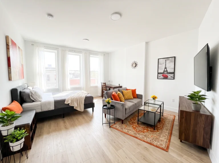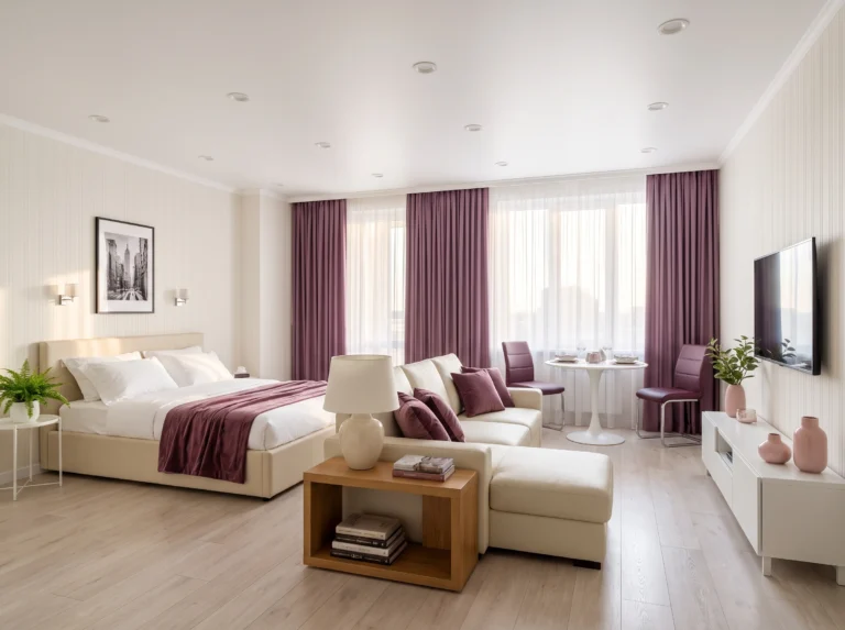
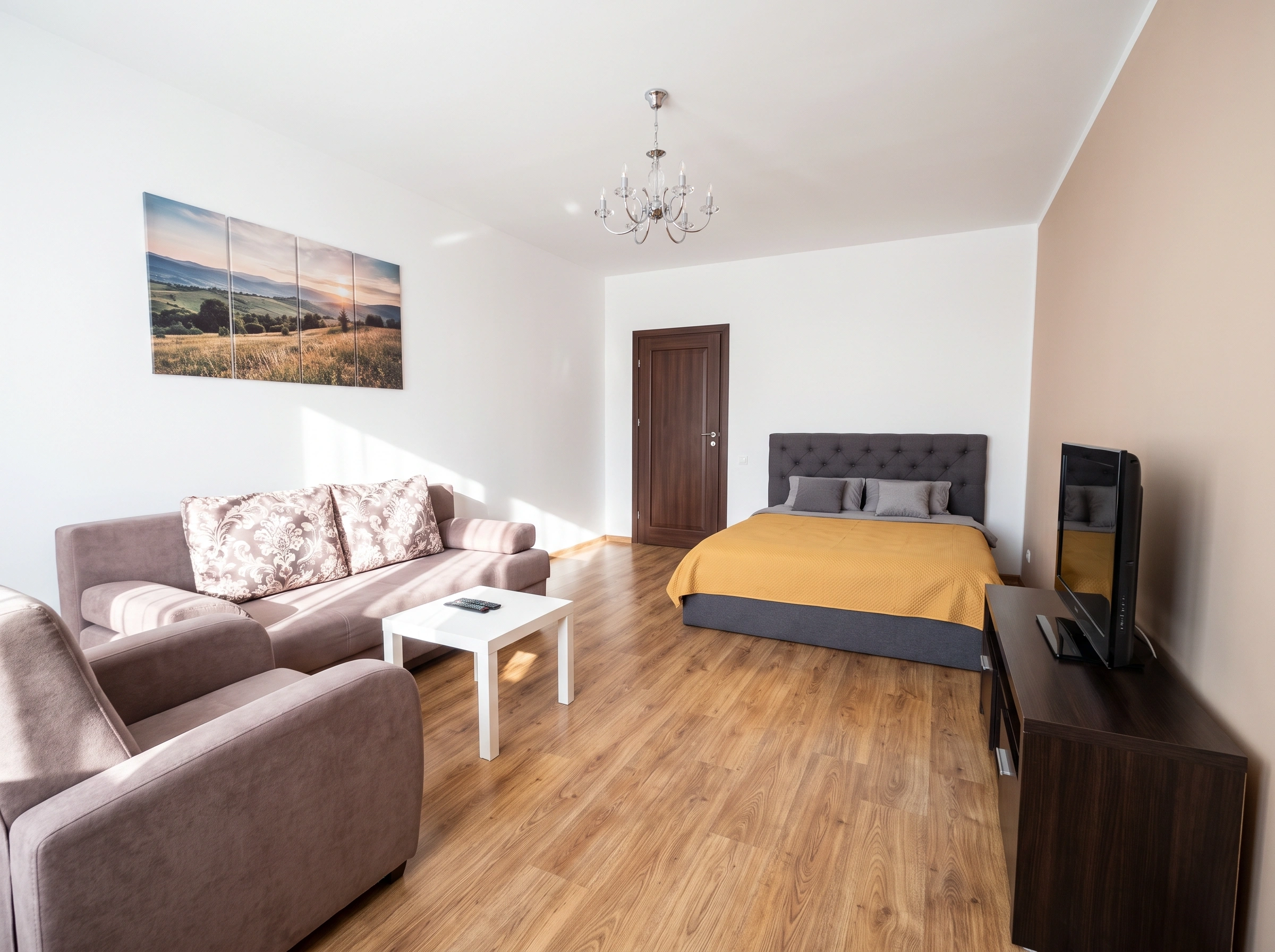
9 Clever Tiny studio Apartment Layout Ideas Designers Swear By
Tiny studio apartments get a bad reputation they don’t deserve. Yes, square footage is tight. No, that doesn’t mean your home has to feel like a glorified hallway. Here’s the thing — the people who make small spaces sing aren’t working with more space, they’re working with smarter layouts. I’ve lived in (and helped friends rescue) enough tiny apartments to know exactly which moves actually pay off, and which Pinterest tricks fall flat the second real life moves in.
These nine layouts are the ones designers keep coming back to. Steal whichever one fits your floor plan.
1. Go Bold With Color to Define Each Zone
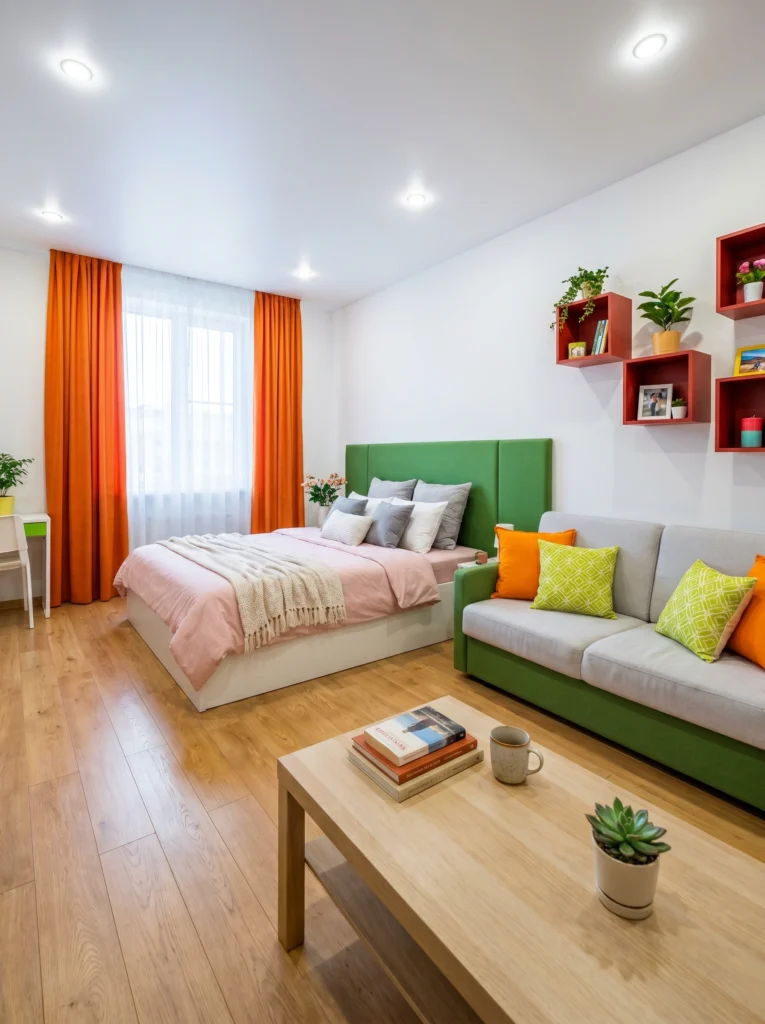
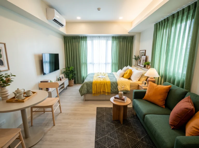
Color is the cheapest room divider you’ll ever use. In this studio, a hunter green headboard signals “this is the bedroom,” while vibrant orange curtains frame the window like a visual full stop. The red cube shelves carve out a display nook without taking up any floor space. You don’t need walls to define zones — just intentional color placement.
Pro tip: Pick one anchor color per zone and repeat it at least twice to make it feel deliberate, not accidental.
2. Let a Neutral Base Do the Heavy Lifting
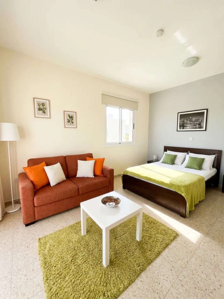
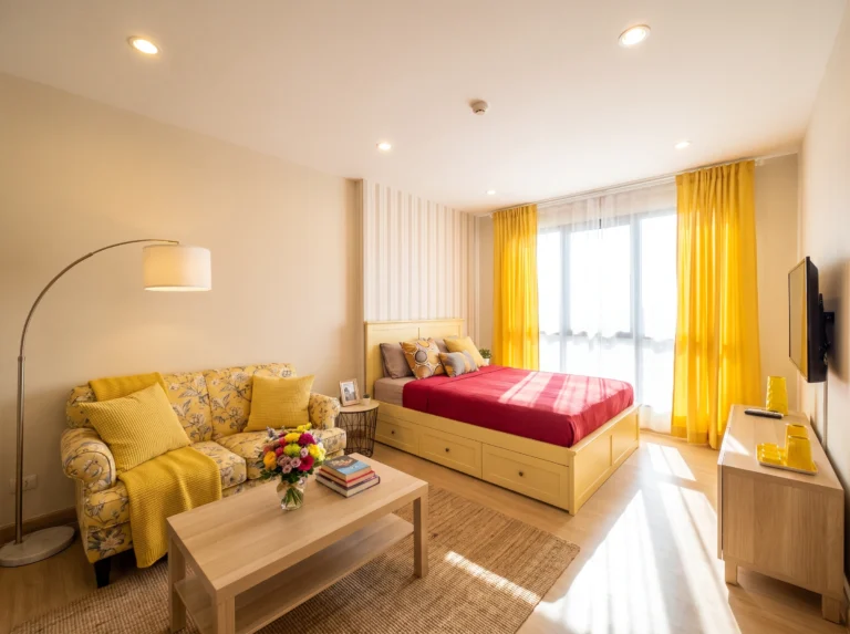
A warm cream or beige backdrop lets every furniture piece breathe. Here, a rust-colored sofa and dark walnut bed frame sit comfortably side by side — they look intentional together precisely because the walls and floor stay calm. The chartreuse rug anchors the living area without competing. This is the “quiet foundation, loud character” approach. It works every single time.
Sofia’s honest take: Neutral doesn’t mean boring. It means your furniture gets to be the personality.
3. Place Your Sofa Next to the Bed, Not Across From It
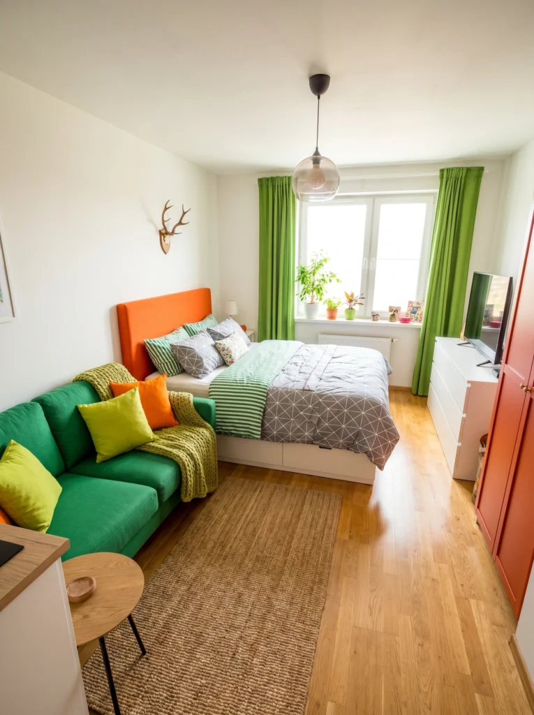
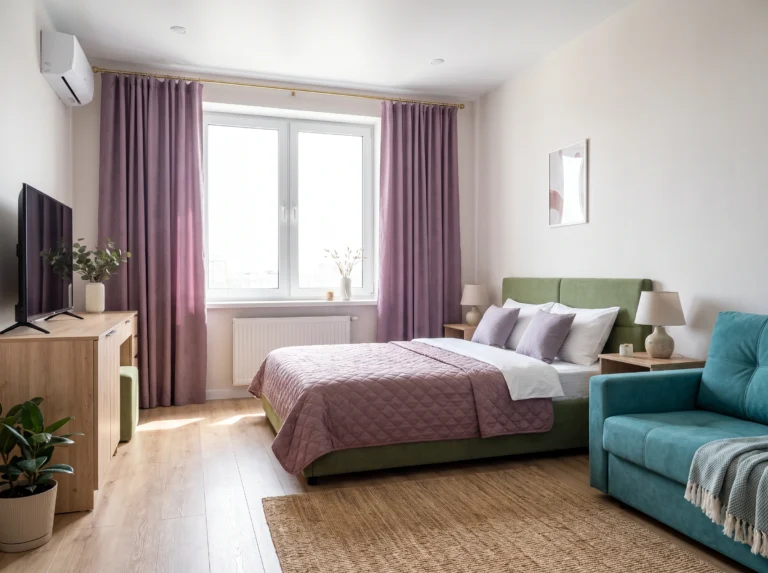
Most people put the sofa on the opposite wall from the bed. Designers don’t. Pushing them side-by-side along one wall opens the center of the room completely — you suddenly have real walkable space. A jute rug under the sofa marks the lounge territory, and floor-to-ceiling curtains draw the eye up, making the ceiling feel higher. Pendant light overhead ties both zones together.
My tip: This layout works especially well in long, narrow studios where facing furniture would eat every inch.
4. Use a Bookshelf as Your Room Divider
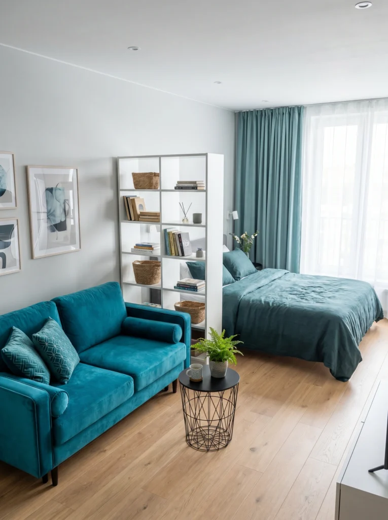
A tall open bookshelf — like an IKEA Kallax or Billy — does what a wall can’t: it divides without darkening. You get visual separation, storage, and a display surface all in one piece. Matching the sofa and bedding in the same teal here makes both zones feel connected rather than competing. The shelves themselves hold woven baskets, books, and a reed diffuser — functional and styled.
Renter-friendly alternative: No drilling needed. Just position the shelf perpendicular to the bed and let gravity do the work.
5. Keep the Layout Minimal, Let the Window Work
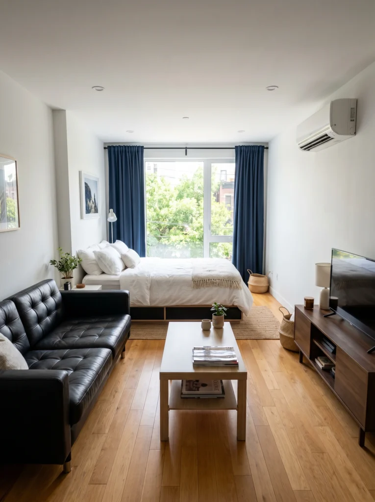
When in doubt, edit. This studio pulls off an impressive amount of function — sleeping, lounging, storage, and TV — by keeping furniture low and away from the window. The floor-to-ceiling navy curtains anchor the bedroom zone. A simple jute rug and wood-shelf media console are all the living area needs. The uncluttered floor makes the space feel twice its actual size.
Don’t waste your money on: bulky coffee tables. A low, slim one like this lets the jute rug do the visual grounding instead.
6. Anchor the Room With Art Above the Bed
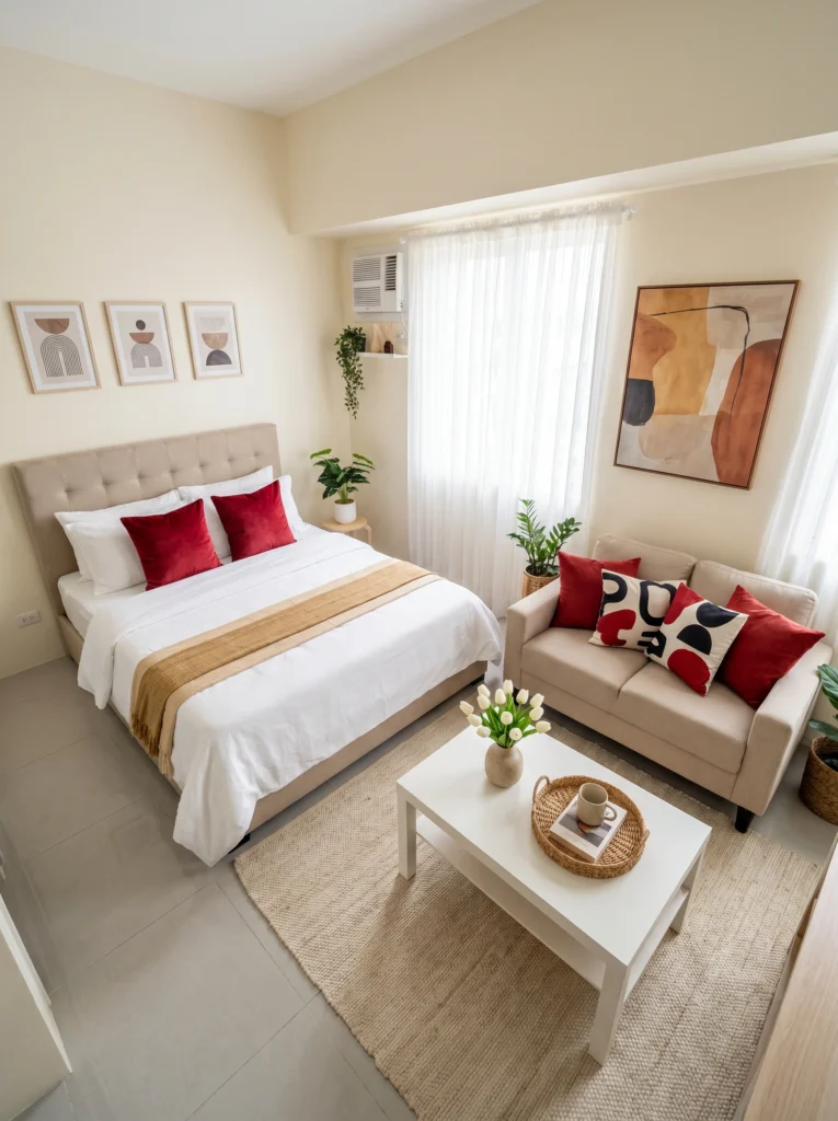
In a studio, the wall above the bed is prime real estate. A triptych of framed abstract prints — hung low and close together — brings the eye inward and gives the sleeping zone a focused, intentional feel. Red cushions on both the bed and sofa tie the two areas together without a physical barrier. A jute rug, tulips on the coffee table: small but specific details that make the whole room feel curated.
My favorite: Abstract geometric prints from Society6 or Desenio look expensive for under $30 each.
7. Let Furniture Placement Draw the Invisible Line
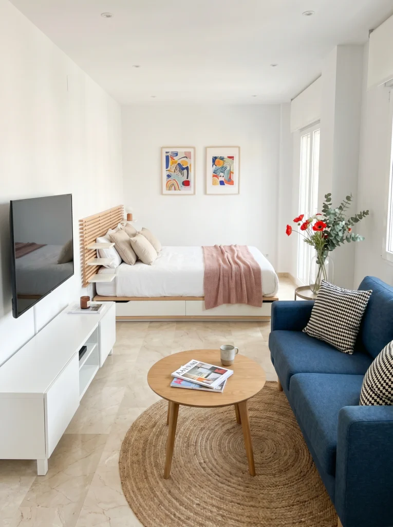
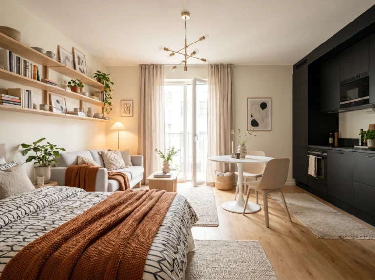
No dividers, no curtains, no shelves — just furniture angles. The bed faces one direction, the sofa faces another, and a round jute rug marks the center of the lounge zone. Two colorful art prints float above the headboard, giving the bedroom its own identity. This layout feels open and gallery-like, which is exactly what all-white studios need: a sense of curated calm, not bare emptiness.
Budget vs. splurge: Save on rugs (IKEA Sindal, $49). Splurge on one statement art print that anchors the bedroom wall.
8. Build In Every Zone You Need — Even in a Tiny Footprint
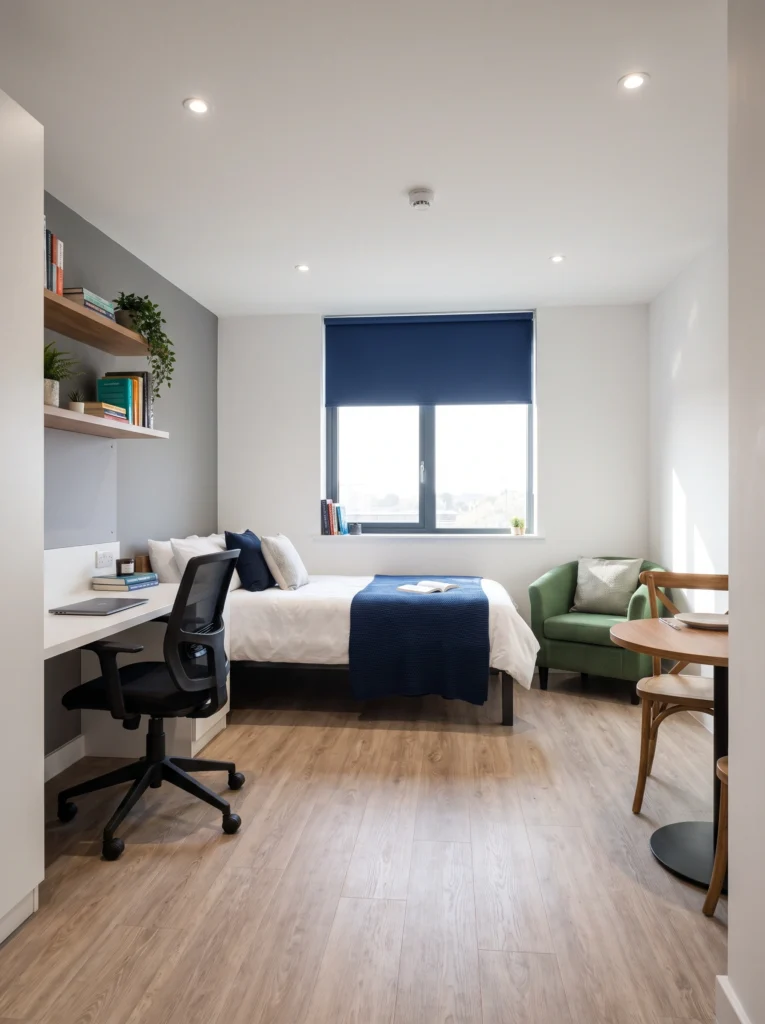
This studio fits four distinct zones: sleeping, working, lounging, and dining. The secret? Everything is compact and purpose-built. A wall-mounted desk and floating wall shelves replace a freestanding bookcase. A petite green armchair substitutes for a full sofa. A small round dining table tucks into the corner. When every piece is right-sized, you stop feeling cramped and start feeling clever.
I’ve tested this: A 24-inch floating desk is genuinely enough for a laptop and notebook. You don’t need more surface — you need better cable management.
9. Carve Out Three Mini-Zones in One Studio
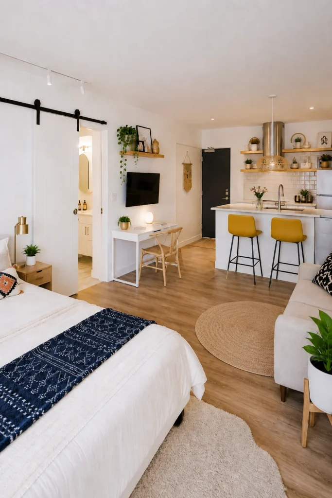
A studio doesn’t have to mean “everything piles into one corner.” With smart placement, you can fit a sleeping zone, a working zone, a tiny living area, and a kitchen — and have all of them feel intentional. The trick is giving each zone one anchor: the bed has a nightstand and lamp, the desk has its own chair and light, the living area has a small round rug. Each zone gets defined by what it has, not by walls.
My favorite move here: the barn door on the bathroom. Saves serious floor space versus a swing door.
Final Thoughts
Tiny apartments aren’t a design problem to solve — they’re a creative constraint, and the best layouts come from people who stopped wishing for more space and started getting smarter with what they have. Pick the idea from this list that matches your floor plan. Try just one move this weekend — float the sofa, swap the rug, push the sectional against the long wall. You’ll feel the difference the second you walk in.
Your apartment doesn’t need to be bigger. It needs to be braver.
— Sadik Sofia