15 Wall Art Ideas for Anyone Living in a Studio Apartment
When you’re living in a studio, your walls are doing double duty — they’re your only real canvas for personality. The right piece of art can define zones, add depth, and make a 400-square-foot box feel like a space with actual character. The wrong piece? It just collects dust and makes the room feel smaller.
Here are 15 wall art ideas that actually work in tight quarters, with real examples to prove it.
1. Make a Statement with a Large-Scale Portrait
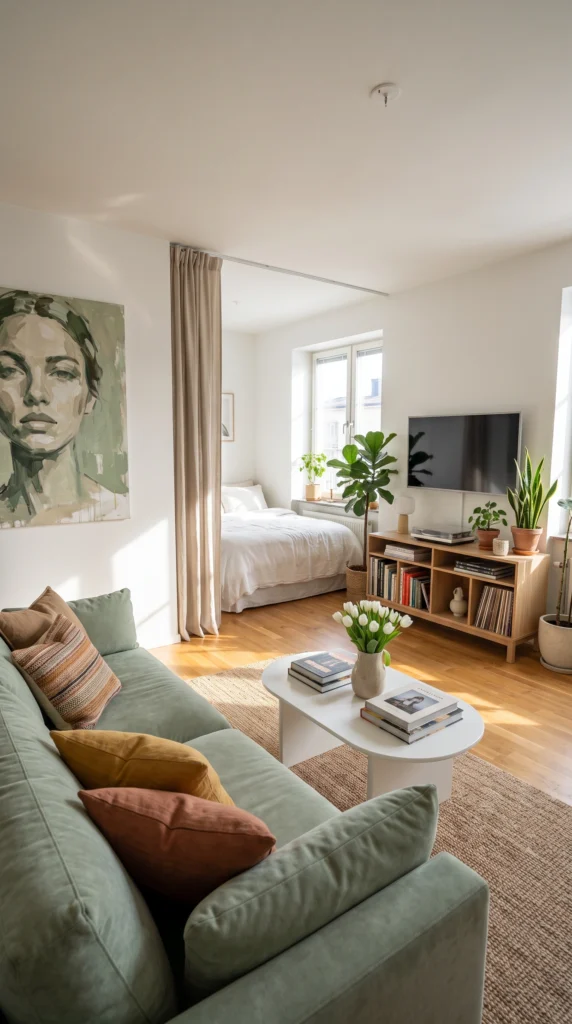
A single oversized portrait does more for a studio than a dozen small frames ever could. This abstract face painting anchors the living side of the room and gives the eye something bold to land on. You don’t need gallery-level art — canvas prints from places like Society6 or even a local artist market work beautifully. Go big, keep the frame simple, and let it breathe.
Pro tip: Hang large art slightly lower than you think. Eye level in a studio means closer to sofa height, not standing height.
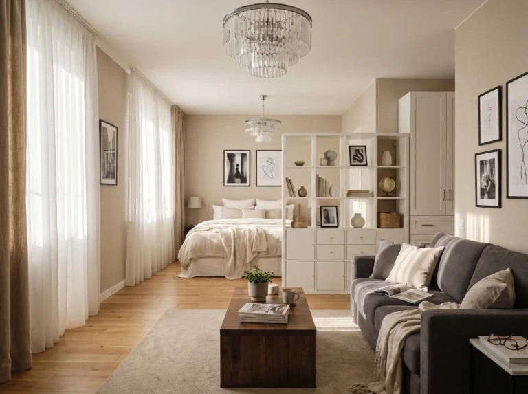
2. Use Framed Photography as a Focal Point
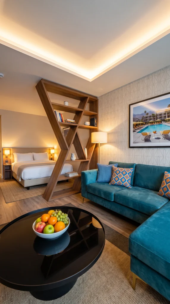
A well-chosen photograph can set the entire mood of your studio. This framed pool-scene print turns a compact space into something that feels curated and intentional. Travel photography, architecture shots, or black-and-white cityscapes all work — the key is picking one image that tells a story. Frame it in something substantial so it reads as art, not a vacation snapshot taped to the wall.
Sofia’s honest take: Skip the multi-photo collage in a studio. One strong image beats five mediocre ones every time.
3. Keep It Clean with Minimalist Abstract Prints
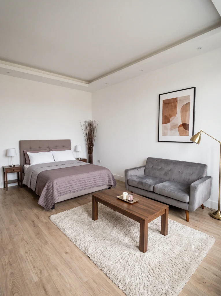
If your studio already has a lot going on — furniture, textures, life — a quiet abstract print gives the room room to breathe. Earth tones like terracotta, sand, and muted olive work especially well because they warm up white walls without competing with everything else. This style pairs perfectly with minimal furniture and lets the space feel calm rather than cluttered.
My tip: Stick to prints with no more than three colors. Anything busier starts fighting your furniture for attention.
4. Hang Landscape Art That Opens Up the Room
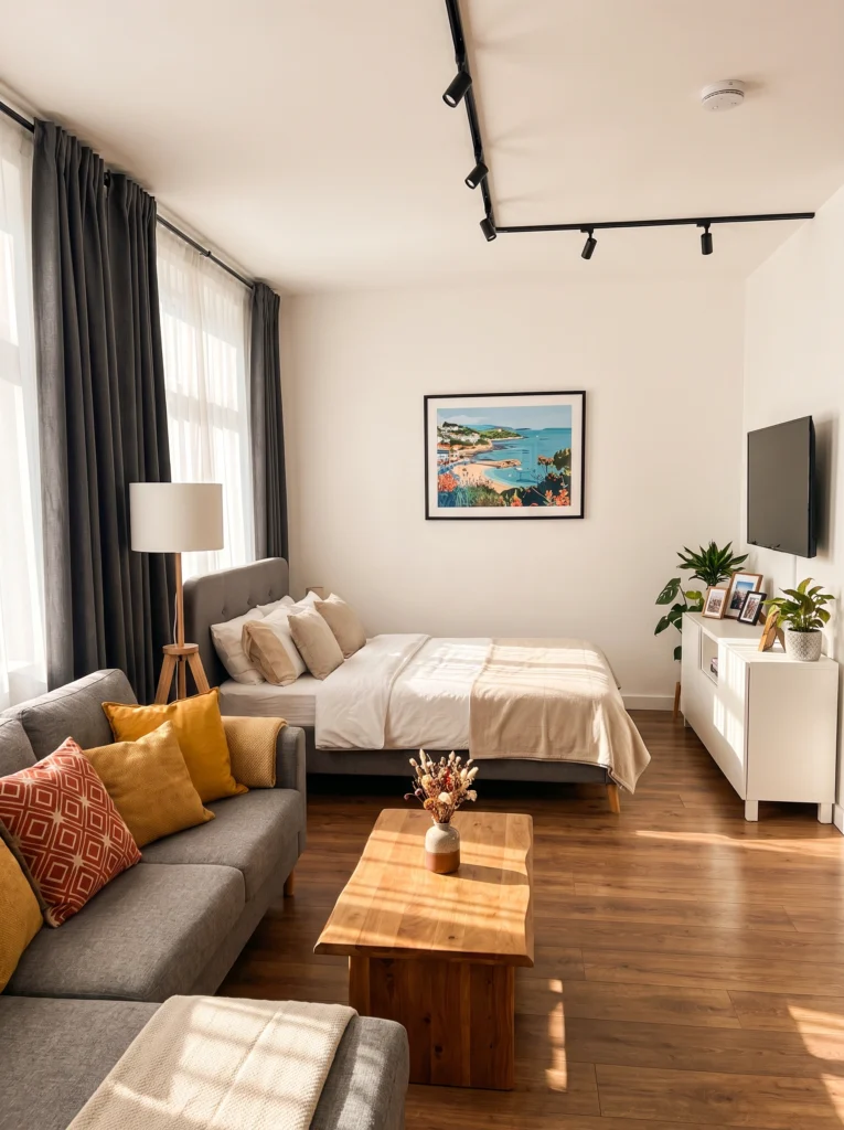
Landscape art is a quiet trick for studios — it creates a sense of depth and distance that your four walls can’t offer on their own. A bright coastal scene like this one draws the eye outward, making the sleeping area feel less boxed in. Hang it centered above the bed to give that corner purpose and identity, almost like a headboard wall in a one-bedroom.
My favorite: Illustrated landscapes with bold color have more personality than generic stock photography prints.
5. Coordinate Your Art with Your Accent Wall
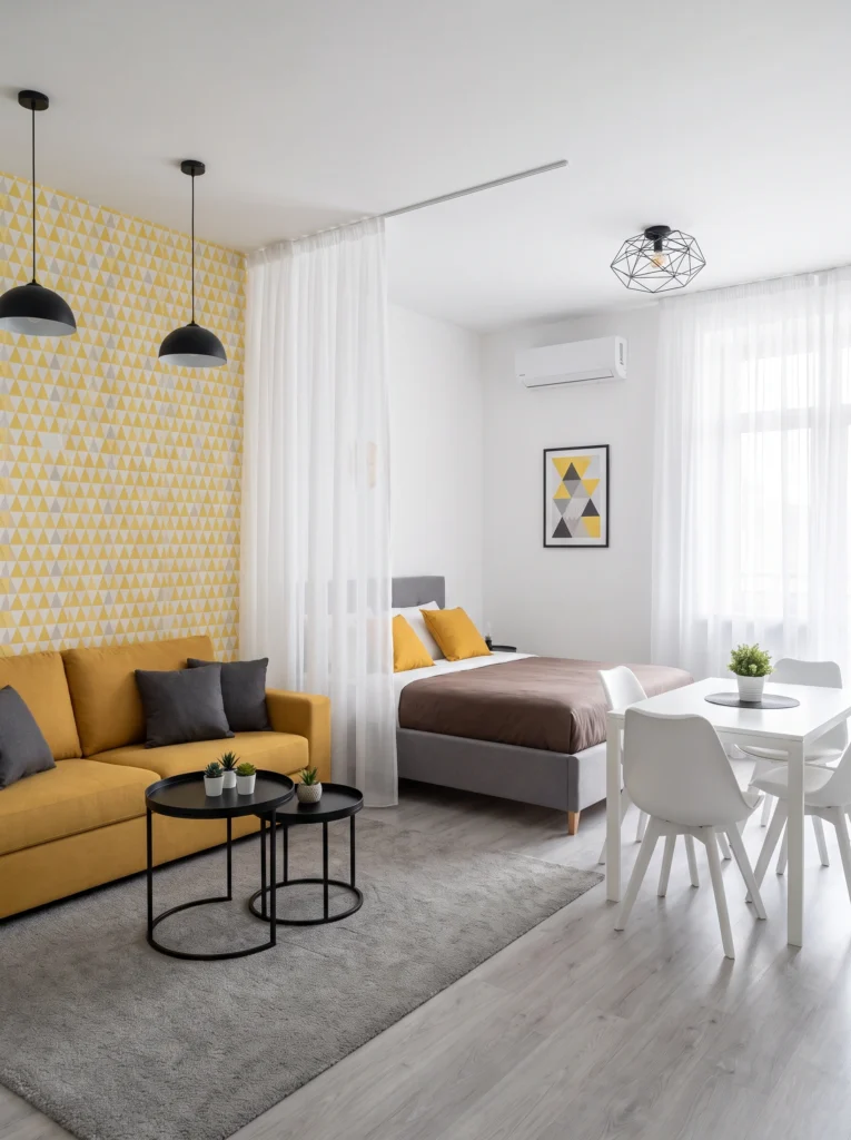
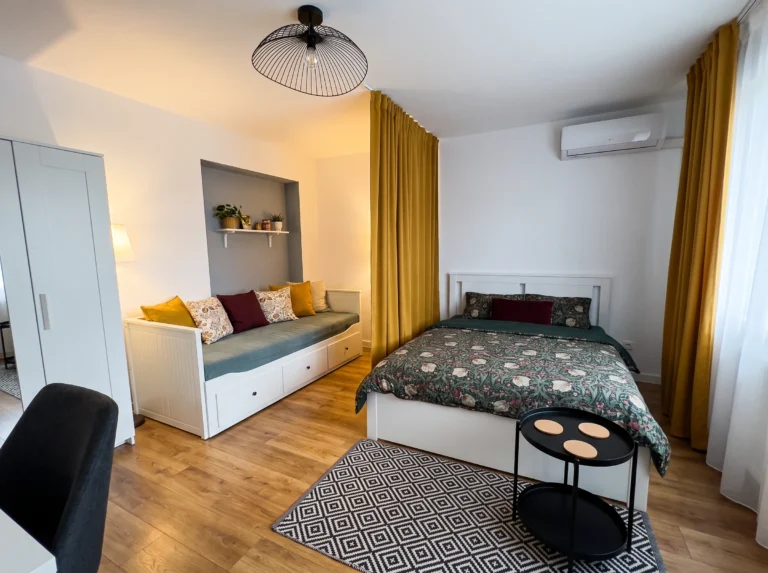
Here’s a designer move that looks expensive but isn’t — match your art to your wallpaper or accent wall. This geometric print picks up the same yellows and grays from the triangle-patterned wall, creating a cohesive look that feels intentional and pulled together. It works because the art echoes the palette without being an exact copy. The result is a studio that looks professionally styled.
Budget vs. splurge: Save on the print — Etsy has endless geometric options under $25. Splurge on a clean, simple frame.
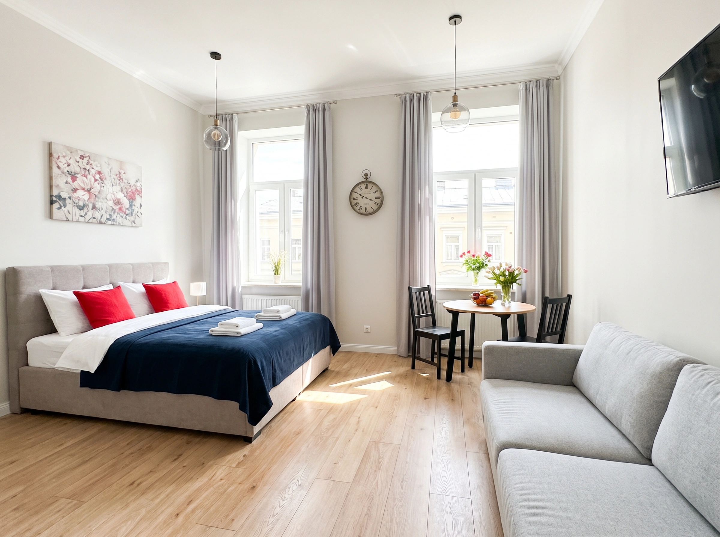
6. Pair Floral Prints with a Colored Wall
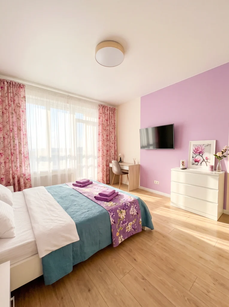
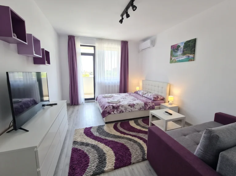
A floral print on a white wall can look flat. But put that same print against a lavender or blush accent wall, and suddenly it has depth and context. The trick is matching the art’s undertones to the wall color so they feel connected, not random. This setup proves that a painted accent wall and a coordinated print can make even a basic studio bedroom feel like a boutique hotel room.
Renter-friendly alternative: Can’t paint? Peel-and-stick solid-color wallpaper gives you the same effect, and it comes off cleanly.
7. Go Monochromatic for a Calm, Collected Mood
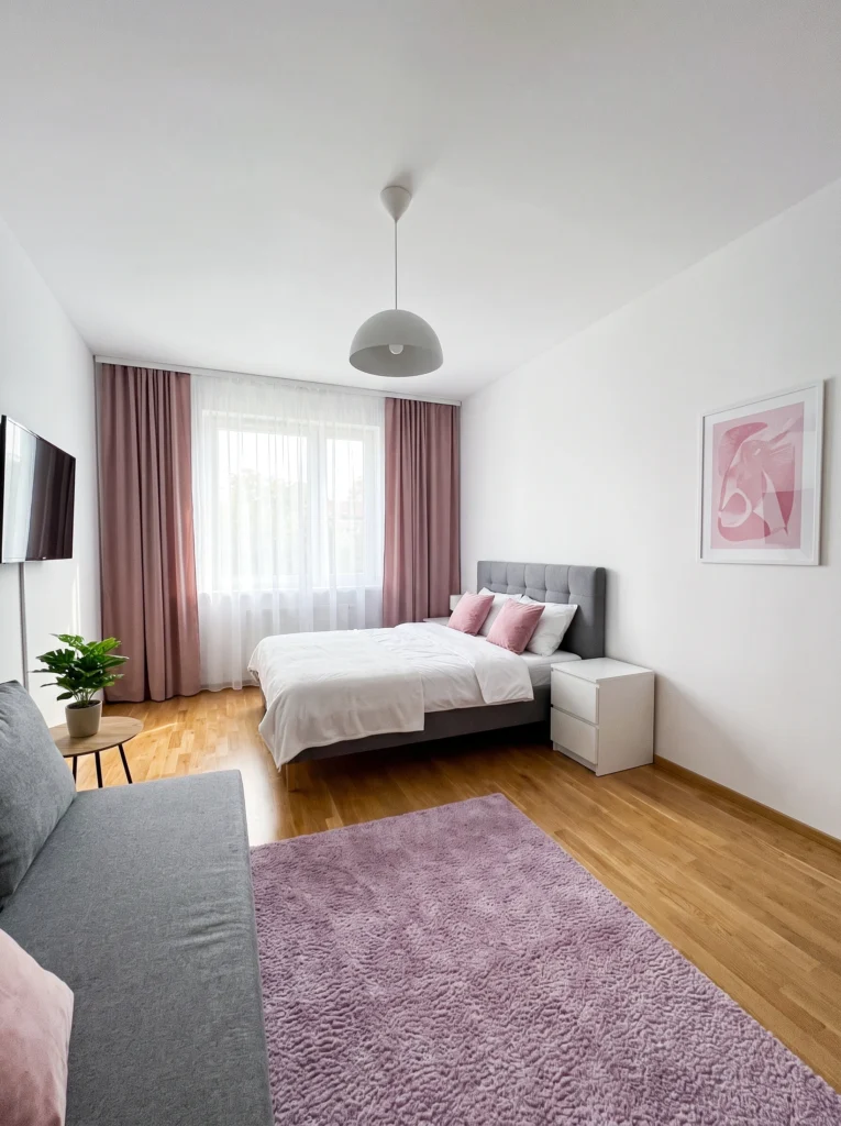
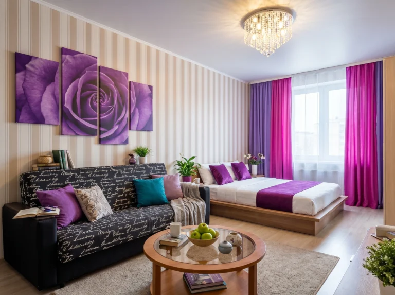
When your art, textiles, and rug all live in the same color family, something magical happens — the whole room exhales. This pink-toned abstract print ties into the mauve curtains and lavender rug without being matchy-matchy. Monochromatic doesn’t mean boring. It means every piece supports every other piece, which is exactly how you make a small space feel designed rather than decorated.
I’ve tested this: Sticking to one color family is the fastest way to make a messy studio look intentional.
8. Hang a Cityscape Canvas on a Textured Wall
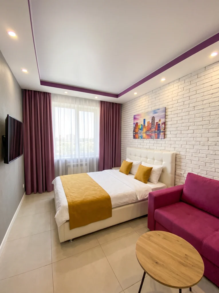
Brick — real or faux — gives a canvas print instant gallery energy. This vibrant cityscape pops against the white brick because the texture adds dimension that a flat wall can’t. If your studio has any kind of textured accent wall, lean into it with a bold, colorful piece. The contrast between rough wall and smooth canvas makes both elements look more interesting than they would alone.
Don’t waste your money on: Tiny art on a big textured wall. It disappears. Go medium to large, always.
9. Flank Your Art with Wall Sconces
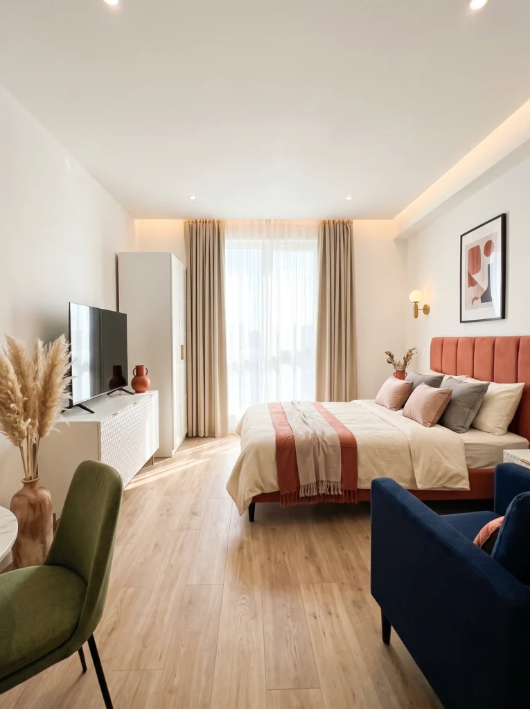
This is the detail most people skip, and it’s exactly why their art feels like an afterthought. Adding sconces on either side of a print creates a vignette — a deliberate moment that says “this matters.” Brass sconces with warm bulbs work especially well because they cast a glow that makes the art feel alive at night. It’s a small investment that makes your studio look twice as polished.
Pro tip: Plug-in sconces exist for renters. No electrician needed — just a discreet cord and a command strip.
10. Embrace Eclectic Art Against Bold Wallpaper
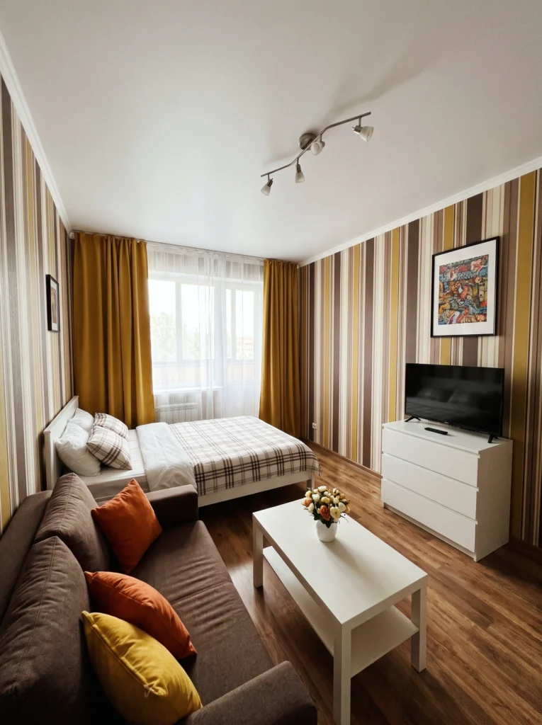
Most advice says busy walls need simple art. But sometimes more-on-more just works. This eclectic, colorful print holds its own against striped wallpaper because it’s bold enough to compete. The key is confidence — pick a piece with strong colors and a thick frame so it reads as intentional, not accidental. Studios are small enough that a maximalist moment in one corner can become your whole personality.
Sofia’s honest take: This look isn’t for everyone, and that’s the point. If it feels like you, commit fully. Half-bold always looks wrong.
11. Let an Oversized Floral Canvas Steal the Show
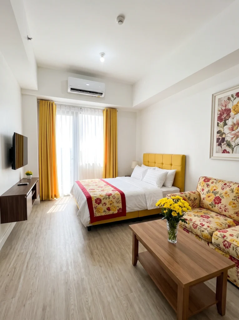
A big floral canvas brings warmth and softness to a studio without adding any physical clutter. This one works because the flowers in the art echo the floral pattern on the sofa, creating visual rhythm across the room. You don’t need to match exactly — just pull one or two shared colors. Oversized florals feel romantic and lived-in, which is exactly what a small space needs to feel like home.
My tip: Canvas prints are lighter than framed glass, which means easier hanging and fewer holes in rental walls.
12. Add Energy with an Abstract Color-Block Canvas
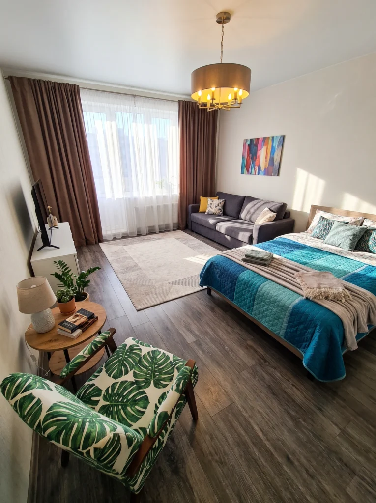
When your studio needs a jolt of personality, a bright abstract color-block canvas delivers without overwhelming the space. This one pulls together the teal bedding, the leafy green chair, and the warm brass chandelier into a cohesive story. Abstract art is forgiving — it doesn’t need to “match” anything perfectly. It just needs to share a couple of colors with the room, and the eye does the rest.
Budget vs. splurge: Honestly, abstract canvases are the easiest to DIY. Grab three paint colors and a blank canvas from the craft store.
13. Don’t Underestimate Small-Scale Art
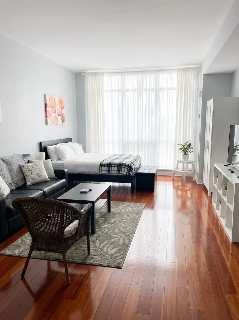
Not every piece needs to dominate the wall. A small, simple canvas — like these red poppies — can add just enough color and life to a neutral space without demanding attention. This works especially well in studios where the furniture is already dark or heavy. The art becomes a quiet accent, a little moment of brightness that keeps the room from feeling too serious or monotone.
I’ve tested this: Small art works best when you place it slightly off-center, near a lamp or plant. It needs a companion.
14. Create Drama with Triptych Panels
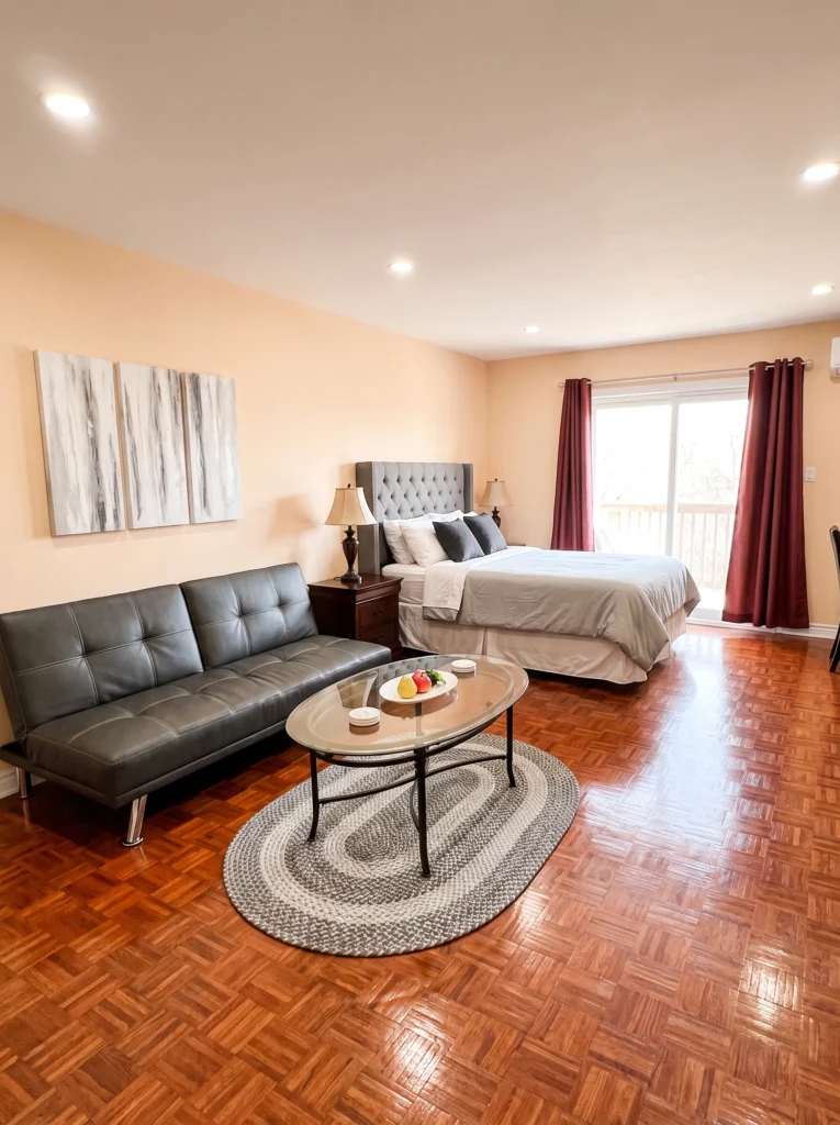
A triptych — three panels that form one image — is a smart way to fill a wide wall without committing to a single massive piece. These abstract gray-and-white panels add visual weight above the bed without competing with the warm peach walls. The gaps between panels create rhythm and make the arrangement feel more curated. It’s a gallery look that takes about ten minutes to hang.
Renter-friendly alternative: Lightweight canvas triptychs can hang on adhesive hooks. No nails, no damage, no stress.
15. Keep It Simple with Typography Art
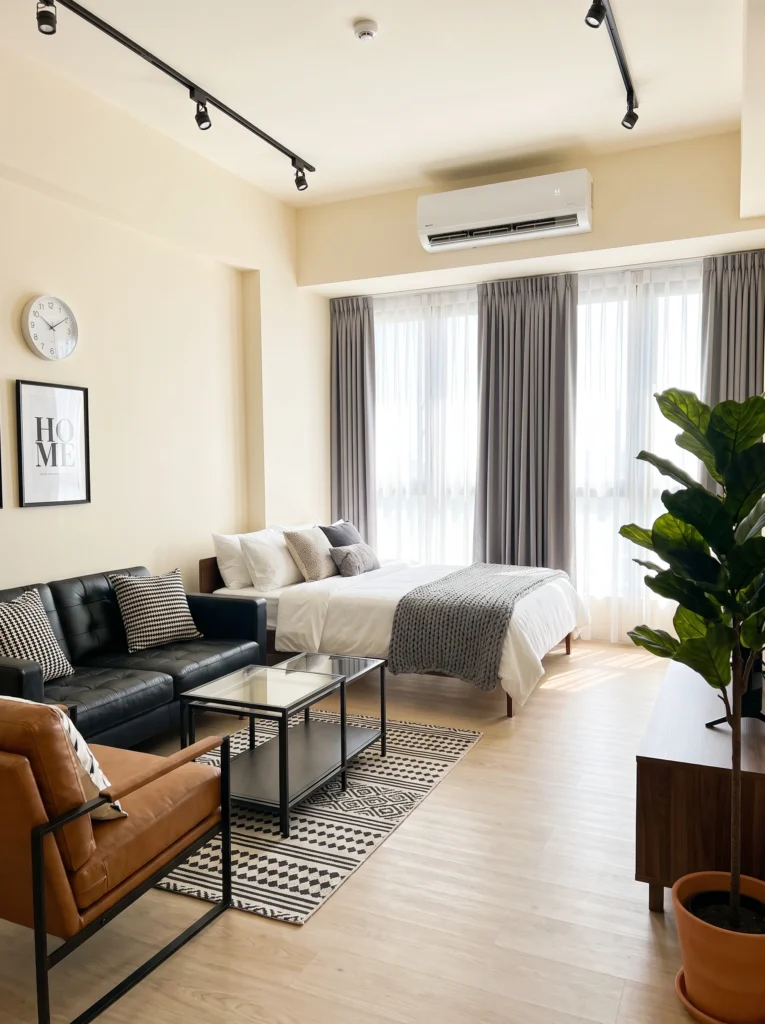
Sometimes the most effective wall art is just a word. A clean typography print — like this simple “HOME” design — works perfectly in modern or industrial-styled studios where you want art that’s understated but intentional. Pair it with a graphic rug and a few strong textures, and the whole room feels pulled together. Typography art is also the easiest to swap seasonally if you like switching things up.
My favorite: Black-and-white typography in a slim black frame. It goes with literally everything and costs almost nothing.
Final Thoughts
Wall art in a studio isn’t about filling empty space — it’s about choosing pieces that earn their spot. Whether you go big with a portrait that stops you mid-step or quiet with a small floral canvas that just adds a touch of warmth, the goal is the same: make your walls feel like yours. You don’t need a gallery budget or a design degree. You just need one piece that makes you smile when you walk through the door.
Your walls are the one part of a studio that doesn’t have to multitask. Let them just be beautiful.