15 Studio Apartment Walls That Do More Than Just Look Pretty
Your walls are the most underused real estate in a studio apartment. While everyone’s obsessing over furniture and storage hacks, smart studio dwellers are quietly making their walls work overtime — holding art, anchoring zones, storing things, and making 400 square feet feel intentional. Here are 15 studio spaces where the walls are doing something genuinely clever.
1 Turn a Blank Wall Into Storage You’ll Actually Use
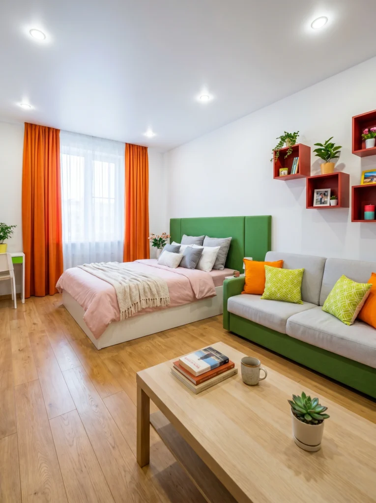
This wall is doing double duty, and that’s the point. Those red shadow-box shelves hold books, photos, and a candle without eating an inch of floor space — exactly what a studio needs. Mixing open cube sizes keeps it from looking like a kit. Paint them a color that pops against white walls and suddenly your “storage” reads as styled decor instead of clutter management.
Pro tip: Stagger the boxes asymmetrically instead of lining them up in a grid. It looks more curated and hides the fact that you’re basically just hiding stuff.
2 A Small Gallery Wall Can Tie a Whole Room Together
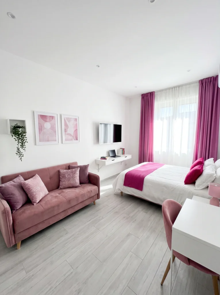
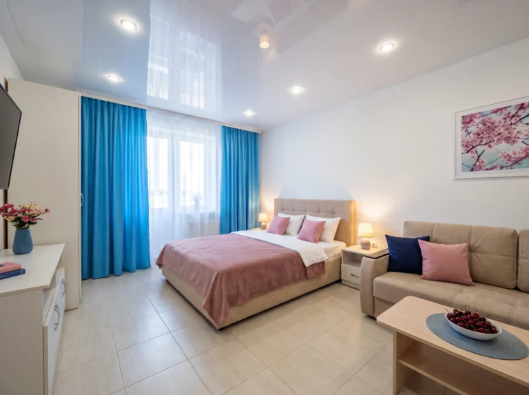
You don’t need ten frames to make a gallery wall feel intentional — two can absolutely do it. Here, a pair of pink abstract prints sits dead-center above the console, echoing the sofa and curtains exactly. That repetition is the trick: matching your wall art to your existing palette makes the whole room feel designed instead of decorated piece by piece.
Sofia’s honest take: A mismatched gallery wall in a studio just adds visual noise. Keep it to one or two pieces that actually relate to your color story.
3 Wallpaper One Wall Instead of Renovating the Whole Room
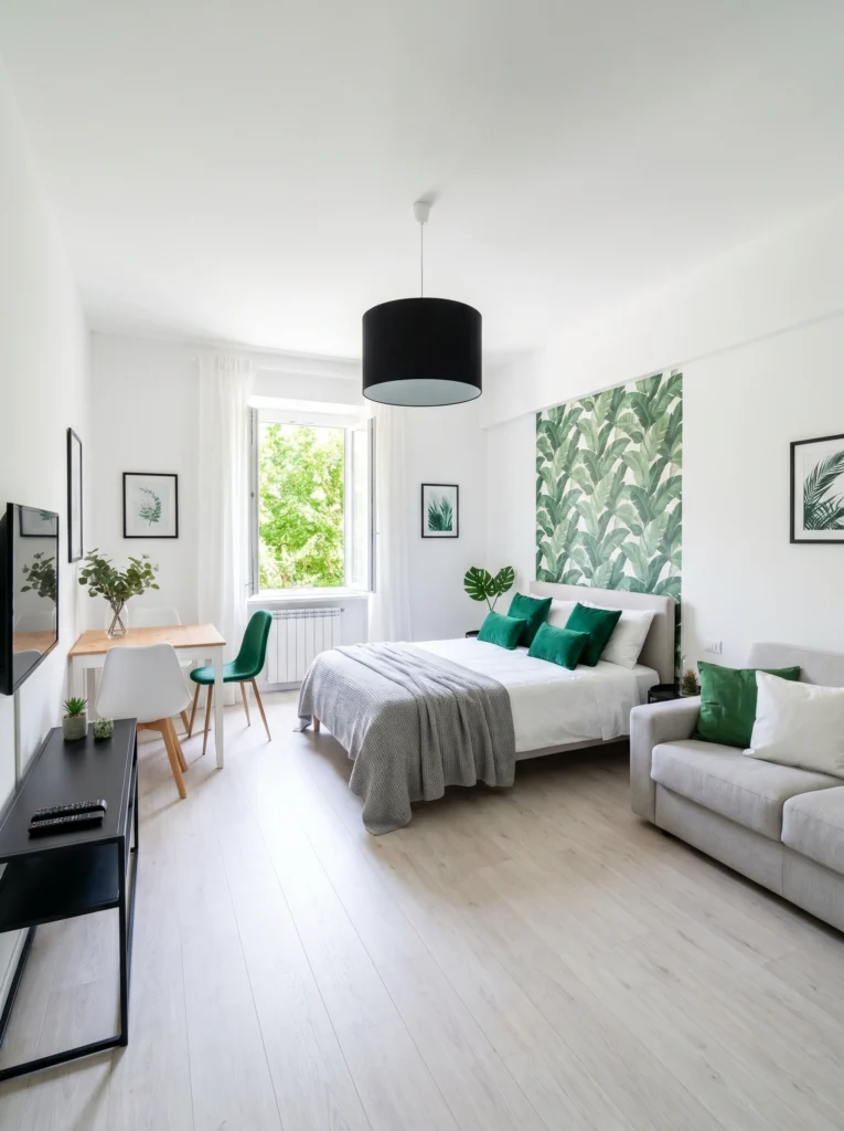
This banana leaf wallpaper only covers one wall, and that’s why it works. A bold, leafy print on every surface would overwhelm a small room — but isolated behind the headboard, it becomes a focal point that makes the white walls around it feel calm by comparison. It also visually defines the “bedroom” zone without adding a single piece of furniture.
Renter-friendly alternative: Skip the paste-and-soak kind entirely. Peel-and-stick wallpaper panels go up in an afternoon and come down clean when you move.
4 Exposed Brick Doesn’t Need Much Help
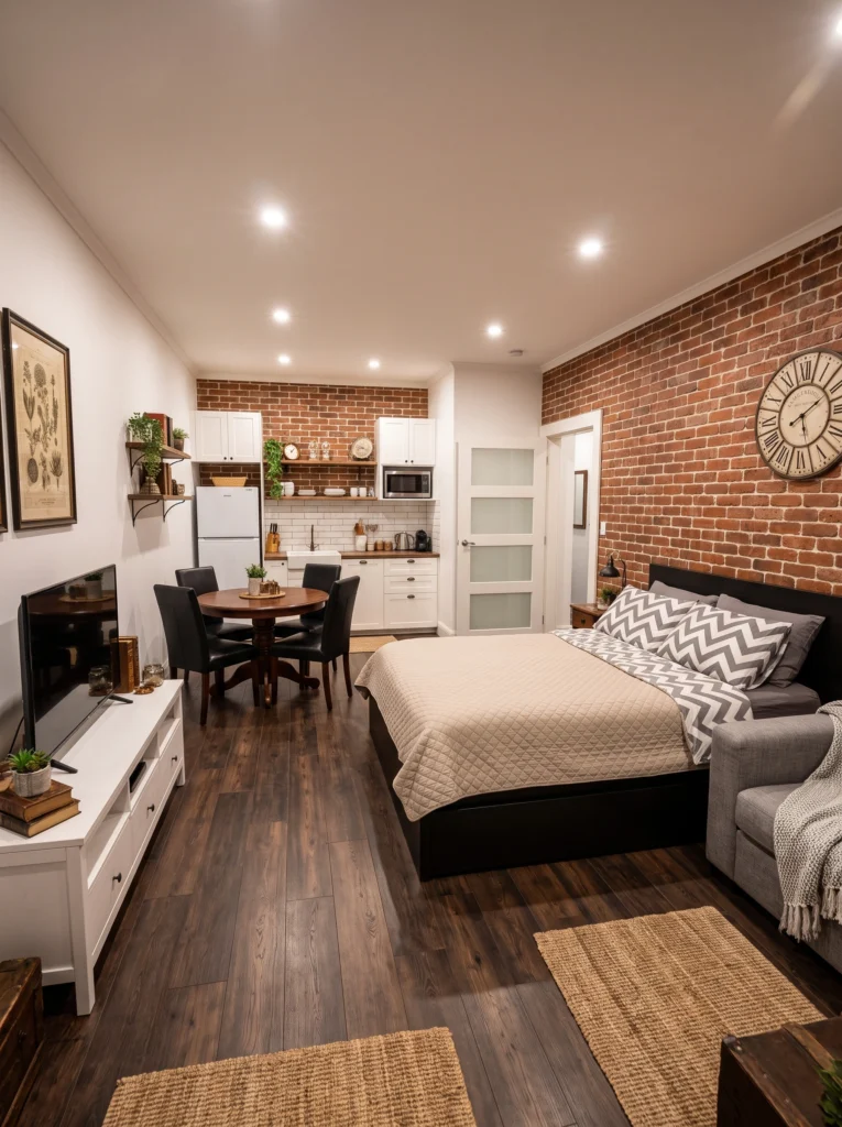
If your studio has real exposed brick, resist the urge to cover it up or fight it with busy decor. That texture already has presence — all this wall needed was one oversized clock to anchor it. The warm tone of the brick also makes a small room feel cozy instead of cramped, especially paired with warm-toned lighting like the recessed cans here.
My tip: One large statement piece beats five small ones on a textured wall. Let the brick stay the star.
5 Use a Carved Screen to Soften a Wall (and a Room)
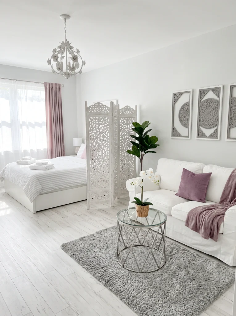
A flat wall and a flat divider can feel stiff side by side, so this room pairs a carved screen with matching Moroccan-pattern wall art on the adjacent wall. The repeated lattice motif ties the two together, so the screen reads as part of the design rather than a random partition dropped in to block the bed and chop up the layout.
Budget vs. splurge: Splurge on the carved screen since it’s doing real work as a room divider. Save on the wall art — framed printed panels get you the same look for a fraction of the carved-wood price.
6 Color the Wall Before You Touch the Frames
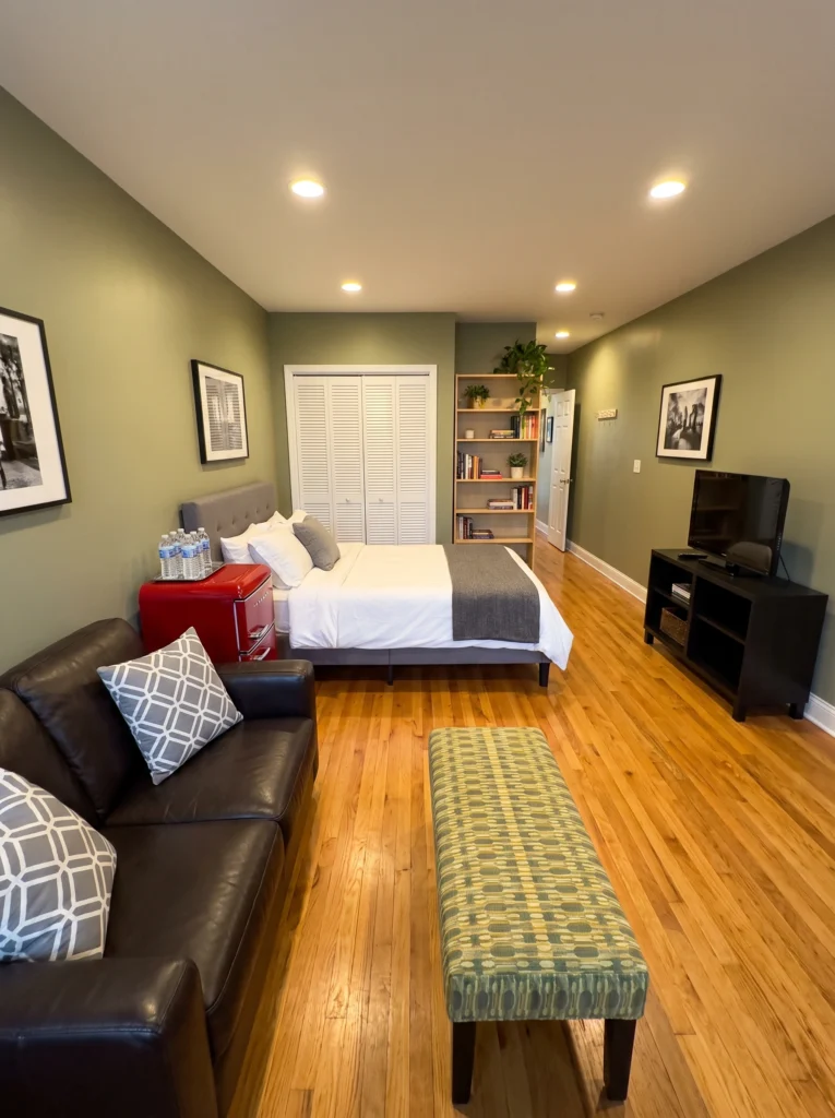
Before this room added a single frame, it made one big decision: paint the wall olive instead of leaving it white. That choice does most of the visual heavy lifting. The black-and-white photography on top reads as gallery-quality precisely because the deep green background gives it contrast and weight it wouldn’t have on plain white drywall, especially under warm lighting.
I’ve tested this: Deep, moody wall colors make black-and-white art look intentional and expensive. White walls make the same art look like an afterthought.
7 Woven Wall Decor Adds Texture Without Adding Bulk
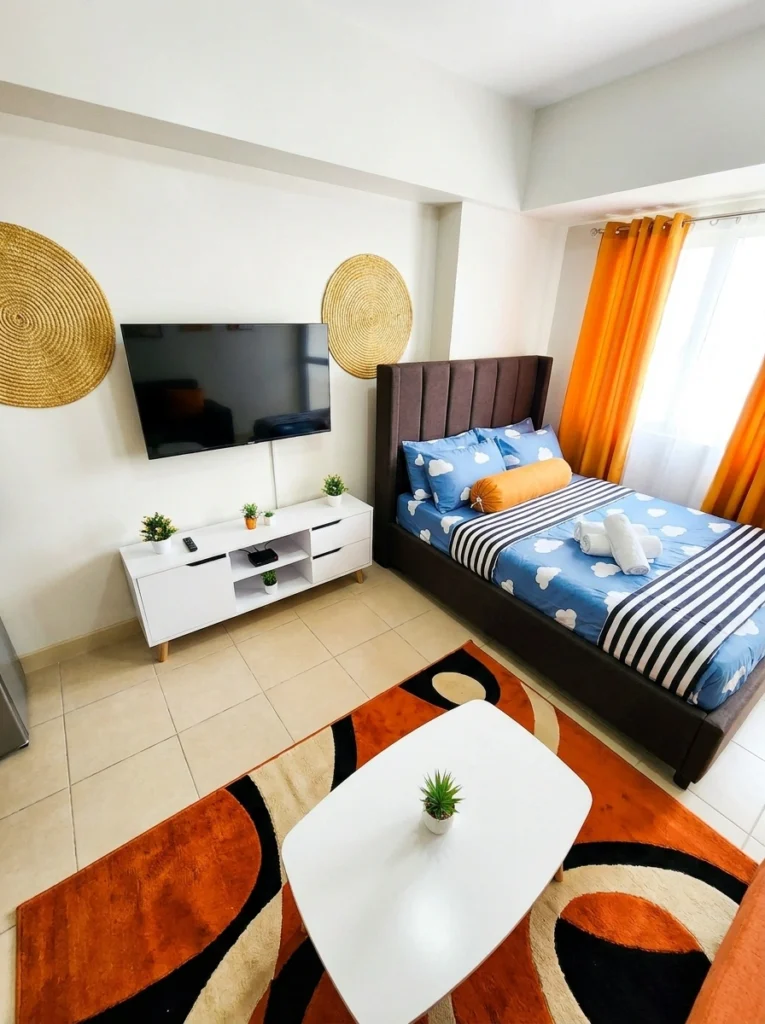
A mounted TV can leave a wall feeling flat and a little cold, especially in an all-white room. These two woven rattan discs flank the screen and add warmth and texture without crowding the space or competing with it. They’re lightweight, command-strip friendly, and instantly soften a wall that would otherwise just be “TV plus blank space” staring back at you.
Don’t waste your money on: heavy ceramic wall plates in this spot. Lightweight woven pieces give the same boho texture without the risk of a hook giving out.
8 Let One Wall Color Define Your “Bedroom” Without Walls
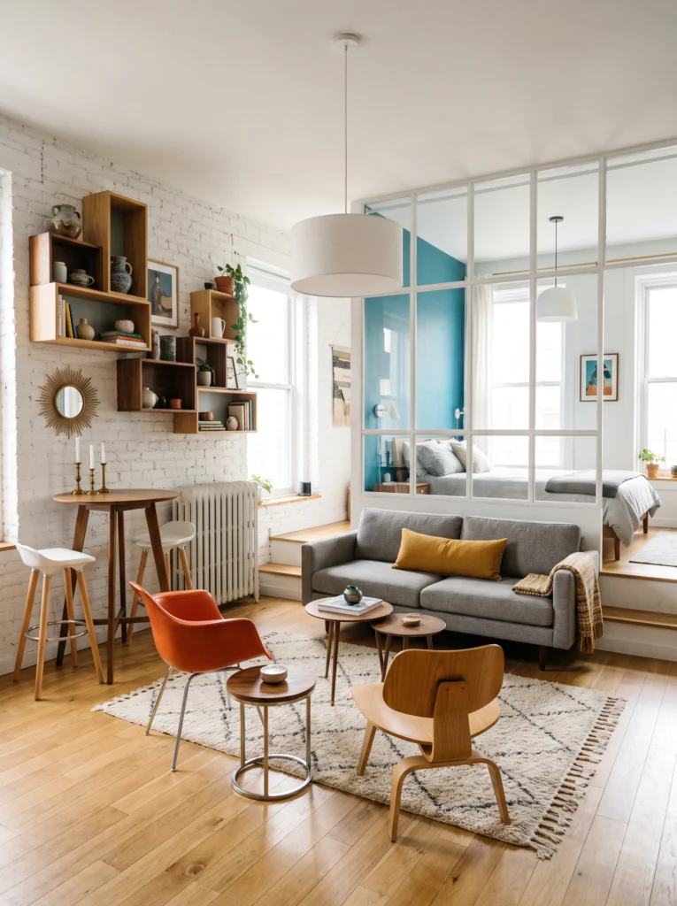
This is the most ambitious wall trick on the list: a glass-paned partition that lets a bold teal accent wall announce “this is the bedroom” while keeping the whole studio feeling open and airy. Up front, whitewashed brick with floating wood shelves and a sunburst mirror keeps the living area textured and personal. Two completely different wall treatments, one cohesive apartment.
Pro tip: If a full glass partition isn’t in the budget, paint just the headboard wall a saturated color. It creates the same psychological “room” effect for the price of a paint can.
9 A Symmetrical Gallery Grid Reads Bigger Than It Is
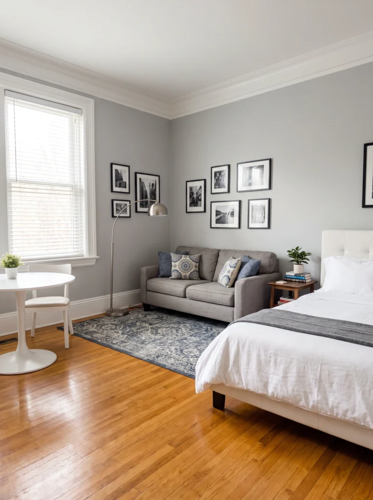
Six identical black frames, evenly spaced, wrapped around this corner — and the precision is what makes it feel high-end rather than cluttered. Symmetry is forgiving in a small space because your eye reads “organized” instantly, even with multiple pieces on the wall. The matching black frames against soft gray paint keep the whole thing quiet instead of busy or chaotic.
My favorite: Measure and mark every frame placement with painter’s tape before you hang a single nail. It’s the difference between a gallery wall and a guessing game.
10 A Bold Headboard Wall Can Replace a Headboard
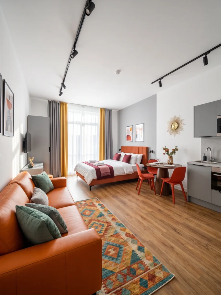
This charcoal accent wall behind the bed does so much work that the orange upholstered headboard almost feels like a bonus. The dark wall grounds the bright furniture instead of letting it float awkwardly against white drywall, and the gold sunburst clock adds a little shine without needing extra wall space anywhere else in the room, which is a real win in a studio.
Budget vs. splurge: Splurge on a quality interior paint in a saturated shade — it needs fewer coats and won’t look patchy. Save by skipping a designer headboard altogether; the wall color does that job.
11 Pop Art Can Be Your Whole Color Story
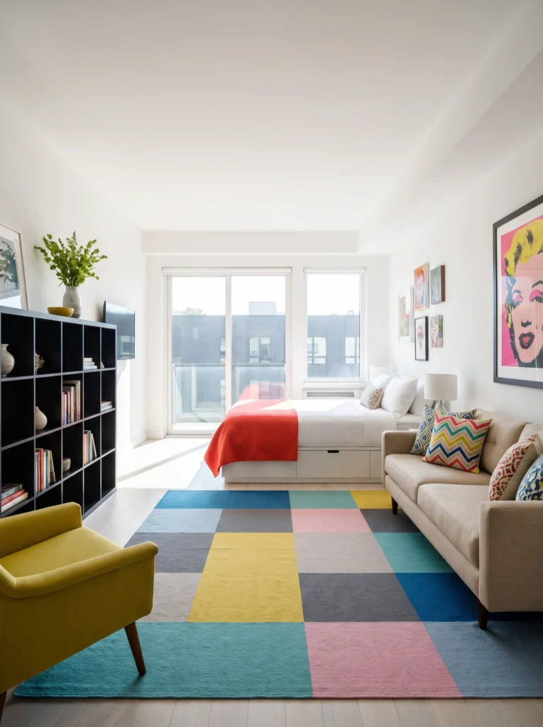
One oversized pop-art print, a scattering of smaller colorful pieces, and a multicolor rug pulling it all together — that’s the entire color strategy in this studio. The wall doesn’t need a paint color when the art itself is this loud. It’s a great option if you’re renting and can’t paint but still want a room with serious personality and color.
Renter-friendly alternative: Use removable adhesive strips rated for your frame’s weight instead of nails. Big statement art still needs to come down clean.
12 Macramé Still Works — If You Use It Sparingly
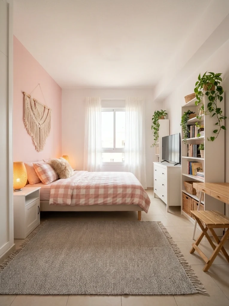
Macramé gets dismissed as dated, but hung against a blush pink accent wall like this, it looks intentional rather than trendy. The trick is restraint — one hanging, one accent wall, nothing else competing for attention. It adds texture and a handmade feel to a small room without requiring drilling, painting more than one wall, or spending much money at all.
I’ve tested this: One macramé piece reads as boho-chic. Three on the same wall starts to feel like a craft fair. Keep it to one statement hanging.
13. Minimalist Floating Shelves in a Scandinavian Studio
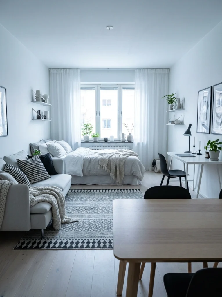
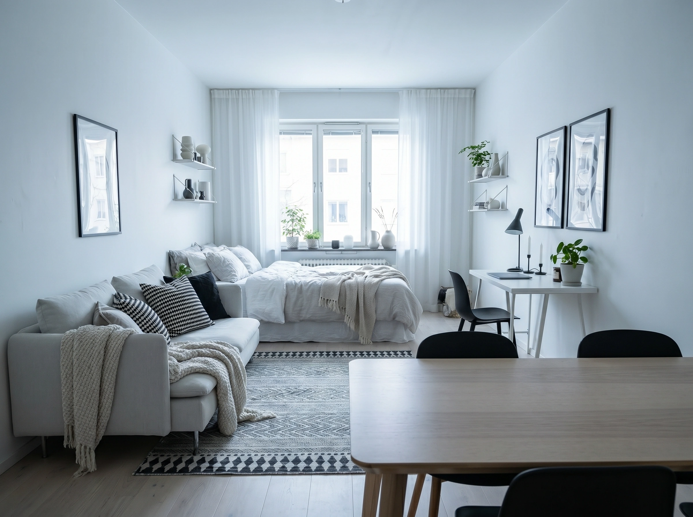
Less is genuinely more here. Small floating shelves at two heights — one mid-wall, one higher — display just enough to feel lived-in without feeling cluttered. Each shelf holds three to five objects maximum: a ceramic vase, a small plant, a minimal sculpture. The white-on-white palette keeps everything airy. This is perfect for renters who want to add wall interest without committing to a gallery wall or a large bookcase.
Renter-friendly alternative: Use Command strips on lighter shelves if drilling isn’t allowed.
14. Textured Wallpaper Behind the Bed as a Statement
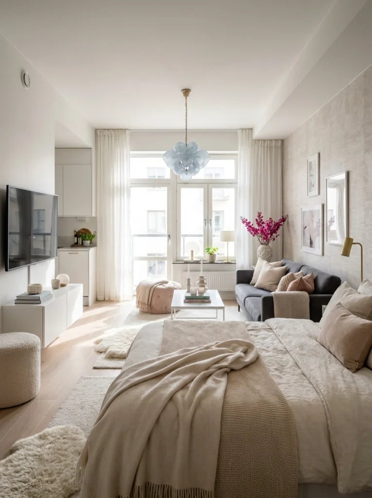
You don’t need paint to add a statement wall. Textured wallpaper in a soft linen or grasscloth finish behind the bed does the same job a headboard wall paint would — defines the sleeping zone, adds warmth, creates visual depth — without overwhelming the space. This creamy textured wall anchors the room beautifully while keeping the overall palette light and serene. Peel-and-stick wallpaper options have come a long way; many are genuinely indistinguishable from the real thing.
15. The Gallery Wall That Zones the Bedroom
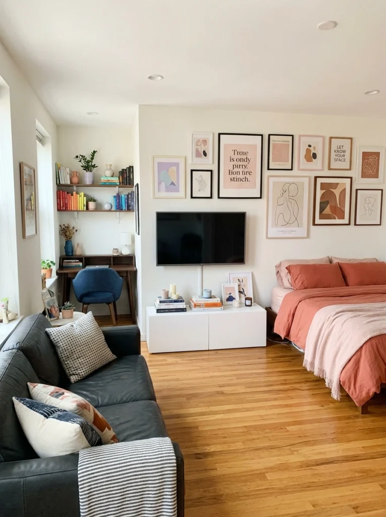
When your bed and living room share the same four walls, a gallery wall is one of the easiest ways to visually anchor the sleeping zone without building a divider. This warm, collected arrangement of abstract prints in terracotta and blush frames the TV wall and tells your brain: this is the bedroom corner. It also brings in serious personality. Layer different frame sizes — black, natural wood, blush — for depth. The result feels curated, not chaotic.
Final Thoughts
Your walls have more to offer than a coat of paint and a few nails. In a studio apartment, they’re the one surface that can anchor zones, add personality, create storage, and shape how the entire space feels — all without touching the floor plan. Pick one idea from this list that speaks to your style. Just one. You don’t need to do all fifteen.
The best studio apartments aren’t the biggest ones — they’re the ones where every surface, including the walls, is doing something on purpose.
Happy decorating, Sofia