15 Small Studio Apartment Layout Ideas Worth Copying
Here’s the truth about studio apartments — the walls aren’t the problem, the layout is. When your bed, sofa, and dining table all share one room, every inch matters. But a great layout isn’t about squeezing more in; it’s about creating zones that feel intentional. Below are 15 studio layouts I keep coming back to when I need inspiration for small-space living that actually works.
1. The Warm All-in-One Layout
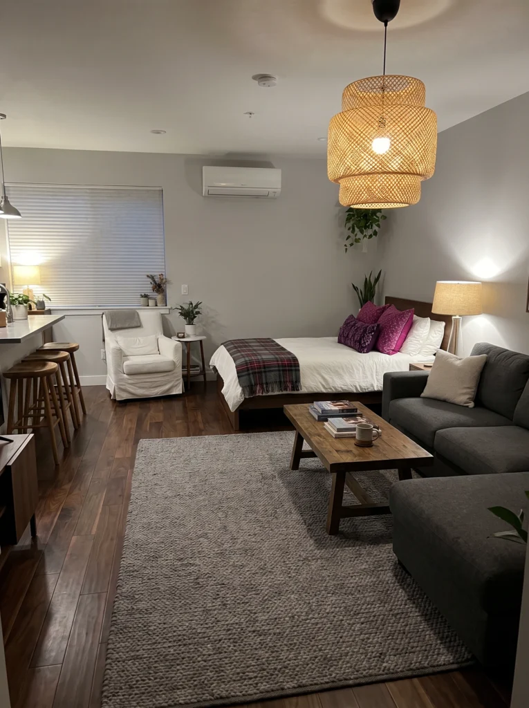
Here’s the thing about studios — you don’t need walls to define a room. This layout uses a rattan pendant, warm walnut floors, and a textured wool rug to anchor the living zone, while the bed sits proudly at the back like it belongs there. A single white reading chair by the window quietly carves out a third zone without stealing an inch of floor space. Cozy without ever feeling cramped.
Sofia’s honest take: Warm walnut flooring does more heavy lifting than any accent wall ever could. If you can’t touch the floor, layer a big wool rug and let the rest of the room breathe around it.
2. The Sheer Curtain Divider Layout
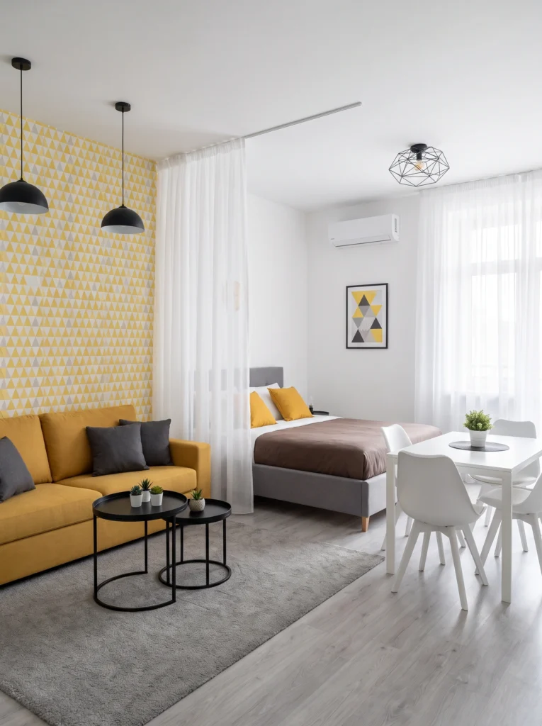
Sometimes the smartest divider is the softest one. A ceiling-mounted sheer curtain floats between the bed and the mustard sofa, giving you privacy at night and openness during the day. Add a bold triangle wallpaper on one wall and pull matching yellow accents into the pillows and framed art to tie the two zones together. The result feels intentional — like two rooms holding hands instead of fighting for space.
Pro tip: Ceiling-mounted curtain tracks cost around $30 and install with four screws. Choose linen-look sheers so the divider softens the room instead of chopping it in half.
3. The Dining-First Layout
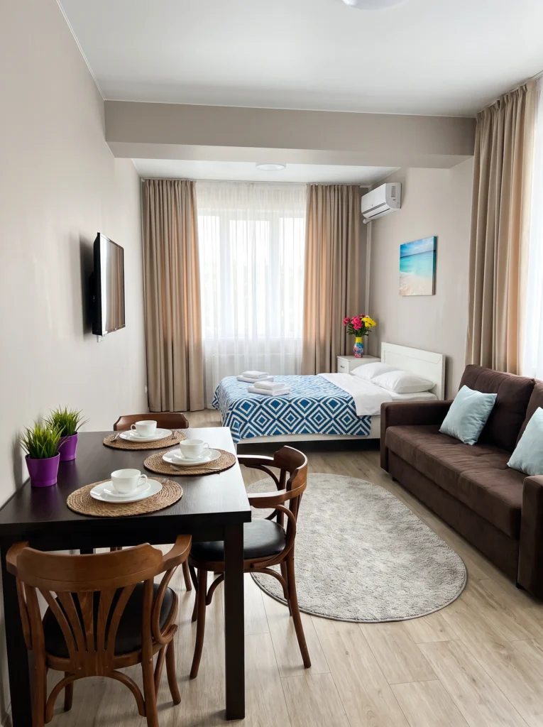
Most studios push the dining table into a corner. This one flips the script and makes it the star. A four-seater in dark wood sits front and center, the bed tucks against the window, and a brown sofa runs parallel — so the whole room reads like a proper dining apartment that also happens to sleep two. Perfect if you host more than you nap, or if meals matter more to you than movie nights.
Renter-friendly alternative: Can’t commit to a full dining set? A drop-leaf table folds flat against the wall when unused and expands to seat four in seconds — same effect, half the footprint.
4. The Bed-as-Centerpiece Layout
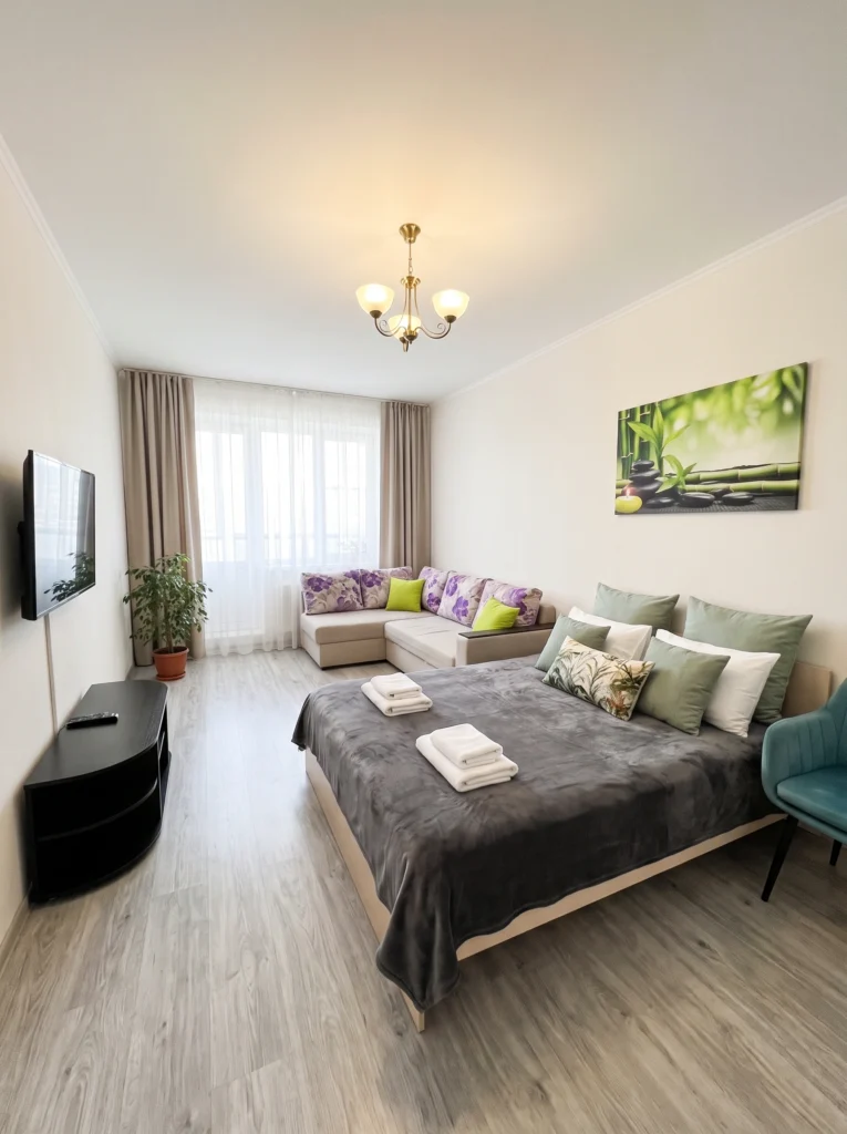
If your bed is the biggest thing you own, stop hiding it. This layout lets the king-size bed take center stage — dressed in soft charcoal, layered with sage and botanical pillows — while a beige sectional wraps around the corner behind it. The TV stays low and unobtrusive on the opposite wall, and a bright green artwork adds calm. It reads more like a boutique hotel suite than a small-space compromise.
My tip: Pull the bed at least 18 inches away from the back wall. That small gap makes the bed feel intentional rather than shoved in, and it opens up the whole room visually.
5. The Gallery Wall Linear Layout
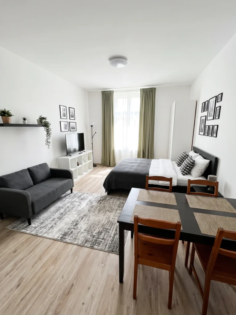
Long, narrow studios need long, narrow thinking. Here, the grey sofa, TV console, and bed all sit along one line, while the dining table anchors the other end of the room. Two gallery walls of black-framed prints run down each side, drawing the eye horizontally and making the whole space feel noticeably longer than it actually is. It’s a layout that respects the shape of the room instead of fighting against it.
Budget vs. splurge: Save on the frames — IKEA’s Ribba line at $8 apiece looks identical to $60 versions. Splurge on the prints or photographs inside them, because that’s what your eye actually lands on.
6. The Breakfast Bar Layout
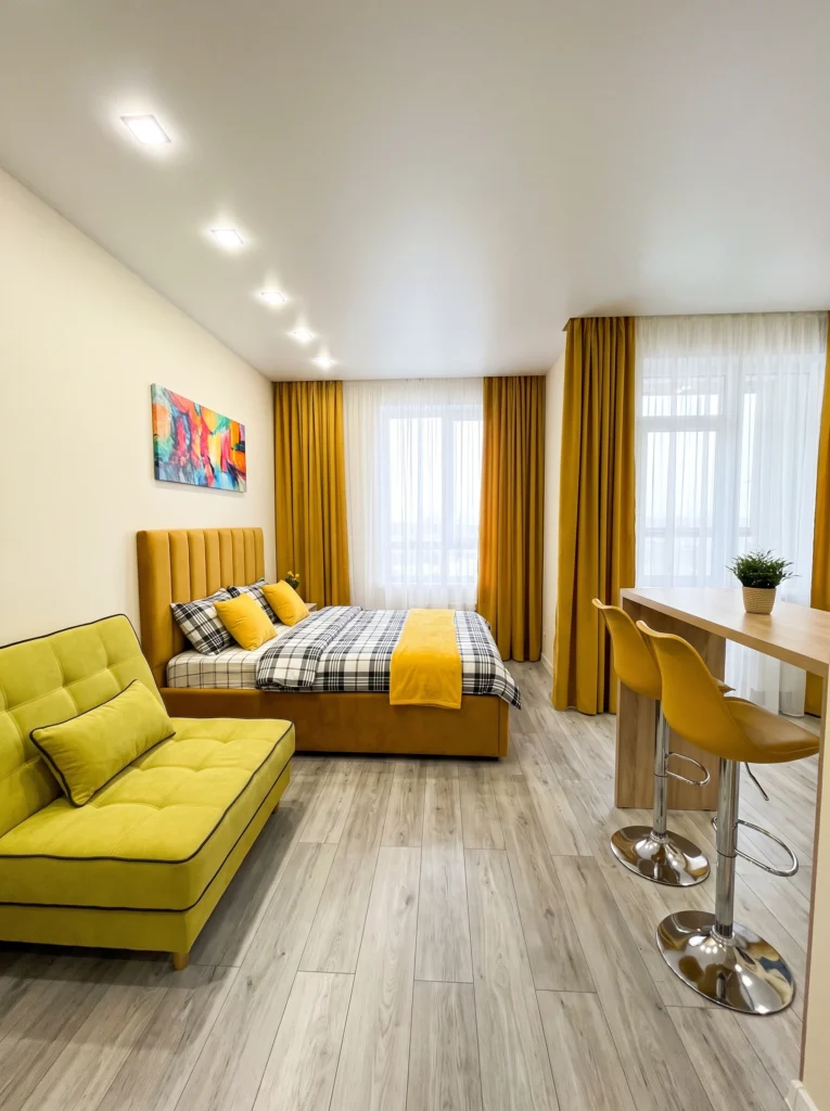
A breakfast bar isn’t just for eating — in a studio, it’s a full-blown zone-maker. Two yellow bar stools tuck under a slim wooden counter by the window, giving you a dining spot, a workspace, and a psychological wall between the sleeping and living zones. Pair it with a punchy monochrome palette (yellow chaise, yellow curtains, yellow throw) and suddenly the whole apartment feels curated on purpose instead of cramped by accident.
Sofia’s honest take: Monochrome color schemes look intimidating on Pinterest but are the easiest to pull off in real life. Pick one bold color, commit fully, and let neutrals do the balancing.
7. The Slatted Wood Divider Layout
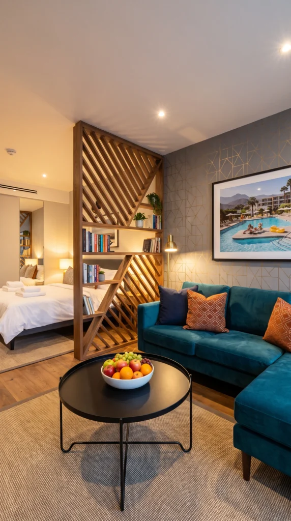
This is the layout I daydream about. A floor-to-ceiling walnut slat divider separates the bedroom from the living zone without blocking a single ray of light. The angled slats double as open bookshelves, the teal velvet sofa adds a moody jewel-tone glow, and a warm brass lamp behind it makes the whole scene feel like a boutique hotel in Palm Springs. Genuinely one of the smartest studio dividers I’ve ever seen.
My favorite: The bookshelf-and-divider hybrid. It gives you privacy, storage, and a design moment all at once — three studio problems solved with one piece of furniture.
8. The Long Rectangular Layout
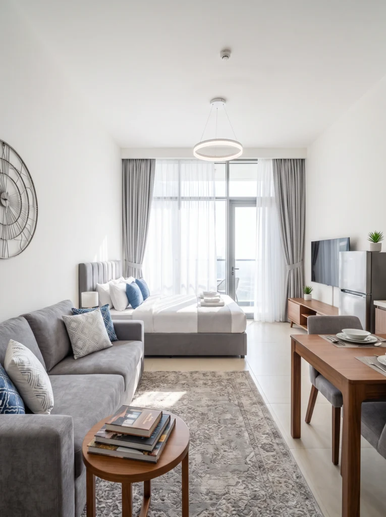
When your studio is longer than it is wide, work with the geometry instead of fighting it. Push the bed to one end near the window, place the grey sofa perpendicular to define the living zone, and slide the wooden dining table down the opposite side. A round ring pendant light anchors the middle and keeps the ceiling from feeling like a tunnel. Long studios love clean, parallel lines and one strong focal point.
Pro tip: In narrow layouts, always leave a walkway of at least 32 inches down the middle. Anything less and the room starts feeling like a hallway with furniture bolted to the sides.
9. The Traditional Conversation-Area Layout
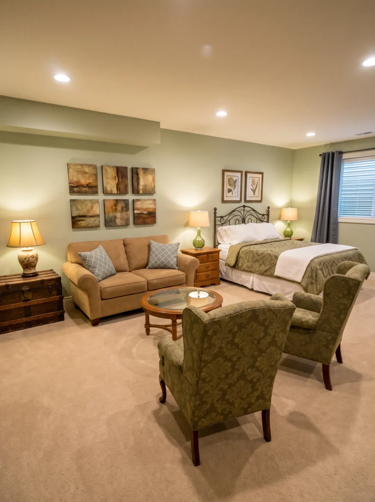
Not every studio needs to look like it was designed for a twenty-something. This one leans into a traditional conversation-area setup: a beige loveseat, two upholstered green wingback chairs, and an oval glass coffee table create a full seating arrangement in the center of the room. The bed sits calmly off to the side, dressed in soft greens. It proves studios can feel grown-up, layered, and quietly formal too.
Don’t waste your money on: A giant sectional in a room like this. Two smaller upholstered chairs give you more flexible seating, more visual balance, and the option to actually rearrange things later.
10. The Parallel Bed-and-Sofa Layout
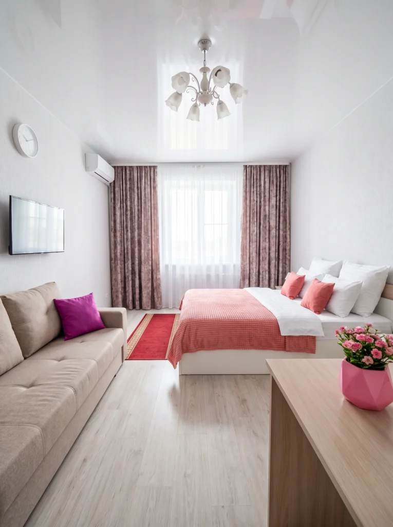
Two long walls, one facing the other — this layout leans all the way in. The bed lines up along the right wall, the beige sofa sits parallel on the left, and the floor space between them stays wide open. Blush coral bedding, dusty pink curtains, and a small red runner rug give the room a soft, feminine mood without going overboard. Perfect if you crave symmetry and hate visual clutter with a passion.
Renter-friendly alternative: Curtains change a room faster than paint ever will. Two long panels in a saturated color instantly define the “bedroom” side, and they leave zero holes when you move out.
11. The Side-by-Side Long Layout
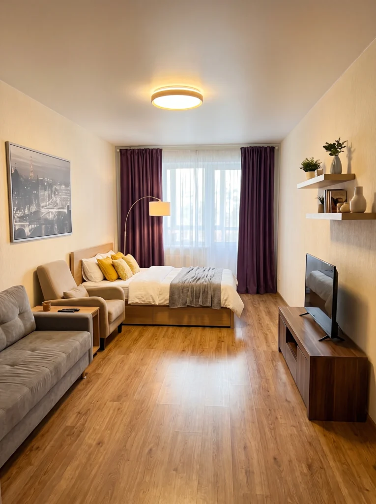
In a long, skinny studio, the bed and living area can sit side by side without stepping on each other. Push the bed against the long left wall, place a low grey sofa a few feet in front of it, and mount the TV on the opposite wall with a slim wooden console. An arc floor lamp bends elegantly over the bed to double as a nightstand light. I’ve lived with this exact arrangement — it works.
I’ve tested this: The arc floor lamp trick saves you from needing a nightstand at all. One less piece of furniture in a small studio is one less thing bumping your shins in the dark.
12. The Color-Coded Zone Layout
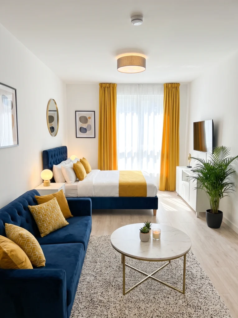
When you can’t build walls, build them with color. This studio uses navy velvet and mustard yellow as its entire visual vocabulary — the sofa, the headboard, the curtains, even the throw pillows all pull from the same three shades. The bed zone and the living zone look like two chapters of the same story instead of two rooms competing for attention. Cohesion, not clutter, is the real space-maker in a studio.
Budget vs. splurge: Splurge on one statement velvet piece — a headboard or sofa. Save on the rest by matching pillows, curtains, and throws in the same color family from any high-street store.
13. The Statement Floor Layout
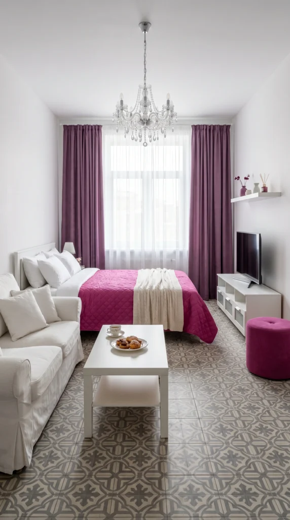
Sometimes the floor does the heavy lifting. This studio uses a bold black-and-white Moroccan tile pattern to anchor the entire space, then keeps everything else clean and simple: a white slipcovered sofa, a magenta bedspread, dusty purple curtains, and a crystal chandelier overhead. The pattern is loud enough to be memorable but neutral enough in tone to let the furniture float above it. If your rental has interesting floors, please don’t hide them.
Sofia’s honest take: Statement floors mean you should keep furniture upholstery quiet. One bold element per room is elegance; two competing bold elements is chaos wearing a nice outfit.
14. The Media Wall Layout
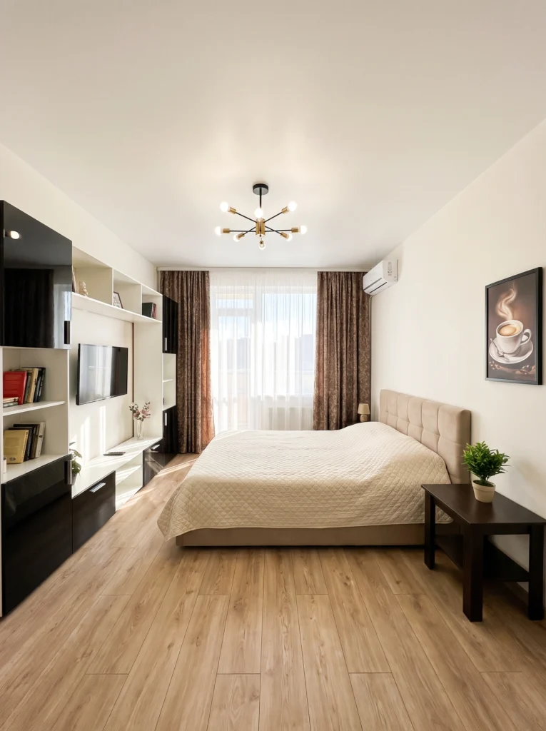
A full-height media wall is the studio hack nobody talks about. This layout uses a black-and-white built-in unit to hold the TV, books, framed photos, and hidden storage — all along one single wall. The bed sits directly across from it on the opposite wall, so you get a proper bedroom-meets-living-room feel without any physical dividers. The brass sputnik chandelier adds just enough personality to keep the whole room from feeling like a hotel suite.
My tip: Look for modular media units from IKEA’s BESTÅ line. You can configure open shelving, closed doors, and drawers exactly where you need them — and expand later without replacing the whole thing.
15. The Sofa-at-Foot-of-Bed Layout
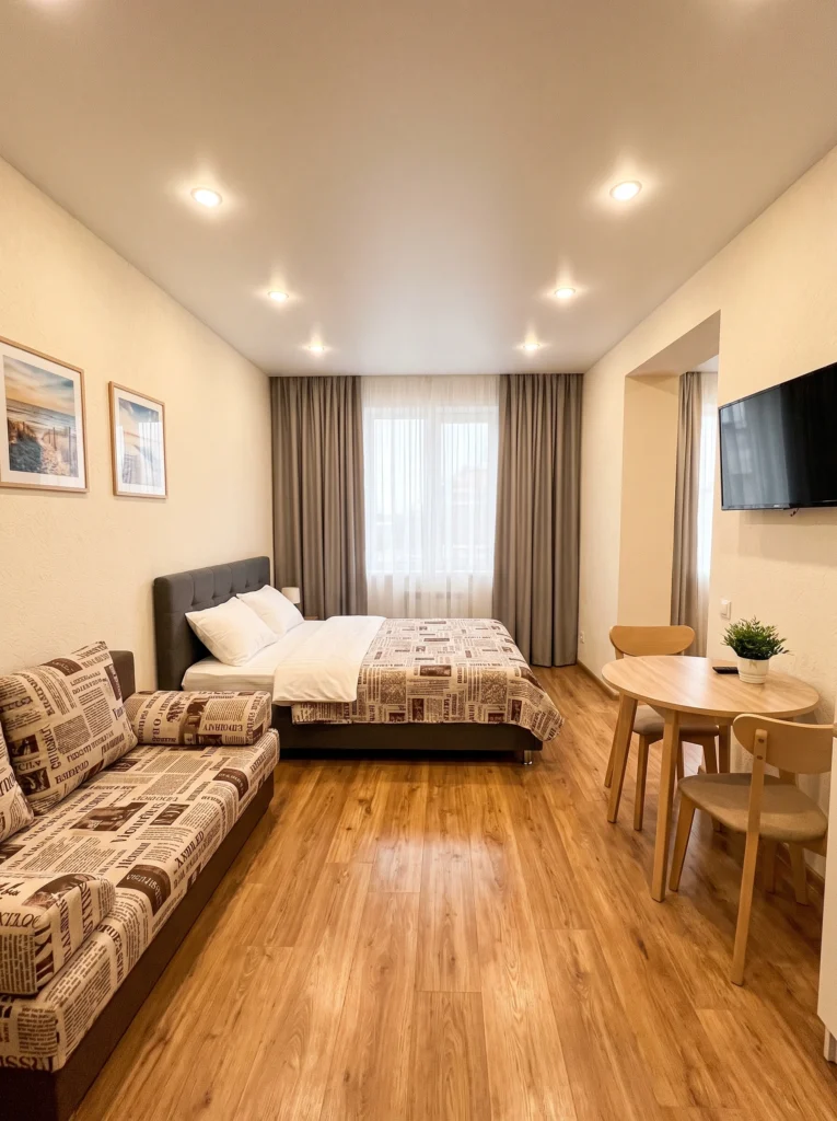
Placing the sofa at the foot of the bed is one of the oldest studio tricks in the book, and it still works beautifully. Here, a printed daybed sits perpendicular to a grey upholstered bed, creating a clear boundary between sleeping and lounging without adding a single wall. A small round wooden dining table tucks into the window corner to round out the third zone. Three functions, one room, zero awkwardness.
Pro tip: Choose a low-back sofa or daybed for this arrangement. A tall backrest at the foot of the bed will block light and make the room feel chopped instead of continuous.
Final Thoughts
A great studio layout isn’t about having more space — it’s about being smarter with the space you already have. Whether you’re divided by a slatted wood screen, a sheer curtain, or just clever furniture placement, the goal stays the same: three functional zones that don’t fight each other. Pick one layout that speaks to you, borrow a detail from another, and start there. You don’t have to nail it on the first try.
Your studio doesn’t need to look bigger — it just needs to feel like home.